
An Interest In:
Web News this Week
- March 20, 2024
- March 19, 2024
- March 18, 2024
- March 17, 2024
- March 16, 2024
- March 15, 2024
- March 14, 2024
Some of Our Sources
- BoingBoing
- Engadget
- Techcrunch
- Technology Review
- Simplebits
- Smashing Apps
- Abduzeedo
- TutsPlus - Design
- Stylized Web
- Wal You
Help Webnuz
Referal links:
Easily toggle between light and dark theme with Material-UI
In this blog you are going to learn how to create a toggle button that switches between light and dark theme.
I have already created a video about it on my youtube channel. Check that out. If you like the video please subscribe to my channel.
We know that in dark mode, the background stays dark and the foreground is white to keep the contrast. In light mode, it is just the opposite.
So, we need a component that automatically changes its background color based on the theme. Also for the text.
In Material-ui, we have a component like that. That is the Paper component. The Paper component is intelligent enough to automatically detect the theme and it will change its background color. For more information, please check their docs out. Paper
- Let's create a boilerplate component.
import React from 'react'const DarkTheme = (props) => { return ( <div> </div> )}export default DarkTheme- Create a new state with useState hook.
import React, {useState} from 'react'const DarkTheme = (props) => { const [dark, setDark] = useState(false) return ( <div> </div> )}export default DarkThemeThis will be used for checking if the current mode is in dark or not.
- Create a new theme.
import React, {useState} from 'react'import { createMuiTheme, ThemeProvider } from '@material-ui/core/styles'const DarkTheme = (props) => { const [dark, setDark] = useState(false) const theme = createMuiTheme({ palette: { type: dark ? 'dark' : 'light', }, }) return ( <div> </div> )}export default DarkThemeSimply we specify the theme mode by the type property. In this case, it will be updated based on the dark state value. We will use a button to manipulate the state.
- Insert a paper with the Typography component.
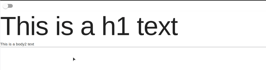
import React, { useState } from 'react'import { createMuiTheme, ThemeProvider } from '@material-ui/core/styles'import Typography from '@material-ui/core/Typography'import Paper from '@material-ui/core/Paper'const DarkTheme = () => { const [dark, setDark] = useState(false) const theme = createMuiTheme({ palette: { type: dark ? 'dark' : 'light', }, }) return ( <Paper> <Typography variant='h1'>This is a h1 text</Typography> <Typography variant='body2'>This is a body2 text</Typography> </Paper> )}export default DarkTheme- Wrap all components by the ThemeProvider and pass the theme object as a theme prop.
import React, { useState } from 'react'import { createMuiTheme, ThemeProvider } from '@material-ui/core/styles'import Typography from '@material-ui/core/Typography'import Paper from '@material-ui/core/Paper'const DarkTheme = () => { const [dark, setDark] = useState(false) const theme = createMuiTheme({ palette: { type: dark ? 'dark' : 'light', }, }) return ( <ThemeProvider theme={theme}> <Paper> <Typography variant='h1'>This is a h1 text</Typography> <Typography variant='body2'>This is a body2 text</Typography> </Paper> </ThemeProvider> )}export default DarkThemeIf you have no idea about theming in material-ui, then please check this video out.
ThemeProvider is making our custom theme available to all the children. It is like redux and context API.
But we still don't have the toggle functionality. We need a switch component
- Insert a switch component or any other button-type component that can be togglable.
import React, { useState } from 'react'import { createMuiTheme, ThemeProvider } from '@material-ui/core/styles'import Typography from '@material-ui/core/Typography'import Paper from '@material-ui/core/Paper'import Switch from '@material-ui/core/Switch'const DarkTheme = () => { const [dark, setDark] = useState(false) const theme = createMuiTheme({ palette: { type: dark ? 'dark' : 'light', }, }) return ( <ThemeProvider theme={theme}> <Switch checked={dark} onChange={() => setDark(!dark)} /> <Paper> <Typography variant='h1'>This is a h1 text</Typography> <Typography variant='body2'>This is a body2 text</Typography> </Paper> </ThemeProvider> )}export default DarkThemeEvery time you click on the switch button, the dark state will be changed to its opposite value. This will toggle the theme type.
Switch off.
Switch on.

How is it working?
The Paper component has a white Background color and dark font color. And Typography component by default inherits the font color from its parent. In this case, it is the Paper component.
When the theme type is changed, Paper is intelligent enough to detect the change. It will invert the color to keep the contrast between foreground and background color.
So, This is how it works. Isn't it so easy?
Shameless Plug
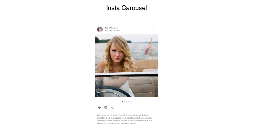
I have made a video about how to build a carousel postcard with React, Material-UI, and Swiper.js.
If you are interested you can check the video.
You can also demo the application form here
Please like and subscribe to Cules Coding. It motivates me to create more content like this.
If you have any questions, please comment down below.
You can reach out to me on social media as @thatanjan.
Stay safe. Goodbye.
About me
Why do I do what I do?
The Internet has revolutionized our life. I want to make the internet more beautiful and useful.
What do I do?
I ended up being a full-stack software engineer.
What can I do?
I can develop complex full-stack web applications like social media applications or e-commerce sites.
What have I done?
I have developed a social media application called Confession. The goal of this application is to help people overcome their imposter syndrome by sharing our failure stories.
I also love to share my knowledge. So, I run a youtube channel called Cules Coding where I teach people full-stack web development, data structure algorithms, and many more. So, Subscribe to Cules Coding so that you don't miss the cool stuff.
Want to work with me?
I am looking for a team where I can show my ambition and passion and produce great value for them.
Contact me through my email or any social media as @thatanjan. I would be happy to have a touch with you.
Contacts
- Email: [email protected]
- linkedin: @thatanjan
- portfolio: anjan
- Github: @thatanjan
- Instagram (personal): @thatanjan
- Instagram (youtube channel): @thatanjan
- Twitter: @thatanjan
- Facebook: @thatanjan
Blogs you might want to read:
- Eslint, prettier setup with TypeScript and react
- What is Client-Side Rendering?
- What is Server Side Rendering?
- Everything you need to know about tree data structure
- 13 reasons why you should use Nextjs
Videos might you might want to watch:
Original Link: https://dev.to/thatanjan/easily-toggle-between-light-and-dark-theme-with-material-ui-kbk
Dev To
 An online community for sharing and discovering great ideas, having debates, and making friends
More About this Source Visit Dev To