
An Interest In:
Web News this Week
- April 18, 2024
- April 17, 2024
- April 16, 2024
- April 15, 2024
- April 14, 2024
- April 13, 2024
- April 12, 2024
Some of Our Sources
- Technology Review
- Simplebits
- Team Treehouse
- Pearsonified
- Line 25
- 24 Ways
- Wal You
- Android Dissected
- Willems Lab
- TechPowerUp
Help Webnuz
Referal links:
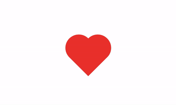
Make a beating heart using CSS: beginner-friendly tutorial
Did Valentines Day slip your mind this year? Youre probably not the only one. You could go the ol procrastinators route and buy your significant other some last-minute chocolate or flowers. Or, you could build them something quick and simple but still makes them think, Dang, Im in love with a thoughtful genius. Enter: a beating heart animation made with CSS.
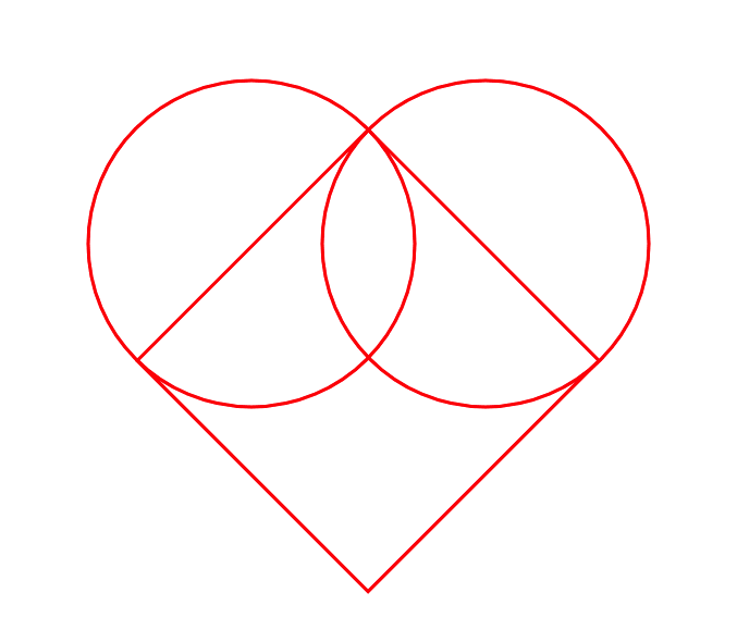
CSS art can be complex and daunting, but the foundation of this easy tutorial is just a couple of shapes: a square and two circles.
We start by creating a div in our HTML. I gave mine a class of heart just to really solidify thats what were making (and what we risk breaking if we dont give our loved ones anything for Valentines).
<div class="heart"></div>Lets make sure this heart is centered on the page. In your CSS, set the body (the container of the heart) to display: flex and center the content inside it using the justify-content and align-items properties.
body { display: flex; justify-content: center; align-items: center; height: 100vh;}Next, lets give the div some color and dimensions. I chose a classic red and set the height and width to 100 pixels each. Regardless of how big you make your heart, the height and width should be equal so you end up with a square. Rotate this square -45 degrees to get the pointed end on the bottom of the heart.
.heart { height: 100px; width: 100px; background-color: red; transform: rotate(-45deg); position: relative;}To create the circles that form the top of the heart, we use the ::before and ::after pseudo-elements to generate two new shapes. Set them to the same height, width, and color as the original element and give them a border-radius of 50% to turn them into circles. Set their position to absolute.
.heart::before, .heart::after { content: ""; height: 100px; width: 100px; background-color: red; border-radius: 50%; position: absolute;}Now that we have these circles, we need to move them into place to create a heart. Bring the .heart::before pseudo-element halfway up from its starting position by offsetting it -50 pixels (or half of however tall your .heart::before is) from the top. Notice that it moves diagonally toward the top left of the screen because of how the original .heart element was rotated -45 degrees. To complete the heart, bring the .heart::after pseudo-element halfway to the right of its starting position by offsetting it 50px from the left.
.heart::before { top: -50px; left: 0px;}.heart::after { left: 50px; top: 0px;}Time for the fun part: let's make this baby beat! We'll use the @keyframes and name the animation heartbeat. Let's transform the heart to grow 1.25x its original size when the animation is 25% through its duration, and then grow even bigger when the animation is 45% of the way through. This change in size should give us that beating effect. Make sure you keep the -45 degrees rotation in your transform property so your heart doesn't tilt during the animation.
@keyframes heartbeat { 0% { transform: scale(1) rotate(-45deg); } 25% { transform: scale(1.25) rotate(-45deg); } 45% { transform: scale(1.5) rotate(-45deg); }} The last thing we need to do now is define the duration and iteration count for our animation. Let's go back to our .heart element and set the animation property to specify our heartbeat animation. Then, let's set the duration to 1 second and give it an infinite loop.
.heart { height: 100px; width: 100px; background-color: red; transform: rotate(-45deg); position: relative; animation: heartbeat 1s infinite;}And there you have it: a CSS heart animation that will beat as infinitely as your love will (hopefully) last. Happy Valentine's Day!
Original Link: https://dev.to/larainnepasion/make-a-beating-heart-using-css-beginner-friendly-tutorial-25ff
Dev To
 An online community for sharing and discovering great ideas, having debates, and making friends
More About this Source Visit Dev To