
An Interest In:
Web News this Week
- April 2, 2024
- April 1, 2024
- March 31, 2024
- March 30, 2024
- March 29, 2024
- March 28, 2024
- March 27, 2024
Some of Our Sources
- BoingBoing
- The Logo Smith
- Spoon Graphics
- Six Revisions
- Web Designer Depot
- 24 Ways
- Specky Boy
- Freelance Switch
- Android Dissected
- Hashedout
Help Webnuz
Referal links:
Creating a Miro-like UI overlay layout using CSS
When creating highly interactive websites like Miro (or Google Maps, Drawio, etc) with a drawing board or some other interactive experience occupying most of the screen developers are challenged with implementing responsive overlays. Such overlays add necessary information and tools to interact with the product.
The most obvious way to implement such an overlay would be to use a combination of absolute or fixed positioning - which could work. But it would involve a lot of magic numbers with positioning and would not be very responsive - adding a new item would involve a lot of changes and perhaps even some JavaScript statements.
But there are other ways to implement an overlay like this without any JavaScript and with as little of absolute positioning as possible.
I will be using codepen.io to prototype this layout. I find this application very useful when discovering different CSS layout implementation options. Find the pen with this tutorial here.
Test bench
First let's create a bench where we may try out different ways of implementing such a layout and test whether our implementation works properly.
Some text and a button should suffice. We should also make sure we can scroll the container both ways.
<div class="wrapper"> <div class="overlay"> </div> <div class="content"> <p> Lorem ipsum dolor sit amet, consectetur adipiscing elit, sed do eiusmod tempor incididunt ut labore et dolore magna aliqua. Ut enim ad minim veniam, quis nostrud exercitation ullamco laboris nisi ut aliquip ex ea commodo consequat. Duis aute irure dolor in reprehenderit in voluptate velit esse cillum dolore eu fugiat nulla pariatur. Excepteur sint occaecat cupidatat non proident, sunt in culpa qui officia deserunt mollit anim id est laborum. </p> <button> I understand </button> </div></div>And add some CSS to make it a little nicer.
* { margin: 0; padding: 0;}.wrapper { position: relative; width: 100%; min-width: 350vw; min-height: 350vh;}.content { max-width: 500px; padding: 20px; margin-top: 150px; margin-left: 500px;}.content > :not(:first-child) { margin-top: 10px;}button { cursor: pointer; padding: 8px; box-shadow: none; border: none; border-radius: 4px; background: #dedede; color: black;}button:hover { box-shadow: 0 0 4px #000;}We will use div.overlay as the container for all our overlays. At the moment it is an empty div - we will fill it with content now.
Implementing the overlay
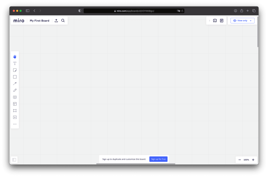
Looking at the overlay of Miro we may imagine the container for all the UI items as a vertical flexbox. Informational messages may be appended at the top and other items would adapt accordingly. Let's make it in a similar way.
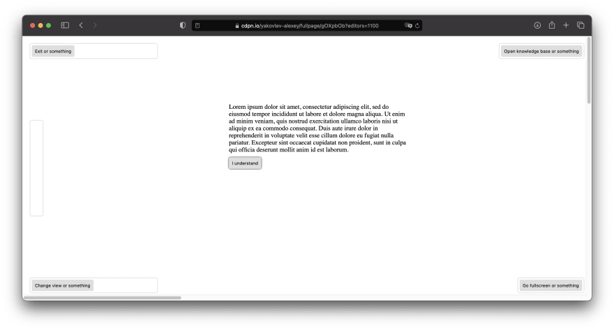
<div class="overlay"> <header class="overlay-row"> <div class="widget" style="width: 320px"> <button> Exit or something </button> </div> <div class="widget"> <button> Open knowledge base or something </button> </div> </header> <div class="overlay-row toolbar-row"> <div class="widget" style="height: 240px; width: 32px"> </div> </div> <footer class="overlay-row"> <div class="widget" style="width: 320px"> <button> Change view or something </button> </div> <div class="widget"> <button> Go fullscreen or something </button> </div> </footer> </div>And some CSS to position everything.
.overlay { position: fixed; top: 0; left: 0; display: flex; flex-flow: column nowrap; width: 100vw; height: 100vh; padding: 20px;}.overlay-row { display: flex; flex-flow: row nowrap; align-items: center; justify-content: space-between; width: 100%;}.widget { display: flex; flex-flow: row nowrap; align-items: center; padding: 4px; background: #fff; border-radius: 4px; box-shadow: 0 0 2px rgba(0, 0, 0, 0.5);}.toolbar-row { flex: 1;}The widget class will serve as the base container for every piece of overlay UI - we may expand it later. UI elements are placed inside rows with specific purposes.

The UI looks fine - it is positioned well and you can click UI buttons. However when it comes to the content it gets worse. We can't interact with the button inside the content and we can't select any text. Obviously the div.overlay we fixed over the div.wrapper blocks us from accessing underlying elements.
To fix this we will use a clever hack. We will move the overlay outside the visible area of the screen using transform. This will clear the underlying elements - we will once again be able to click the content button and select text. Though UI widgets would not be visible. widget class will also recieve a transform property to translate back to the original position.
.overlay { position: fixed; top: 0; left: 0; display: flex; flex-flow: column nowrap; width: 100vw; height: 100vh; padding: 20px; transform: translateX(-100vw);}.widget { display: flex; flex-flow: row nowrap; align-items: center; padding: 4px; background: #fff; border-radius: 4px; box-shadow: 0 0 2px rgba(0, 0, 0, 0.5); transform: translateX(100vw);}You may wonder: why don't we apply
transform: translateX(100vw)tooverlay-rowclass? The answer is simple - rows still would obstruct the user from clicking the content since they also occupy the whole screen with their boxes.
Now we still see the UI widgets where we should see them and can still click the content. Great success!
But what about scrolling?
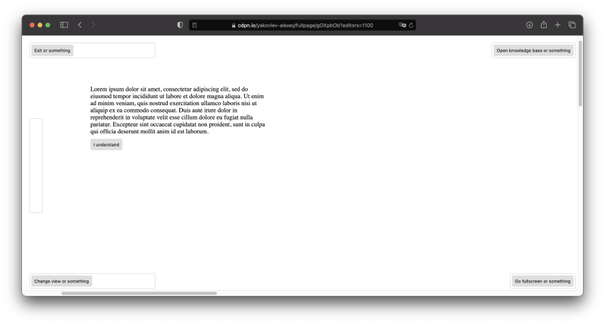
Also works as intended! Turns out it is this simple to develop an overlay like Miro's.
It is important to note however that it would still likely require some JavaScript to collapse some of the widgets or buttons inside them for smaller screens. But this topic is out of scope for this post.
At this point it should be visible that the code for an overlay like this is far simpler and shorter compared to absolutely positioning every widget. But how easy is it to add new elements?
Extending the overlay
Let's imagine our Product Owner approaches us asking to add a banner at the top of the screen with some very useful information that he believes every user should see when entering your application. Being professional developers we discussed everything with them and started implementing this banner.
<div class="overlay"> <div class="banner"> Some very useful information that every user should see clearly </div> <div class="overlay-content"> <header class="overlay-row"> <div class="widget" style="width: 320px"> <button> Exit or something </button> </div> <div class="widget"> <button> Open knowledge base or something </button> </div> </header> <div class="overlay-row toolbar-row"> <div class="widget" style="height: 240px; width: 32px"> </div> </div> <footer class="overlay-row"> <div class="widget" style="width: 320px"> <button> Change view or something </button> </div> <div class="widget"> <button> Go fullscreen or something </button> </div> </footer> </div>.overlay-content { display: flex; flex-flow: column nowrap; flex: 1; padding: 20px;}.banner { padding: 4px 8px; font-size: 18px; background: rgba(66, 98, 255, 1); transform: translateX(100vw); color: white;}As you can see wee added a wrapper for all the widgets so that it is easier to add more outside banners. The layout will automatically adapt accordingly.

It is also extremely easy to hide the banner: just set display property to none and the widgets would snap back to place.

Another advantage you may get with this layout is when you embed it in a container - you may easily change
div.overlayto usestickypositioning. This will allow some external static elements on the page.
Conclusion
Hopefully you found this post interesting and useful. I remind you that the complete tutorial is available here.
This overlay implementation is very different to what you usually find websites using. But it offers very predictable adaptivity using just CSS and with very little magical numbers and unintuitive styles. You may also use grid layouts for even more intricate widget locations.
Perhaps you have something to say about this implementation. Maybe you do not agree with me and have reasons why you think having every widget absolutely positioned is less challenging? Feel free to discuss below.
Original Link: https://dev.to/yakovlev_alexey/creating-a-miro-like-ui-overlay-layout-using-css-aom
Dev To
 An online community for sharing and discovering great ideas, having debates, and making friends
More About this Source Visit Dev To