
An Interest In:
Web News this Week
- April 2, 2024
- April 1, 2024
- March 31, 2024
- March 30, 2024
- March 29, 2024
- March 28, 2024
- March 27, 2024
Some of Our Sources
- Slashdot
- Simplebits
- Abduzeedo
- Naldz Graphics
- CSS Tricks
- Freelance Switch
- Codrops
- Android Headlines
- Willems Lab
- The Verge
Help Webnuz
Referal links:
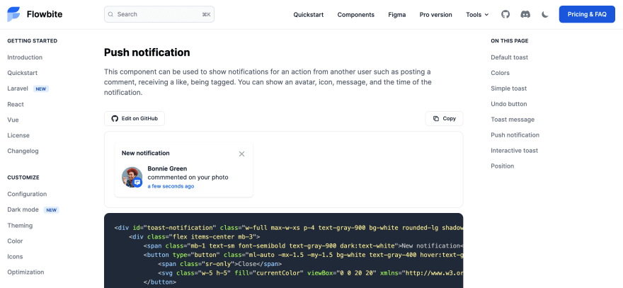
How to build a toast (notification) component with Tailwind CSS and Flowbite
Tailwind CSS is one of the most popular open-source CSS frameworks based on the utility-first approach and it is estimated that this year it will reach more weekly downloads on NPM than Bootstrap.
Flowbite is an open-source component library based on Tailwind CSS featuring dark mode support, a Figma design system, components like buttons, dropdowns, modals, navbars, and more.

In this article I want to show you how you can build a toast/notification component for your Tailwind CSS project using Flowbite.
Let's get started!
Tailwind CSS toast component
First of all, we should set up the semantic HTML5 markup:
<div id="toast-default" role="alert"> <div>Set yourself free.</div></div>Let's now add the close use some stylings for the toast wrapper and the text inside:
<div id="toast-default" class="flex items-center w-full max-w-xs p-4 text-gray-500 bg-white rounded-lg shadow dark:text-gray-400 dark:bg-gray-800" role="alert"> <div class="ml-3 text-sm font-normal">Set yourself free.</div></div>A toast and notification pop-up should always have a close icon. Let's use a SVG X icon:
<div id="toast-default" class="flex items-center w-full max-w-xs p-4 text-gray-500 bg-white rounded-lg shadow dark:text-gray-400 dark:bg-gray-800" role="alert"> <div class="ml-3 text-sm font-normal">Set yourself free.</div> <button type="button" class="ml-auto -mx-1.5 -my-1.5 bg-white text-gray-400 hover:text-gray-900 rounded-lg focus:ring-2 focus:ring-gray-300 p-1.5 hover:bg-gray-100 inline-flex h-8 w-8 dark:text-gray-500 dark:hover:text-white dark:bg-gray-800 dark:hover:bg-gray-700" aria-label="Close"> <span class="sr-only">Close</span> <svg class="w-5 h-5" fill="currentColor" viewBox="0 0 20 20" xmlns="http://www.w3.org/2000/svg"><path fill-rule="evenodd" d="M4.293 4.293a1 1 0 011.414 0L10 8.586l4.293-4.293a1 1 0 111.414 1.414L11.414 10l4.293 4.293a1 1 0 01-1.414 1.414L10 11.414l-4.293 4.293a1 1 0 01-1.414-1.414L8.586 10 4.293 5.707a1 1 0 010-1.414z" clip-rule="evenodd"></path></svg> </button></div>Let's also add a descriptive icon before the text:
<div id="toast-default" class="flex items-center w-full max-w-xs p-4 text-gray-500 bg-white rounded-lg shadow dark:text-gray-400 dark:bg-gray-800" role="alert"> <div class="inline-flex items-center justify-center flex-shrink-0 w-8 h-8 text-blue-500 bg-blue-100 rounded-lg dark:bg-blue-800 dark:text-blue-200"> <svg class="w-5 h-5" fill="currentColor" viewBox="0 0 20 20" xmlns="http://www.w3.org/2000/svg"><path fill-rule="evenodd" d="M12.395 2.553a1 1 0 00-1.45-.385c-.345.23-.614.558-.822.88-.214.33-.403.713-.57 1.116-.334.804-.614 1.768-.84 2.734a31.365 31.365 0 00-.613 3.58 2.64 2.64 0 01-.945-1.067c-.328-.68-.398-1.534-.398-2.654A1 1 0 005.05 6.05 6.981 6.981 0 003 11a7 7 0 1011.95-4.95c-.592-.591-.98-.985-1.348-1.467-.363-.476-.724-1.063-1.207-2.03zM12.12 15.12A3 3 0 017 13s.879.5 2.5.5c0-1 .5-4 1.25-4.5.5 1 .786 1.293 1.371 1.879A2.99 2.99 0 0113 13a2.99 2.99 0 01-.879 2.121z" clip-rule="evenodd"></path></svg> </div> <div class="ml-3 text-sm font-normal">Set yourself free.</div> <button type="button" class="ml-auto -mx-1.5 -my-1.5 bg-white text-gray-400 hover:text-gray-900 rounded-lg focus:ring-2 focus:ring-gray-300 p-1.5 hover:bg-gray-100 inline-flex h-8 w-8 dark:text-gray-500 dark:hover:text-white dark:bg-gray-800 dark:hover:bg-gray-700" aria-label="Close"> <span class="sr-only">Close</span> <svg class="w-5 h-5" fill="currentColor" viewBox="0 0 20 20" xmlns="http://www.w3.org/2000/svg"><path fill-rule="evenodd" d="M4.293 4.293a1 1 0 011.414 0L10 8.586l4.293-4.293a1 1 0 111.414 1.414L11.414 10l4.293 4.293a1 1 0 01-1.414 1.414L10 11.414l-4.293 4.293a1 1 0 01-1.414-1.414L8.586 10 4.293 5.707a1 1 0 010-1.414z" clip-rule="evenodd"></path></svg> </button></div>If you want to make add the feature of the close icon to actually hide the toast component, I recommend you to install Flowbite as a plugin inside your Tailwind CSS project and also include the JS script.
Make sure that you have Node.js and Tailwind CSS installed.
- Install Flowbite as a dependency using NPM by running the following command:
npm i @themesberg/flowbite- Require Flowbite as a plugin inside the
tailwind.config.jsfile:
module.exports = { plugins: [ require('@themesberg/flowbite/plugin') ]}- Include the main JavaScript file to make interactive elements work:
<script src="../path/to/@themesberg/flowbite/dist/flowbite.bundle.js"></script>- Additionally to your own
contentdata you should add@themesberg/flowbiteto apply the classes from the interactive elements in thetailwind.config.jsfile:
module.exports = { content: [ "./node_modules/@themesberg/flowbite/**/*.js" ]}Now add the data-collapse-toggle="toast-default" data attribute to close the toast component:
<div id="toast-default" class="flex items-center w-full max-w-xs p-4 text-gray-500 bg-white rounded-lg shadow dark:text-gray-400 dark:bg-gray-800" role="alert"> <div class="inline-flex items-center justify-center flex-shrink-0 w-8 h-8 text-blue-500 bg-blue-100 rounded-lg dark:bg-blue-800 dark:text-blue-200"> <svg class="w-5 h-5" fill="currentColor" viewBox="0 0 20 20" xmlns="http://www.w3.org/2000/svg"><path fill-rule="evenodd" d="M12.395 2.553a1 1 0 00-1.45-.385c-.345.23-.614.558-.822.88-.214.33-.403.713-.57 1.116-.334.804-.614 1.768-.84 2.734a31.365 31.365 0 00-.613 3.58 2.64 2.64 0 01-.945-1.067c-.328-.68-.398-1.534-.398-2.654A1 1 0 005.05 6.05 6.981 6.981 0 003 11a7 7 0 1011.95-4.95c-.592-.591-.98-.985-1.348-1.467-.363-.476-.724-1.063-1.207-2.03zM12.12 15.12A3 3 0 017 13s.879.5 2.5.5c0-1 .5-4 1.25-4.5.5 1 .786 1.293 1.371 1.879A2.99 2.99 0 0113 13a2.99 2.99 0 01-.879 2.121z" clip-rule="evenodd"></path></svg> </div> <div class="ml-3 text-sm font-normal">Set yourself free.</div> <button type="button" class="ml-auto -mx-1.5 -my-1.5 bg-white text-gray-400 hover:text-gray-900 rounded-lg focus:ring-2 focus:ring-gray-300 p-1.5 hover:bg-gray-100 inline-flex h-8 w-8 dark:text-gray-500 dark:hover:text-white dark:bg-gray-800 dark:hover:bg-gray-700" data-collapse-toggle="toast-default" aria-label="Close"> <span class="sr-only">Close</span> <svg class="w-5 h-5" fill="currentColor" viewBox="0 0 20 20" xmlns="http://www.w3.org/2000/svg"><path fill-rule="evenodd" d="M4.293 4.293a1 1 0 011.414 0L10 8.586l4.293-4.293a1 1 0 111.414 1.414L11.414 10l4.293 4.293a1 1 0 01-1.414 1.414L10 11.414l-4.293 4.293a1 1 0 01-1.414-1.414L8.586 10 4.293 5.707a1 1 0 010-1.414z" clip-rule="evenodd"></path></svg> </button></div>Dark mode
If you noticed I also showed you how to add the dark:x variant classes for dark mode. Check out this Tailwind CSS dark mode tutorial to learn how to set up a dark mode switcher with Flowbite and Tailwind CSS.

Flowbite - Tailwind CSS components
This toast component built with Tailwind is part of a larger and open source component library called Flowbite.
You can check out the following links to view more toast component styles, sizes, and variations and also other components like buttons, modals, navbars, and more.
Tailwind CSS toast component
Flowbite - Tailwind CSS components
Original Link: https://dev.to/themesberg/how-to-build-a-toast-notification-component-with-tailwind-css-and-flowbite-47nb
Dev To
 An online community for sharing and discovering great ideas, having debates, and making friends
More About this Source Visit Dev To