
An Interest In:
Web News this Week
- April 23, 2024
- April 22, 2024
- April 21, 2024
- April 20, 2024
- April 19, 2024
- April 18, 2024
- April 17, 2024
Some of Our Sources
- BoingBoing
- Team Treehouse
- The Logo Smith
- Six Revisions
- Abduzeedo
- Vandelay Design
- Fuel Your Creativity
- 24 Ways
- Codrops
- Daily Now
Help Webnuz
Referal links:
Learn TailwindCSS: Make A Profile Card
Tailwind is a CSS framework that lets you build amazing responsive UI with less effort.
If you're learning TailwindCSS, this blog can help you to build concepts stronger by creating a mini profile card with a button in less than 5 minutes.
First you need to install Tailwind in your project. Now there are 3 ways as given below. Visit the one you prefer. As this is a simple card, I'll just use CDN:
We're using CDN for this project. So add this
linkinside the<head>tag:
<link href="https://unpkg.com/tailwindcss@^1.0/dist/tailwind.min.css" rel="stylesheet">If you're using React, I have a step-by-step blog on it already.
Read it here: How to setup TailwindCSS in your React App
- Now we're ready to use Tailwind. Let's start by defining the basic structure first:
- To use the image used in this project, copy this link
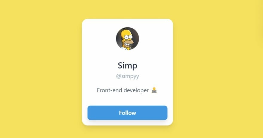
<!-- main - parent div --> <div class="main"> <!--card--> <div class="card"> <!--profile-image--> <div class="image"> <img src="#" alt="profile"> </div> <!--name--> <div class="name"> <p>Simp</p> </div> <!--username--> <div class="username"> <p>@simpyy</p> </div> <!--work--> <div class="work"> <p>Front-end developer </p> </div> <!-- follow button --> <div> <button>Follow</button> </div> </div> </div>Here's what you see right now.

Pretty boring right?
Let's make it interesting by adding classes that Tailwind provides us:
We'll start from top to bottom to avoid confusions. But first I'll pick up the div having a class "card":
CARD SECTION
<div class="card bg-white flex flex-col items-center justify-center p-4 shadow-lg rounded-2xl w-64">bg-white: sets the white background to thedivflex items-center justify-center: works just as we centre a div using CSS flexbox model.flex:sets display to flexitems-center:align-items: center;in CSSjustify-center:justify-content: center;in CSS
p-4:sets a padding of 1rem- check all possible values here
shadow-lg:sets shadow to the div- possible values:
sm | md | lg | xl | 2xl | inner
- possible values:

rounded-2xl:sets border radius to the elementmd | lg | full | xl | 2xlw-64:We want our card to be of a fixed width so setting it accordingly.- Experiment with
w-{number}and explore more
Result:
Our card has started getting shape, so let's center it and start designing!
PARENT (TOPMOST) DIV
- To center the
carddiv, I'd take the parent divmainand set CSS grid to it:
<!-- parent div --><div class="main bg-yellow-400 grid place-items-center h-screen">bg-yellow-400:set the yellow background color.bg: backgroundyellow: color | try more colors available here400: shades | ranges from 50-900
grid h-screen place-items-center:To centre the card divgrid:sets display to gridplace-items-center- works like
place-items: center;in css
- works like
h-screen:sets full viewport height (full width as screen)
Result:
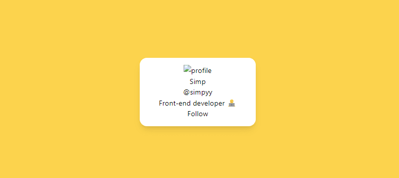
Now the card looks much better and visible.
PROFILE PICTURE DIV
<div class="profile mx-auto rounded-full py-2 w-16 "> <img src="/simp.jpg" alt="profile"></div>- To use the image used in this project, copy this link
mx-auto:sets equal margins to both (left and right) sides, so centres the imagerounded-full:gives the circular shape- works just like
border-radius: 50%
- works just like
py-2:setspadding-topandpadding-bottomvalues to 0.5rem bothw-16:sets image width- sizes the image according to the card (experiment with the values)
Result:
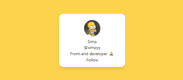
NAME DIV
<div class="name text-gray-800 text-2xl font-medium mt-4 "> <p>Simp</p></div>text-gray-800:sets thefont-colorproperty to greyish blacktext-2xl:increases the font size- possible values:
sm | base | lg | xl | 2xl ...
- possible values:
font-medium:sets thefont-weightpropertylight | normal | medium | semibold | bold
mt-4:setsmargin-top
USERNAME DIV
<div class="username text-gray-500"> <p>@simpyy</p></div>text-gray-500:sets the font color to light gray.
WORK DIV
<div class="work text-gray-700 mt-4"> <p>Front-end developer </p></div>text-gray-700:changes the font color to gray.mt-4:setsmargin-top

Now almost everything is done. Let's do the final work of designing the Follow Button.
FOLLOW BUTTON
<div class="w-full mt-8"> <button class="bg-blue-500 py-2 px-4 hover:bg-blue-600 text-white w-full font-semibold rounded-lg shadow-lg"> Follow </button></div>div:
w-fullsets the full width (according to the parent div) so covers the card properly.mt-8:setsmargin-top
button:
bg-blue-500:sets the blue color- explore all the possible colors here
py-2andpx-4: setspadding-bottomandpadding-top, respectivelytext-white:sets thefont-colorto whitehover:bg-blue-600: sets the CSS hover properties, in this case we've simply increased the shade from500 to 600to give it a realistic look.

Congratulations! Your follow card is completed now.
My motive for this post was to make you understand how to add Tailwind classes to a project. I hope I was able to complete this job.
Thanks for reading!
I share content related to web development and technical writing on Twitter daily.
Would love to connect!
Original Link: https://dev.to/shreya/learn-tailwindcss-make-a-profile-card-597d
Dev To
 An online community for sharing and discovering great ideas, having debates, and making friends
More About this Source Visit Dev To