
An Interest In:
Web News this Week
- March 28, 2024
- March 27, 2024
- March 26, 2024
- March 25, 2024
- March 24, 2024
- March 23, 2024
- March 22, 2024
Some of Our Sources
- Slashdot
- Mashable
- Web Designer Wall
- Team Treehouse
- Smashing Magazine
- Six Revisions
- You The Designer
- Naldz Graphics
- FanExtra - PSD
- CSS Tricks
Help Webnuz
Referal links:
How to make full stack social media website using HTML, CSS and JS | Part 01
Hello, In today's article we'll learn to create a social media website basically an Instagram clone. I'll make it full stack from front end to backend. This is the first part of it. And in this part, we'll learn to create Home Page, Post page and user profile page.
All the pages are amazing, but not responsive, well we'll make them responsive in next article.
So without wasting more time let's start.
Video Tutorial
You can watch the video tutorial for demo & step by step guide.
If you do like the tutorial make sure you subscribe my channel. It will really motivate me
Code
Let's start, So first let's see what files and folders we have in our project.

Well we have a CSS folder for styles and JS folder for scripts. And also you can download the images here. If you want to get its source code. Click Here.
Home page.
Let's begin with our home page. In home page we have 3 main elements. A navbar, a post section and a suggestion section. So, let's, make them step by step.
Navbar
First, write basic HTML5 Template inside index.html file and link style.css file to it. Also I am using GOOGLE POPPINS FONTS. So, if you want to use it make sure you link it.
Okay, once you are done with linking all style files and fonts. Let's move on to our navbar. For navbar make a nav element inside body and make the below elements.
Index.html
<!-- navbar --><nav class="navbar"> <img src="img/logo.png" class="logo" alt=""> <form class="search-box"> <input type="text" placeholder="search" name="search-query" id="search-input"> <button class="search-btn" type="submit"><img src="img/icon/search.png" class="search-icon" alt=""></button> </form> <div class="nav-links"> <a href="#" class="nav-links"><img src="img/icon/home-fill.png" class="nav-icon" alt=""></a> <div class="activity-log"> <img src="img/icon/heart-nofill.png" class="nav-icon" alt=""> <div class="activity-container hide"> <div class="activity-card"> <img src="img/user1.png" class="user-img" alt=""> <p class="activity"><b>@siri</b> liked your post</p> <img src="img/posts/post1.png" class="activity-post" alt=""> </div> <div class="activity-card"> <img src="img/user2.png" class="user-img" alt=""> <p class="activity"><b>@siri</b> liked your post</p> <img src="img/posts/post1.png" class="activity-post" alt=""> </div> <div class="activity-card"> <img src="img/user1.png" class="user-img" alt=""> <p class="activity"><b>@siri</b> liked your post</p> <img src="img/posts/post1.png" class="activity-post" alt=""> </div> <div class="activity-card"> <img src="img/user3.png" class="user-img" alt=""> <p class="activity"><b>@siri</b> liked your post</p> <img src="img/posts/post1.png" class="activity-post" alt=""> </div> </div> </div> <a href="#" class="nav-links"><img src="img/icon/add-nofill.png" class="nav-icon" alt=""></a> <a href="#" class="nav-links"><img src="img/profile-img.png" class="nav-icon user-profile" alt=""></a> </div></nav>Well the above HTML code is a lot. Isn't it, if you do understand it well you are amazing, but if don't get it, I suggest you watch the video tutorial, there you'll make the navbar and all the elements step by step. Anyway, let's add some CSS to it.
Style.css
*{ margin: 0; padding: 0; box-sizing: border-box;}body{ width: 100%; position: relative; font-family: 'poppins', sans-serif; background: #fafafa;}.navbar{ width: 100%; height: 60px; position: fixed; top: 0; left: 0; z-index: 9; background: #fff; border-bottom: 1px solid #999; padding: 10px 5vw; display: flex; align-items: center; justify-content: space-between;}.logo{ height: 30px;}.search-box{ width: 300px; height: 40px; display: flex;}#search-input{ width: 260px; height: 100%; background: #fafafa; border: 1px solid #999; padding: 10px; text-transform: capitalize;}.search-btn{ background: #fff; cursor: pointer; border: 1px solid #999; border-left: none; padding: 10px;}.search-icon{ width: 20px; height: 20px;}.nav-links{ display: flex; align-items: center; gap: 30px;}.nav-icon{ width: 25px; height: 25px; cursor: pointer;}.user-profile{ width: 30px; height: 30px; border-radius: 50%;}.activity-log{ position: relative; height: 25px;}.activity-container{ width: 350px; height: auto; max-height: 300px; position: absolute; top: 200%; right: 0; background: #fff; border: 1px solid #999;}.activity-card{ width: 100%; display: flex; justify-content: space-between; align-items: center; padding: 10px; padding-bottom: 0; margin-bottom: 10px; cursor: pointer;}.activity-card:hover{ background: #fafafa;}.activity-container.hide{ pointer-events: none; opacity: 0;}.user-img{ width: 50px; height: 50px; border-radius: 50%;}.activity{ width: 200px; font-size: 1rem;}.activity-post{ width: 50px; height: 50px; object-fit: cover;}Output
Well its looking amazing, If you notice our nav HTML, you'll see activity-log element. This element we'll use to make an activity pop up. Well in CSS part we are done styling that activity popup, so we just need to add JS to make it work.
post.js
Make sure you link post.js file to index.html using <script src="path">. Once you are done with that let's write JS.
let heartIcon = document.querySelector('.activity-log .nav-icon')let activityContainer = document.querySelector('.activity-container')heartIcon.addEventListener('click', () => { activityContainer.classList.toggle('hide'); changeIcon(heartIcon);})const changeIcon = (icon) => { let src = icon.src.split('-')[0]; if(icon.src.includes('nofill')){ icon.src = `${src}-fill.png`; } else{ icon.src = `${src}-nofill.png`; }}In the above code, I am first selecting the heartIcon which is our heart icon. And then I am selecting activityContainer which it the activity box using querySelector. And then I am adding click event to heartIcon using addEventListener inside it I am just toggling the class of activityContainer using classlist.toggle and the calling a changeIcon function.
Well changeIcon function we made to change the icon image from fill to nofill to fill. The code is simple, but if you don't get it let me know in the discussion.
After this if I click on the heart icon, on the navbar I should see the activity popup.
Output
--- On Click ---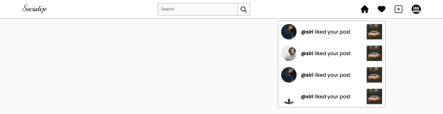
Posts
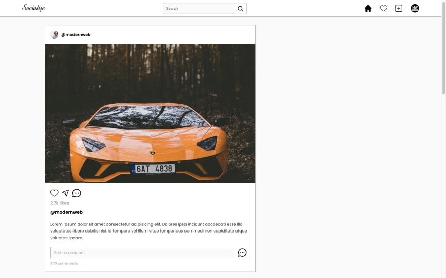
So we are done with our navbar, and after that we have posts, in our home page
Let's create posts now, for that you can code the below HTML code after nav element.
Index.html
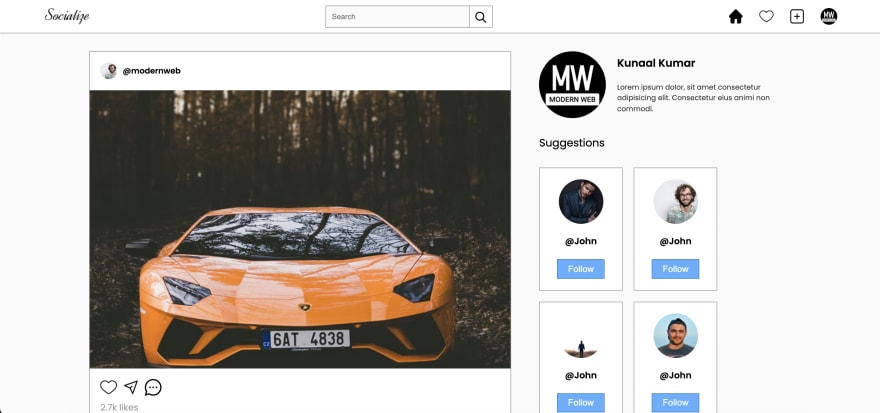
<!-- main section --><section class="main"> <!-- post section --> <div class="post-container"> <div class="post"> <div class="post-header"> <img src="img/user2.png" class="user-icon" alt=""> <p class="username">@modernweb</p> </div> <div class="post-feed"> <div class="post-overlays"> <img src="img/icon/red-heart.png" class="like-icon" alt=""> <div class="share-window"> <h1 class="title">share the post with others</h1> <div class="share-link-container"> <input type="text" id="share-link" value="https://www.socialize.com/post/234234234234" disabled> <button class="copy-btn">copy</button> </div> </div> </div> <div class="post-img-container"> <img src="img/posts/post1.png" alt=""> <img src="img/posts/post2.png" alt=""> <img src="img/posts/post3.png" alt=""> <img src="img/posts/post4.png" alt=""> <img src="img/posts/post5.png" alt=""> </div> </div> <div class="post-detail"> <div class="detail-intracables"> <img src="img/icon/heart-nofill.png" class="like-btn" alt=""> <img src="img/icon/send-nofill.png" class="send-btn" alt=""> <img src="img/icon/comment-nofill.png" class="comment-btn" alt=""> </div> <span class="likes">2.7k likes</span> <p class="username">@modernweb</p> <p class="post-des">Lorem ipsum dolor sit amet consectetur adipisicing elit. Dolores ipsa incidunt obcaecati esse illo voluptates libero debitis nisi. Id tempora vel illum vitae temporibus commodi non cupiditate atque voluptas. Ipsam.</p> <div class="comment-box"> <input type="text" id="comment-input" placeholder="Add a comment"> <button class="add-comment-btn"><img src="img/icon/comment-nofill.png" alt=""></button> </div> <span class="comment-count">300 comments</span> </div> </div> +2 more posts </div></section>To be honest, in our home page the most difficult thing is the post itself, I almost lost in code like twice, when coding the post section. I will recommend you to watch the tutorial if you really want to learn something from it. Okay moving on, let's style it.
Style.css
/* main section */.main{ width: 100%; position: relative; margin-top: 100px; display: flex; padding: 0 10vw 100px; gap: 50px;}/* post section */.post-container{ width: 60%;}.post{ width: 100%; border: 1px solid #999; background: #fff; margin-bottom: 30px;}.post-header{ display: flex; align-items: center; padding: 1.2rem; gap: 10px;}.post-header .user-icon{ width: 30px; height: 30px; border-radius: 50%;}.post-header .username{ font-size: .9rem; font-weight: 600;}.post-feed{ width: 100%; height: 500px; position: relative;}.post-img-container{ width: 100%; height: 100%; display: flex; overflow: hidden;}.post-img-container img{ min-width: 100%; height: 100%; object-fit: cover; transition: .5s;}.post-detail{ padding: 1.2rem;}.detail-intracables{ display: flex; gap: 10px;}.detail-intracables img{ width: 30px; height: 30px; cursor: pointer;}.likes{ color: #a0a0a0; display: flex; margin: 10px 0;}.post .username{ font-weight: 600;}.post-des{ margin: 20px 0; font-size: .9rem; line-height: 1.5rem; opacity: 0.7;}.comment-box{ width: 100%; height: 42px; display: flex; border: 1px solid #999;}#comment-input{ width: 100%; height: 40px; background: #fafafa; border: none; padding: 10px; line-height: 40px; z-index: 2; font-size: 1rem;}#comment-input::placeholder{ color: #bbb;}#comment-input:focus{ outline: 1px solid #2f2f2f;}.add-comment-btn{ display: flex; justify-content: center; align-items: center; width: 60px; height: 40px; cursor: pointer; border: none; outline: none; background: #fff;}.add-comment-btn img{ width: 30px; height: 30px;}.comment-count{ font-weight: 600; color: #a0a0a0; font-size: .8rem; display: flex; margin-top: 10px; opacity: 0.7;}.post-overlays{ position: absolute; width: 100%; height: 100%; display: flex; justify-content: center; align-items: center; pointer-events: none;}.like-icon{ width: 200px; opacity: 0; transition: .5s;}.like-icon.show{ opacity: 1; animation: popup 2s forwards 1;}@keyframes popup{ 0%{ transform: scale(0); } 20%{ transform: scale(1.1); } 80%{ transform: scale(.9); } 90%{ transform: scale(.95); } 100%{ transform: scale(1); }}.share-window{ position: absolute; top: 50%; left: 50%; transform: translate(-50%, -50%); background: #fff; padding: 20px; width: 70%; transition: .5s; opacity: 0;}.share-window.active{ opacity: 1; pointer-events: all;}.share-window .title{ font-size: 1rem; font-weight: 500; text-transform: capitalize; margin-bottom: 20px;}.share-link-container{ width: 100%; display: flex; border: 1px solid #999;}#share-link{ height: 40px; padding: 10px; background: #fafafa; border: none; color: #999; width: 100%;}.copy-btn{ background: #80c2ff88; border: none; outline: none; cursor: pointer; color: #80c2ff; text-transform: capitalize; width: 100px;}Output
Now if you see the HTML code, we have post-overlay element. This element is for like and share window elements. We already styled those elements in CSS we just have to add JS now.
Post.js
const addInterationsToPost = (post) => { // post like let likeBtn = post.querySelector('.like-btn'); let likeImg = post.querySelector('.like-icon'); likeBtn.addEventListener('click', () => { if(likeBtn.src.includes('nofill')){ likeImg.classList.add('show'); if(shareBtn.src.includes('-fill')){ shareBtn.click(); } } changeIcon(likeBtn); setTimeout(() => { likeImg.classList.remove('show'); }, 3000); }) // post share let shareBtn = post.querySelector('.send-btn'); let shareWindow = post.querySelector('.share-window'); shareBtn.addEventListener('click', () => { shareWindow.classList.toggle('active'); changeIcon(shareBtn) }) let postLink = post.querySelector('#share-link').value; let copyLinkBtn = post.querySelector('.copy-btn'); copyLinkBtn.addEventListener('click', () => { navigator.clipboard.writeText(postLink).then(() => { shareBtn.click(); }) })}// postlet posts = [...document.querySelectorAll('.post')];posts.map(post => addInterationsToPost(post));The above code is pretty easy, we just selecting each post card, and passing it to the addInteractionToPost function. Inside that function, we are adding click event to like and share button. And inside the click events just toggling the desired classes of specific elements.
Output
-- Clicked on like button --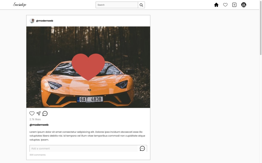
-- Clicked on share button --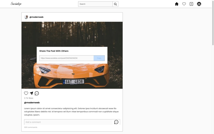
That was a lot .
Suggestion
Now, its time for the last section of our HOME PAGE. Yeah right let's make user suggestions section.
Make to code this inside main section after post-container element.
Index.html
<!-- right section --><div class="user-about-section"> <div class="user-info"> <img src="img/profile-img.png" class="user-dp" alt=""> <div class="info-container"> <h1 class="name">Kunaal Kumar</h1> <p>Lorem ipsum dolor, sit amet consectetur adipisicing elit. Consectetur eius animi non commodi.</p> </div> </div> <h1 class="suggestion-heading">suggestions</h1> <div class="suggestion-container"> <div class="user-card"> <img src="img/user1.png" class="user-dp" alt=""> <p class="username">@john</p> <button class="follow-btn">follow</button> </div> +5 more user cards </div></div>Okay, se let's style it and finish the home page.
Style.css
/* right section */.user-about-section{ width: 40%; height: 100%; position: relative;}.user-info{ width: 100%; display: flex; align-items: center; gap: 20px;}.user-dp{ width: 120px; height: 120px; border-radius: 50%;}.name{ font-size: 1.2rem; font-weight: 600; margin-bottom: 20px;}.info-container p{ font-size: .8rem; line-height: 1.2rem; opacity: 0.8;}.suggestion-heading{ font-weight: 400; font-size: 1.2rem; margin: 30px 0; text-transform: capitalize;}.suggestion-container{ width: 100%; display: flex; flex-wrap: wrap; gap: 20px;}.user-card{ min-width: 150px; background: #fff; padding: 20px; border: 1px solid #999;}.user-card .user-dp{ width: 80px; height: 80px; display: block; margin: auto;}.user-card .username{ text-align: center; font-size: 1rem; font-weight: 600; margin: 20px 0; text-transform: capitalize;}.follow-btn{ display: block; margin: auto; width: 80%; height: 35px; background: #59afff; color: #fff; font-size: 1rem; text-transform: capitalize; border: 1px solid #3086d6; cursor: pointer;}Output
So I guess that was a lot for today guys, to I am wrapping this here. We are done with our Home page, but if you wist to create post page and user profile page, you can checkout the video tutorial. Also if you want you can get its source from here.
Great work! If you stuck somewhere or you have any doubt, feel free to ask me in discussions. Also, if you don't want to miss this Full Stack Social Media Website make sure to subscribe my channel right now. I am also making a Full stack Ecom Website

I really appreciate if you can subscribe my youtube channel. I create awesome web contents.
Articles you may find Useful
Buy me a coffee
Your donation really motivates me to do more amazing
Thanks for watching.
Original Link: https://dev.to/kunaal438/how-to-make-full-stack-social-media-website-using-html-css-and-js-part-01-46f1
Dev To
 An online community for sharing and discovering great ideas, having debates, and making friends
More About this Source Visit Dev To