
An Interest In:
Web News this Week
- April 2, 2024
- April 1, 2024
- March 31, 2024
- March 30, 2024
- March 29, 2024
- March 28, 2024
- March 27, 2024
Some of Our Sources
- BoingBoing
- TutsPlus - Code
- Smashing Apps
- You The Designer
- Creative Curio
- Reencoded
- Wal You
- Android Dissected
- Codrops
- Willems Lab
Help Webnuz
Referal links:
50 lines of JavaScript: animated source code statistics with Vizzu
In this article I visualize the source code statistics of the open-source project which I am a developer of: Vizzu. Since it happens to be a data visualization library, I will use it to show metrics about the project itself.
Software is a visual affair
We like to talk about programming with my friends. The software developer members of the group usually mention how they visually perceive the code they are working on. This visual representation is different for everyone, once I tried to describe mine to others with moderate success.
Some have gone further in resolving this issue than a friendly conversation, like PayodPanda. It is worth checking out their thesis on the subject:
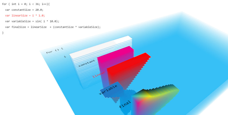
multidimensional visualizations of programming constructs by PayodPanda
This example graphically illustrates the essential components of software like variables, loops, and functions and describes algorithms. But the large-scale structures remain hidden, and we need to use other tools to explore those.
An exciting option is Richard Wettel's CodeCity project, which depicts the source code and its metrics in the form of a 3D city:

CodeCity integrated software analysis environment
The buildings here represent the classes, districts are libraries, and the other properties - color, height, and floor space - are based on CodeCrawler's language-independent software metrics.
For a programmer, the above figure is very informative, and it could have come in very handy when I needed to discover software source code as a new employee at a company. However, this has not happened to me yet. Creating visualizations with such detail takes a lot of work, and keeping them up-to-date takes even more.
If we don't need this level of detail, we can use the source code as the basis of the visualization. For example, we can make a spreadsheet listing the files and the line count, the language (based on the extensions), and the folder structure. We can easily create this low-end database and keep it up-to-date, and we just need a generic visualization tool for the next step.
Data collection and overview
I use VSCode for my daily work, so I wanted to solve the data collection problem within this ecosystem. I found an extension called VSCode Counter, that seemed perfectly suitable for the job. Its output contained all the necessary information and I was able to produce it with a single click. The result is an easily processable csv file with the full path and the extracted information of the source file.
After arranging the directory names, file names, and the number of lines into a table, we get something like this:

Lines count and folder structure of the source code
The most important difference between the raw data table and this one above is the directory structure description. Since we want to examine the hierarchy of directories, we broke the full paths into parts so they can be used for grouping within the visualization. I used Google Spreadsheet for this task. After importing the data, I broke the directory names into columns with the SPLIT function. Next, I conditionally reassembled the path fragments based on their place in the hierarchy.
After having the information in this form, we can look for correlations by creating simple charts with the popular spreadsheet app. Let's see how it supports us in doing so.
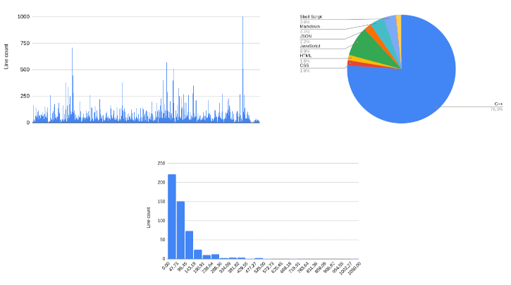
Charts from spreadsheet application
These are fine for a first attempt; the picture is much clearer. The first chart shows all the files and their sizes. There are no unusually large items, with a few exceptions, which we'll look at later. The histogram shows the healthy distribution of the source files with a tiny question: why does the source contain so many small files? The answer is on the pie chart: This is mainly a C++ project, and as such, it has many of the declarations in header files. But then, why is there a significant JavaScript part in the source? For that answer, we need to dig a little deeper.
Lets try a new approach
For further analysis, we have to rearrange the table. We could use the spreadsheet applications, but many pivot tables would be needed, which can become very inconvenient very soon. At this point, its better to choose a professional data visualization tool or select a library and write a few lines of code. Solving our task with Jupyter or Tableau is alright, but their usage is atypical among developers. For us, coding comes much more naturally.

Animated, open source charting library: Vizzu
I chose the Vizzu library because it describes all chart types with a uniform description. I like that. And its open source. With Vizzu, I didn't have to know the parameters and settings of a bar chart, pie chart, or treemap. Instead, I can just construct them by changing generic settings.
The theory in the background sounds simple: the charts are made of different markers. The markers have six visual parameters that the data series can control: the channels. The following channels are available: x (horizontal position), y (vertical position), color, size, lightness, and the label of the markers. One continuous and any number of discrete data series can be attached to these channels. Selecting the shape of the markers and the applied coordinate system gives access to a universe of different charts. In the late 90s, Leland Wilkinson built charts with a similar logic described in his book The Grammar of Graphics.
Taking the first steps with Vizzu
I converted the table into a js file and put it into a git repository to start playing with the visualization in JSFiddle.
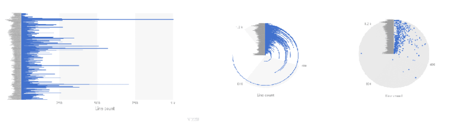
To get acquainted with this generic logic, lets try to recreate one of the charts from above using Vizzu. What will be the result if I attach the 'Line count' to the 'x channel, and put the 'File names' on the 'y' channel? The answer is easy: rectangular markers for each file are distributed along the y-axis, and their width along the x-axis will represent the line count of each file. Bingo, this is the bar chart of the source code line count.
import Vizzu from '...';import { data } from '...';let chart = new Vizzu('myVizzu');chart.initializing.then(chart => chart.animate({ data: data, config: { channels: { y: 'Line count', x: 'File name' } }}));...channels: { x: 'Line count', y: 'File name' },coordSystem: 'polar'......channels: { x: 'Line count', y: 'File name' },coordSystem: 'polar',geometry: 'circle'...The last example looks hardly understandable, but it has been our choice. The library doesn' make corrections on settings, just displays the chart with the given method.
First steps with Vizzu
Next, lets recreate the pie chart showing the line count of the different languages. To achieve this, we will need a marker for each language with the summarised line count. The following line performs this job:channels: { x: ['Line count', 'Language'], color: 'Language', }
This example shows that channels can hold more than one data series. The first can be continuous, all the others must hold discrete values. We are nearly there now, just need to change the coordinate system to polar and our pie chart is ready.

And yet it even moves
The uniform description of charts in Vizzu has an interesting consequence: it allows the interpolation of two graphs since only their parameters differ from one another. In other words: it allows the creation of animated charts. The animation creates a strong link between the charts for the viewer, enables storytelling and a deeper understanding of the data.
Lets try and create an animated series of charts that give the same insight that the three, distinct, static charts provided in the beginning. This requires a specific approach where each transition has to be easily followed by the viewer. Sounds complex but as youll see its quite easy if you change the chart settings one-by-one.
Heres an outline - or as were building an animation, a storyboard - of what I want to
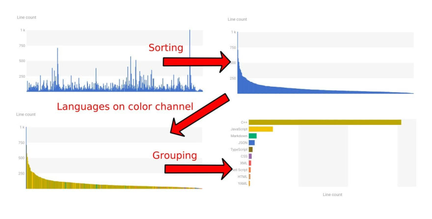
Storyboard of animated chart
The first chart still shows the number of rows in the files. Then we sort them so we get to the histogram but with a much finer resolution then originally. So far so good, the animation can be followed easily. Next I just add the languages to the color channel and I don't think there's a problem with that either especially since the legend automatically appears. Tracking the last step seems to be the most difficult, maybe I could have inserted some interim steps so that its easier for the viewer to follow along. Still, the end result is pretty clear, especially when I add the Line count to the label channel. And I achieved all this with just 50 lines of code!
Here is the result:

I think this is a surprisingly good solution. During the animation, you can track exactly what languages the individual files belong to and how many lines are in those languages overall.
At this point, we have the data from our source code and we have a tool to browse them efficiently. Plus, as a bonus, weve got animations that allow us to connect the charts while keeping the context. But what about displaying the folder structure? How can we dig deeper, as I mentioned earlier? I will answer the questions in my next post. I enjoyed working with Vizzu and it has changed my understanding about chart drawing. Feel free to fiddle with the code snippets and hope youll find it as much fun as I did.
Original Link: https://dev.to/kiriwi/50-lines-of-javascript-animated-source-code-statistics-with-vizzu-oi7
Dev To
More About this Source Visit Dev To