
An Interest In:
Web News this Week
- April 2, 2024
- April 1, 2024
- March 31, 2024
- March 30, 2024
- March 29, 2024
- March 28, 2024
- March 27, 2024
Some of Our Sources
- Mashable
- Techcrunch
- TutsPlus - Code
- Just Creative
- Abduzeedo
- TutsPlus - Design
- Fuel Your Creativity
- CSS Globe
- Freelance Switch
- Daily Now
Help Webnuz
Referal links:
Experimenting with Data Visualization Using Vega Lite
For this blog post, I'm going to sidetrack from the usual tutorials and step-by-steps to shed light on a topic that's very important to me.
Disparity in COVID-19 Infections and Deaths Between Different Racial/Ethnic Groups and the Latinx Community
In light of recent news regarding massive spikes in COVID-19 cases, I wanted to create a visualization using data pulled from the CDC regarding COVID-19 infections and deaths within the Latinx community.
While I had fun creating this visualization, I'm by no means a data scientist. I want you to take this with a grain of salt and understand that I'm as new to this as you might be. With that said, if any data scientists or data viz engineers out there want to reach out to me with pointers, I'm all ears. Let's dive in.
Before embarking on this data-visualization journey, I was curious about statistics and data surrounding my community in regards to COVID-19 infection/death rates and their causes. I live in a predominantly Latinx neighborhood in Oakland, and have seen the various community programs incentivizing vaccination against the virus. Despite their best efforts however, according to data from the CDC and the CA Department of Public Health, Latinx and other people of color are disproportionately affected amid worsening historical inequities.

So Why Are Latinx Communities Getting Vaccinated Less?
Latinx communities comprise 18.5% of the U.S. population. And they are being severely impacted by COVID-19.
So why do they make up such a small amount of people getting vaccinated in some states?
Lack of access, vaccine confidence, and misinformation might be part of the answer.
Most states are following the CDC recommendations with vaccine rollout by prioritizing health care workers and elderly people living in assisted living facilities.
However, this can leave states open to interpret who is defined as a health care worker, sometimes leaving out essential workers who are still regularly exposed to COVID-19, such as janitorial and cleaning staff. Where often, essential workers and service workers come from Latinx and Black communities.
In Jean Guerrero's op-ed in The LA Times, they explain the effect of misinformation in Latinx communities:
Now, Latinos lag behind in vaccination rates, driven in part by Spanish-language disinformation deliberately targeting us on Facebook, YouTube, WhatsApp and more. The conspiracy forces that tried to depress Latino voter turnout with lies about the election now appear to be using internet platforms to tell Latinos the vaccine contains a microchip, alters DNA or causes stillbirths. The misinformation then spreads through word of mouth.
Using data pulled from the CDC's National Center for Health Statistics, I plotted a graph using the Vega-Lite JavaScript library on the Observable platform. In the following steps I'm going to detail how I pulled and plotted data illustrating deaths in Latinx communities by county in California.
Fetching and Plotting Data using Observable
Using the Observable Platform, I was able to plot the following graph by simply fetching data from the CDC API like so:
url = 'https://data.cdc.gov/resource/k8wy-p9cg.json?state=CA'I then require d3-fetch in order to have access to its JSON parser method to use with the CDC API.
d3Fetch = require('d3-fetch')
With our d3-fetch object we can now fetch and parse through our JSON data.
covidData = d3.json(url)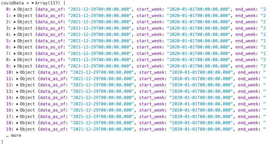
Now that I have access to only CA COVID-19 data (you might have noticed the API URL only specifies California), I want to make sure that decimals aren't used to plot my graph. We can easily fix that.
changedData = { let parsedData = []; for (let i = 0; i < covidData.length; i++) { let data = covidData[i]; data['hispanic'] = data['hispanic'] * 100; parsedData.push(data); } return parsedData;}Using a simple for loop, I change the value for hispanic from the original decimal value to a more usable number for my graph.
Now that I have the data I want, it's time to plot the graph using Vega Lite.
I then require Vega Lite like so:
vegalite = require('@observablehq/vega-lite')Once I have access to the Vega Lite library, I can easily plot my graph setting the values with my changedData array.
vegalite({ data: { values: changedData }, mark: { type: "area", line: { color: "darkgreen" }, color: { x1: 1, y1: 1, x2: 1, y2: 0, gradient: "linear", stops: [ { offset: 0, color: "white" }, { offset: 1, color: "darkgreen" } ] } }, autosize: "fit", width: width, encoding: { x: { field: "county_name", type: "ordinal" }, y: { field: "hispanic", type: "quantitative" } }})The end result will look like this:
California COVID-19 Latinx Deaths by County

How to Help Communities Fight COVID-19 and Misinformation
As I previously mentioned, working on this really hit close to home for me. Particularly because I have family in Fresno County, an area still heavily affected by COVID-19, and have bore witness to my family and other members of my community regurgitating misinformation they heard from non-reliable sources.
In order to fight against this and help our communities move from vaccine hesitancy to confidence, we need to start sharing accurate information on how to protect one another from COVID-19. Some ways of doing this would be by making data more accessible and interpretable, as well as highlighting uplifting stories from other community members who overcame COVID-19 misinformation.
Resources
Original Link: https://dev.to/crrojas88/experimenting-with-data-visualization-using-vega-lite-2kli
Dev To
More About this Source Visit Dev To