
An Interest In:
Web News this Week
- March 21, 2024
- March 20, 2024
- March 19, 2024
- March 18, 2024
- March 17, 2024
- March 16, 2024
- March 15, 2024
Some of Our Sources
- Technology Review
- Simplebits
- Smashing Magazine
- Six Revisions
- Abduzeedo
- Web Designer Depot
- Reencoded
- 24 Ways
- Specky Boy
- Willems Lab
Help Webnuz
Referal links:
December 24, 2021 07:19 am GMT
Original Link: https://dev.to/chetan_atrawalkar/amazing-notification-alert-in-pure-css-5680
Amazing Notification Alert in Pure CSS.
Hello
Welcome to CSS Animation Article. In this, we're going to see how to create an Amazing Notification Alert Animation in Pure CSS.
- Notifications are very important in today's life. It reminds you the things that you forgot, It shows you the progress of various things so that you don't have to open that specific application again and again.
- Hence to show that user recieves a new notification is not a simple task. Here's an easy animation which you can use in your application.
Let's get started....
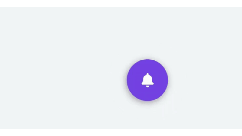
Before going to coding section, checkout quick preview first.
Here's Preview:-
Step 1
Like always, create 2 files - Index.html and Style.css.
Step 2
After creating the html file add the <div> tag with bell icon that wrap into <i>tag.
HTML
<html lang="en" ><head> <meta charset="UTF-8"> <title>Amazing Notification Alert</title><link rel='stylesheet' href='https://cdnjs.cloudflare.com/ajax/libs/font-awesome/5.8.1/css/all.min.css'><link rel="stylesheet" href="./style.css"></head><body><div class="bell"> <div class="bell-border"></div> <i class="fas fa-bell btn-bell"></i></div></body></html>Step 3
Then add the Style.css for amazing style. Using this file we can manage the style as per requirement.
CSS
body { height: 100%; overflow-x: hidden; margin: 0 auto; background: #f6f7fc;}.bell, .bell-border, .btn-bell { border-radius: 50%; position: absolute; top: 50%; left: 50%; transform: translate(-50%, -50%);}.bell { height: 60px; width: 60px; box-shadow: -1px 2px 10px #999; background: #7844E8; animation-name: col; animation-duration: 2s; animation-iteration-count: infinite;}.bell-border { height: 59px; width: 59px; border: 1px solid #7844E8!important; animation-name: bord-pop; animation-duration: 2s; animation-iteration-count: infinite; box-shadow: 2px 2px 5px #ccc, -2px -2px 5px #ccc;}.btn-bell { color: white; font-size: 20px; animation-name: bell-ring; animation-duration: 2s; animation-iteration-count: infinite;}@keyframes bord-pop { 0% { transform: translate(-50%, -50%); } 50% { transform: translate(-50%, -50%) scale(1.9); opacity: 0.1; } 100% { transform: translate(-50%, -50%) scale(1.9); opacity: 0; }}@keyframes col { 0% { transform: scale(1) translate(0,0); } 10% { transform: scale(1.1) translate(0,0); } 75% { transform: scale(1) translate(0,0); } 100% { transform: scale(1) translate(0,0); }}@keyframes bell-ring { 0% { transform: translate(-50%, -50%); } 5%, 15% { transform: translate(-50%, -50%) rotate(25deg); } 10%, 20% { transform: translate(-50%, -50%) rotate(-25deg); } 25% { transform: translate(-50%, -50%) rotate(0deg); } 100% { transform: translate(-50%, -50%) rotate(0deg); }}Step 4
Enjoy the work in your next Projects.
CODEPEN
Thats all, this is Amazing Notification Alert in Pure CSS. You can customize this code further as per your requirement.
Keep Claim And Just Code It
Original Link: https://dev.to/chetan_atrawalkar/amazing-notification-alert-in-pure-css-5680
Share this article:
Tweet

View Full Article
Dev To
 An online community for sharing and discovering great ideas, having debates, and making friends
More About this Source Visit Dev To