
An Interest In:
Web News this Week
- April 18, 2024
- April 17, 2024
- April 16, 2024
- April 15, 2024
- April 14, 2024
- April 13, 2024
- April 12, 2024
Some of Our Sources
- Mashable
- Technology Review
- Smashing Magazine
- Six Revisions
- TutsPlus - Design
- Fuel Your Creativity
- Noupe
- Fudge Graphics
- Web Resource Source
- Daily Now
Help Webnuz
Referal links:
Reusability In React!
What is reusability?
Code that allows itself to be reused for different purposes without having to re-write different code for the same purpose is reusability.
Why reusability at all?
Well, I had the same question when I started learning React. Why do we even need Reusable components when we can straight up write some more code and create another component, right? Well, this goes against many ways. One of them being DRY.
Do not repeat yourself.
One of the key principles of Software Development.
Fun fact: When I Started React, I used to write every other component just like plain html without reusing the code anywhere at all. ( Only until I learned this ).
How can reusability be achieved?
Well there are many ways to achieve reusability. It just depends the type of code that you're writing. In this article I'm gonna show how you can build Reusable Button Component in React which you can reuse anywhere in your React projects.
Step 1:
Start with the idea: To have buttons as components without reusability you'd do something like this in your project:
- DownloadButton.js
- CancelButton.js
- ShareButton.js and ...so on.
I guess you can already sense the problem here. Can't you? Well if you can't, here it is: Multiple files with similar/duplicate code for the same type of component. (Button).
Which means more complex and annoying file structure to maintain as the project grows.
So how can we solve this?
Well, make a component which can give you the result that you want with the data that's given to it. Let's do it.
Create a React project. I've used CRA here:
create-react-app reusable-components
Dependencies: react-icons (npm i react-icons)
Step 2:
Create a component called Button.js or with a name that you prefer.
Place the following code in it:
import React from "react";export default ({ buttons }) => { const generatedButtons = buttons.map((button, index) => { const [icon, text, textColor, backgroundColor, buttonRadius, callback] = button; const Icon = icon; const styles = { receivedStyles: { color: textColor, background: backgroundColor, borderRadius: buttonRadius, }, defaultStyles: { display: "flex", alignItems: "center", justifyContent: "center", border: "none", padding: "0.6em 1.2em", margin: "1em", fontSize: "0.9em", }, }; const { receivedStyles, defaultStyles } = styles; return ( <button key={index} style={ icon ? { ...receivedStyles, ...defaultStyles } : { ...receivedStyles, ...defaultStyles, padding: "1em 1.5em" } } onClick={callback || null} > {icon && <Icon style={{ margin: "0.3em", fontSize: "1.5em" }} />} {text && text} </button> ); }); return ( <div> {generatedButtons} </div> );};The logic in above code is quite simple. We just map a Two Dimensional Array containing individual array data which maps to a different button. And with a bit of conditional rendering, we display them differently based on the data they're given.
How to use?
It's quite simple too.
import Button from "./Button";import { IoMdDoneAll as DoneIcon } from "react-icons/io";import {FaCloudDownloadAlt as CloudDownloadIcon, FaShareAlt as ShareIcon,} from "react-icons/fa";import { MdCancel as CancelIcon } from "react-icons/md";const styles = { height: "100vh", width: "100%", display: "flex", alignItems: "center", justifyContent: "center", background: "#242424",};function App() { return ( <div style={styles}> <Button buttons={[ [DoneIcon, "Done", "#fff", "#570C99", "6px", () => console.log("clicked: Done button")], [cloudDownloadIcon, "Download", "#fff","#009DAE", "100px",() => console.log("clicked: Download button") ], [CancelIcon, "Cancel", "#fff","#FF0000", "100px",() => console.log("clicked: Cancel button") ], [ShareIcon, "Share", "#fff", "#516BEB", null,() => console.log("clicked: Share button") ] ]} </div> );}export default App;Finally, the result!

See how different buttons render? And all this from a single component? Well that's the magic of reusable code.
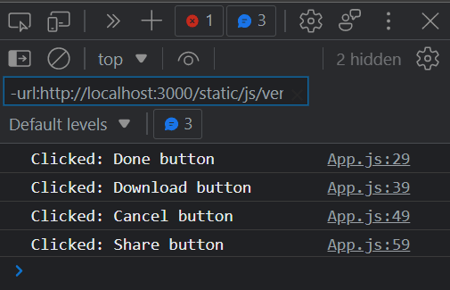
And their callbacks work perfectly too!
The end.
Hope you've learned something new. Thanks for reading. Happy coding!
Original Link: https://dev.to/zxcodes/reusability-in-react-2o4n
Dev To
 An online community for sharing and discovering great ideas, having debates, and making friends
More About this Source Visit Dev To