
An Interest In:
Web News this Week
- April 24, 2024
- April 23, 2024
- April 22, 2024
- April 21, 2024
- April 20, 2024
- April 19, 2024
- April 18, 2024
Some of Our Sources
- TutsPlus - Code
- The Logo Smith
- Spoon Graphics
- Vandelay Design
- Crazy Leaf Design
- My Ink Blog
- Stylized Web
- Spyre Studios
- Design Modo
- Dev To
Help Webnuz
Referal links:
Amazing Portfolio website using HTML, CSS and JS.
If you are a beginner or a pro. This blog is for everyone who want to make his/her portfolio an outstanding one. In this tutorial, youll learn to create your own modern looking portfolio website using HTML, CSS and JS. In the article, youll learn to create smooth transition on navigations, youll create CSS timeline to showcase your education and experience, youll make a separate section for your project with a cool hover effect. You must make this portfolio to impress your recruiter.
So, without wasting more time, let's start. To see project demo or for better understanding of code, you can watch the tutorial below.
Video Tutorial
I appreciate if you can support me by subscribing my youtube channel.
Code
So, let's start by making navbar for the site. But before that you should know our files and folders.

You can download the images here.
Navbar
So let's start, to create navbar first write the HTML basic template and link style.css and app.js file to index.html file. After done with all of this. Create navbar.
<!-- navbar --><nav class="navbar"> <ul class="link-group"> <li class="link active"><a href="#">home</a></li> <li class="link"><a href="#">projects</a></li> <li class="link"><a href="#">about</a></li> <li class="link"><a href="#">contact</a></li> </ul></nav>Okay we are done with HTMl, so add some style to it also.
*{ margin: 0; padding: 0; box-sizing: border-box;}body{ width: 100%; max-width: 1400px; display: block; margin: auto; min-height: 100vh; background: #191919; font-family: sans-serif;}.navbar{ width: 100%; position: fixed; top: 0; left: 0; display: flex; justify-content: center; align-items: center; z-index: 9; background: #1a1a1a;}.link-group{ list-style: none; display: flex;}.link a{ color: #fff; opacity: 0.5; text-decoration: none; text-transform: capitalize; padding: 10px 30px; margin: 0 20px; line-height: 80px; transition: .5s; font-size: 20px;}.link a:hover, .link.active a{ opacity: 1;}After done with this, you'll probably see something like this.
Okay, so with that we are done with navbar. So let's move on to our home section
home section
To create home section code this HTML structure after navbar element.
<!-- home section --><section class="home-section active"> <h1 class="hero-heading">hello, i am <br> kunaal</h1> <img src="img/home.png" class="home-img" alt=""></section>And give it some styles.
.home-section{ width: 100%; height: 100vh; padding: 0 150px; display: flex; align-items: center; position: relative; top: 0; opacity: 0; transition: 1s;}.hero-heading{ color: #fff; font-size: 120px; text-transform: capitalize; font-weight: 300;}.home-img{ position: absolute; top: 0; right: 0; height: 100vh; width: 50%; object-fit: cover; opacity: 0.2;}If you see the above code, you'll see position: relative and top: 0 under .home-section. These properties are important while navigation, cause how will our navigation work is little complex. All of our sections (home, project, about, contact) all of these will have position: fixed because of this, all sections will be on top of each other. And we'll use active class to indicate the active section. Using active class we'll set section's position's to relative along with its opacity to 1. This is how our navigation will work. Isn't is complicated ??
Output

So, once you are done with home section make sure you change its position to fixed from relative.
.home-section{ /* previous styles */ position: fixed;}Then make active class styles.
.home-section.active,.project-section.active,.about-section.active,.contact-section.active{ position: relative; opacity: 1; z-index: 8;}You can see I have added each and every section here in order to make smooth navigation.
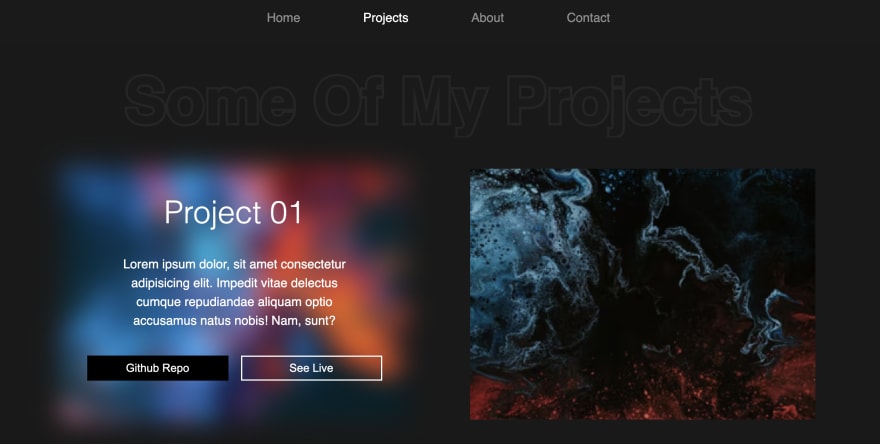
Project section
Now, let's make project section. For that code this HTML.
<!-- project section --><section class="project-section"> <h1 class="project-heading">some of my projects</h1> <div class="project-container"> <div class="project-card"> <img src="img/project-1.png" class="project-img" alt=""> <div class="project-content"> <h1 class="project-title">project 01</h1> <p class="project-info"> Lorem ipsum dolor, sit amet consectetur adipisicing elit. Impedit vitae delectus cumque repudiandae aliquam optio accusamus natus nobis! Nam, sunt? </p> <div class="project-btn-grp"> <button class="project-btn github">github repo</button> <button class="project-btn live">see live</button> </div> </div> </div> // +3 more cards </div></section>Also style it.
/* project-section */.project-section{ width: 100%; min-height: 100vh; padding: 150px 100px 100px; position: fixed; top: 0; transition: 1s; opacity: 0;}.project-heading{ font-size: 100px; background: #252525; text-transform: capitalize; text-align: center; margin-bottom: 50px; color: #1a1a1a; background-clip: text; -webkit-background-clip: text; -webkit-text-stroke: 8px transparent;}.project-container{ display: grid; grid-template-columns: repeat(2, 1fr); grid-gap: 100px;}.project-card{ height: 400px; position: relative;}.project-img{ width: 100%; height: 100%; position: absolute; top: 0; left: 0; object-fit: cover; transition: .5s;}.project-content{ position: relative; padding: 40px; color: #fff; transition: .5s; opacity: 0;}.project-title{ font-size: 50px; text-transform: capitalize; text-align: center; font-weight: 300;}.project-info{ margin: 40px; font-size: 20px; line-height: 30px; text-align: center;}.project-btn-grp{ display: grid; grid-template-columns: repeat(2, 1fr); grid-gap: 20px;}.project-btn{ height: 40px; text-transform: capitalize; font-size: 18px; border: none; background: #000; color: #fff; cursor: pointer;}.project-btn.live{ background: none; border: 2px solid #fff;}.project-card:hover .project-img{ filter: blur(20px);}.project-card:hover .project-content{ opacity: 1;}In the above code, I have already added fixed position to project-section and defined its opacity to 0. But for you in order to see the output. make sure you add active class in project-section like this.
<section class="project-section active">Output [ With hover effect ]
Navigation
Before going forward, let's make the navigation system first. For that code this inside app.js file.
const links = document.querySelectorAll('.link');const sections = document.querySelectorAll('section');let activeLink = 0;links.forEach((link, i) => { link.addEventListener('click', () => { if(activeLink != i){ links[activeLink].classList.remove('active'); link.classList.add('active'); sections[activeLink].classList.remove('active'); setTimeout(() => { activeLink = i; sections[i].classList.add('active'); }, 1000); } })})In the above code, first I am selecting all the links and sections. After that, I defined activeLink this variable will track the current active section or link. After that, I used forEach method to loop through all the links. Inside that I am access individual link and its index.
Inside it first, I am adding click event to link using addEventListener. Then I used a simple condition to make sure user is not clicking on the active link. After that, I am removing the active class from the current active link using classList.remove and adding active class to the clicked link using classList.add. I am doing the same to remove the active class from the active section.
Once done with that, I am using setTimeout to add a 1s delay in executing the below codes. Inside the timeout, it is just simply adding the active class again.
You might see the navigation as a very easy one, but it was the second hardest thing to make in this project
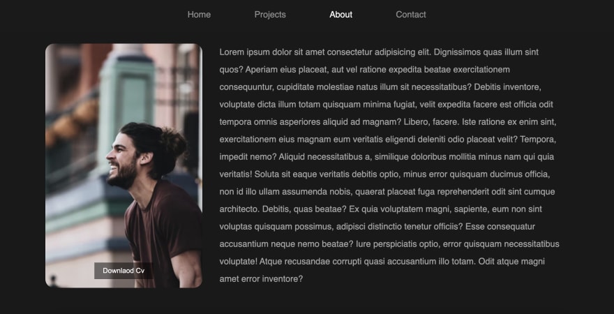
About section.
Now, let's create the about section. Honestly, my favourite section in this entire website is this about section. Our about section has everything, it has skills section, and also a education timeline.
To create about section, code this after project section.
<!-- about section --><section class="about-section"> <div class="about"> <div class="about-img-container"> <img src="img/home.png" class="about-img" alt=""> <button class="download-cv-btn">downlaod cv</button> </div> <p class="about-info">Lorem ipsum.....</p> </div></section>And style it.
/* about-section */.about-section{ width: 100%; min-height: 100vh; padding: 150px 100px 0; position: fixed; top: 0; opacity: 0; transition: 1s;}.about{ width: 100%; display: grid; grid-template-columns: 30% 65%; grid-gap: 40px;}.about-img-container{ position: relative;}.about-info{ color: #fff; opacity: 0.6; font-size: 20px; line-height: 40px;}.about-img{ width: 100%; height: 100%; object-fit: cover; border-radius: 20px;}.download-cv-btn{ position: absolute; bottom: 20px; left: 50%; transform: translateX(-50%); padding: 10px 20px; color: #fff; border: none; font-size: 16px; text-transform: capitalize; cursor: pointer; transition: .5s; background: rgba(0, 0, 0, 0.5);}.download-cv-btn:hover{ background: #000;}Again you might not see anything, make sure to add
activeclass toabout-sectionand remove it from all other sections.
Output
So, now shall we create the skills section ? Well in our skills section I do not have any skill progress bar which is I think is most used thing in the portfolio. But I think its the worst thing to have. I somewhere read on internet that the progress bar might look awesome to you, but let say it know python 90% and you add it to your website saying, you know 90% of python. There is a change that your client think you know 90% python so maybe you don't know the advance topic although you know the advance topics too. So its create a confusion. Well its just a preference. Anyway, let's make the skills section.
<!-- skills --><div class="skill-section"> <h1 class="heading">skills</h1> <div class="skills-container"> <div class="skill-card"> <img src="img/html.png" class="skill-img" alt=""> <div class="skill-level">98%</div> <h1 class="skill-name">HTML</h1> <p class="skill-info">Lorem ipsum dolor, sit amet consectetur adipisicing elit. Consequatur, delectus!</p> </div> // +4 more cards </div></div>Code the above code under about-section element and style them.
/* skills */.skill-section{ position: relative; margin: 100px 0;}.heading{ text-align: center; font-size: 60px; color: #fff; text-transform: capitalize; font-weight: 300; margin-bottom: 100px;}.skills-container{ width: 95%; margin: auto; display: grid; grid-template-columns: repeat(3, 1fr); grid-gap: 100px; color: #fff;}.skill-card{ position: relative;}.skill-img{ display: block; margin: auto; height: 200px;}.skill-name{ font-size: 30px; font-weight: 300; text-align: center; text-transform: capitalize; margin: 30px 0 20px;}.skill-info{ text-align: center; opacity: 0.5; font-size: 18px; line-height: 30px;}.skill-level{ position: absolute; top: 80px; right: 0; width: 150px; height: 150px; display: flex; justify-content: center; align-items: center; font-size: 22px; border-radius: 50%; border: 10px solid;}.skill-card:nth-child(1) .skill-level{ background: #ff4f4f28; border-color: #ff4f4f; color: #ff4f4f;}.skill-card:nth-child(2) .skill-level{ background: #4fa0ff28; border-color: #4fa0ff; color: #4fa0ff;}.skill-card:nth-child(3) .skill-level{ background: #ffed4f28; border-color: #ffed4f; color: #ffed4f;}.skill-card:nth-child(4) .skill-level{ background: #52ff4f28; border-color: #52ff4f; color: #52ff4f;}.skill-card:nth-child(5) .skill-level{ background: #4fdfff28; border-color: #4fdfff; color: #4fdfff;}Output

And now the hardest thing, CSS timeline. It was little hard for me to make at first, but I tried my best not to use lot of code to achieve the goal.
<!-- timeline --><div class="timeline"> <h1 class="heading">education and experience</h1> <div class="card"> <div class="card-body"> <h1 class="card-title">2000-2002</h1> <p class="card-detail">Lorem ipsum dolor, sit amet consectetur adipisicing elit. Architecto sequi recusandae laborum ipsam dignissimos nostrum vitae provident officia, consectetur ab accusantium corrupti exercitationem temporibus repellat non magni cupiditate ea reprehenderit.</p> </div> </div> //+4 more cards</div>Make sure to add these codes inside about-section also.
/* timeline */.timeline{ display: block; width: 80%; margin: 150px auto;}.timeline .heading{ margin-bottom: 150px;}.card{ width: 45%; padding: 30px; border-radius: 10px; color: #fff; display: block; margin: -80px 0; position: relative; background: #f00;}.card:nth-child(even){ margin-left: auto;}.card:nth-child(even):before{ content: ''; position: absolute; left: -15%; top: 50%; transform: translateY(-50%); width: 20px; height: 20px; border: 5px solid #191919; border-radius: 50%;}.card:nth-child(even):after{ content: ''; position: absolute; left: -8.5%; top: 50%; transform: translateY(-50%); width: 7%; height: 2px; background: #fff; z-index: -1;}.card:nth-child(odd):before{ content: ''; position: absolute; right: -13%; top: 50%; transform: translateY(-50%); width: 20px; height: 20px; border: 5px solid #191919; border-radius: 50%;}.card:nth-child(odd):after{ content: ''; position: absolute; right: -8.5%; top: 50%; transform: translateY(-50%); width: 7%; height: 2px; background: #fff; z-index: -1;}.card:nth-child(2), .card:nth-child(2):before{ background: #ff4f4f;}.card:nth-child(3), .card:nth-child(3):before{ background: #ffb84f;}.card:nth-child(4), .card:nth-child(4):before{ background: #3dca5c;}.card:nth-child(5), .card:nth-child(5):before{ background: #565252;}.card:nth-child(6), .card:nth-child(6):before{ background: #4fa0ff;}.card:nth-child(even) .card-body:before{ content: ''; position: absolute; left: -12%; top: 0; width: 0px; height: 100%; border: 1px dashed #fff; z-index: -1;}.card-title{ font-size: 30px; font-weight: 300; margin-bottom: 20px;}Output

Contact section
Anddddddd, the last part contact section. Let's create this also.
<!-- contact section --><section class="contact-section"> <form class="contact-form"> <input type="text" name="name" id="name" autocomplete="off" placeholder="name"> <input type="text" name="email" id="email" autocomplete="off" placeholder="email"> <textarea name="msg" id="msg" placeholder="message" autocomplete="off"></textarea> <button type="submit" class="form-submit-btn">contact</button> </form> <!-- map --> <div class="map"> <iframe src="https://www.google.com/maps/embed?pb=!1m18!1m12!1m3!1d448181.163742937!2d76.81306771991275!3d28.647279935262464!2m3!1f0!2f0!3f0!3m2!1i1024!2i768!4f13.1!3m3!1m2!1s0x390cfd5b347eb62d%3A0x37205b715389640!2sDelhi!5e0!3m2!1sen!2sin!4v1639489002410!5m2!1sen!2sin" width="600" height="450" style="border:0;" allowfullscreen="" loading="lazy"></iframe> </div></section>By the way, the above iframe code is the google map embed link. You can get it using google map.
.contact-section{ position: absolute; top: 0; opacity: 0; transition: 1s; padding: 100px 150px; height: 100vh; display: grid; grid-template-columns: repeat(2, 1fr); grid-gap: 50px;}.contact-form input, .contact-form textarea{ width: 100%; height: 40px; background: rgba(255, 255, 255, 0.2); border: 1px solid #fff; margin-bottom: 30px; border-radius: 5px; text-transform: capitalize; color: #fff; padding: 5px 10px;}::placeholder{ color: #fff;}#msg{ height: 280px; resize: none; font-family: sans-serif;}.form-submit-btn{ background: #ff4f4f; color: #fff; text-transform: capitalize; padding: 15px 40px; display: block; margin: auto; border: none; border-radius: 10px; cursor: pointer;}.map{ width: 100%; height: 100%; padding: 10px; border: 2px solid #fff; background: rgba(255, 255, 255, 0.2); border-radius: 10px;}.map iframe{ width: 100%; height: 100%; border-radius: 5px;}Output

So, that's it. Great work guys. We are done with the portfolio.
I hope you understood each and everything. If you have doubt or I missed something let me know in the comments.
Articles you may find Useful
I really appreciate if you can subscribe my youtube channel. I create awesome web contents.

Source Code
Thanks for reading
Original Link: https://dev.to/kunaal438/amazing-portfolio-website-using-html-css-and-js-l8f
Dev To
 An online community for sharing and discovering great ideas, having debates, and making friends
More About this Source Visit Dev To