
Some of Our Sources
- Mashable
- Technology Review
- TutsPlus - Code
- Joshua Blankenship
- The Logo Smith
- Smashing Apps
- Inspiredology
- CSS Globe
- Design Modo
- Daily Now
Help Webnuz
Referal links:
November 28, 2021 05:12 am GMT
Original Link: https://dev.to/femil/create-stunning-profile-card-html-css-4j0f
Create stunning profile card || HTML & CSS
In this blog i coverd how you can make amazing and stunning profile card.
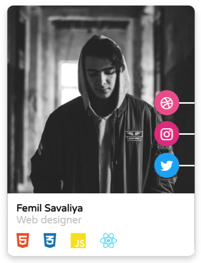
You can use this card to showcase your skills and share your social network for contact.
No need to take a cup of coffee or tea it takes two minutes like Meggie :)
Let's design,
Folder Structure
- Profile Card
- - index.html
- - style.css
1.HTML
Add this code into your index.html file, change name, img and links and other stuff according to your preferences
<html> <head> <title>Page Title</title> <link rel="stylesheet" href="https://cdnjs.cloudflare.com/ajax/libs/font-awesome/5.15.1/css/all.min.css" /> <link href="https://stackpath.bootstrapcdn.com/font-awesome/4.7.0/css/font-awesome.min.css" rel="stylesheet"> <link href="https://fonts.googleapis.com/css2?family=Varela+Round&display=swap" rel="stylesheet"> <link rel="stylesheet" href="style.css" /> </head> <body> <div class="main-container"> <div class="icons"> <ul> <li> <a href="https://codepen.io/Femil_32/"><i class="fa fa-dribbble" aria-hidden="true"></i></a> </li> <li> <a href="https://www.instagram.com/femil_32/"><i class="fa fa-instagram" aria-hidden="true"></i></a> </li> <li> <a href="https://codepen.io/Femil_32/"><i class="fa fa-twitter" aria-hidden="true"></i></a> </li> </ul> </div> <div class="layer"> <div class="text"> <h4>Femil Savaliya</h4> <p>Web designer</p> <div class="skill"> <i class="fab fa-html5"></i> <i class="fab fa-css3-alt"></i> <i class="fab fa-js"></i> <i class="fab fa-react"></i> </div> </div> </div> </div> </body></html>2.CSS
Now time to give awesome look to our HTML skeleton, add the below style in your style.css file
*{ padding:0; margin:0; box-sizing:border-box;}.main-container{ position:absolute; top:50%; left:50%; transform:translate(-50%,-50%); width:300px; height:400px; box-shadow:0 5px 10px rgba(0,0,0,.2); border-radius:10px; overflow:hidden;}.main-container::before{ content:""; position:absolute; width:100%; height:100%; background:url("https://images.unsplash.com/photo-1552562739-152fee1f81f3?ixid=MXwxMjA3fDB8MHxzZWFyY2h8Njd8fG1hbGUlMjBwb3J0cmFpdCUyMGJsYWNrJTIwYW5kJTIwd2hpdGV8ZW58MHx8MHw%3D&ixlib=rb-1.2.1&auto=format&fit=crop&w=1100&q=60") center/cover; transition:.7s cubic-bezier(.46, 1.48, .18, .81);}.icons{ position:absolute; right:-30px; top:130px;}ul{position:relative;width:100px;height:150px; list-style:none; display:flex; flex-direction:column; align-items:center; justify-content:space-around; perspective:300px;}ul li{ width:50px; height:2px; transform:rotateY(-100deg); opacity:0; transform-origin:right;}li:nth-child(1){ transition-delay:.3s;}li:nth-child(2){ transition-delay:.2s;}li:nth-child(3){ transition-delay:.1s;}li a{ display:block; width:40px; height:40px; position:absolute; top:50%; left:0; transform:translate(-50%,-50%); border-radius:50%; text-align:center; line-height:43px; font-size:1.4rem; text-decoration:none; color:#fff;}li:nth-child(1) a{ background:#EA4C89;}li:nth-child(2) a{ background:#dd2a7b;}li:nth-child(3) a{ background:#1DA1F2;}.layer{ position:absolute; bottom:0; width:100%; height:100px; transform:translateY(150px);}li,a,.layer{ background:#fff; transition:.7s cubic-bezier(.46, 1.48, .18, .81);}.text{ margin:.6rem; padding:5px;font-family: 'Varela Round', sans-serif;}.text p{ color:#bfbfbf;}.skill{ font-size:1.7rem; padding-top:.5rem;}.fab{ margin:0 1rem 0 0;}.fab:nth-child(1){color:#E34F26;}.fab:nth-child(2){color:#1572B6;}.fab:nth-child(3){color:#f7df1e;}.fab:nth-child(4){color:#61DAFB;}.main-container:hover .layer{ transform:translateY(0);}.main-container:hover:before{ transform:scale(1.1);}.main-container:hover ul li{ transform:rotateY(0); opacity:1;} 3.RESULT
Drop your thought in the comment section below and Thank you for reading
Original Link: https://dev.to/femil/create-stunning-profile-card-html-css-4j0f
Share this article:
Tweet

View Full Article
Dev To
 An online community for sharing and discovering great ideas, having debates, and making friends
More About this Source Visit Dev To