
An Interest In:
Web News this Week
- April 20, 2024
- April 19, 2024
- April 18, 2024
- April 17, 2024
- April 16, 2024
- April 15, 2024
- April 14, 2024
Some of Our Sources
- BoingBoing
- Team Treehouse
- TutsPlus - Design
- You The Designer
- Creative Curio
- CSS Globe
- 24 Ways
- Wal You
- CSS Tricks
- Hashedout
Help Webnuz
Referal links:
Accessibility Auditing My Portfolio Site - Part 6
Read Part 1 - The Audit, Part 2 - Quick Fixes, Part 3 - Dark Mode Toggle, Part 4 - Blog Preview Component and Part 5 - Blog Page Deep Dive.
We've finally reached the end. If you've read multiple articles in this series, I want to thank you, especially. It was quite a dense journey.
I'm going to finish up with a final round of testing, a final fix, a brief mention of things I'd like to revisit, some main takeaways, and my final thoughts on this series.
Final Testing
Automated Tools
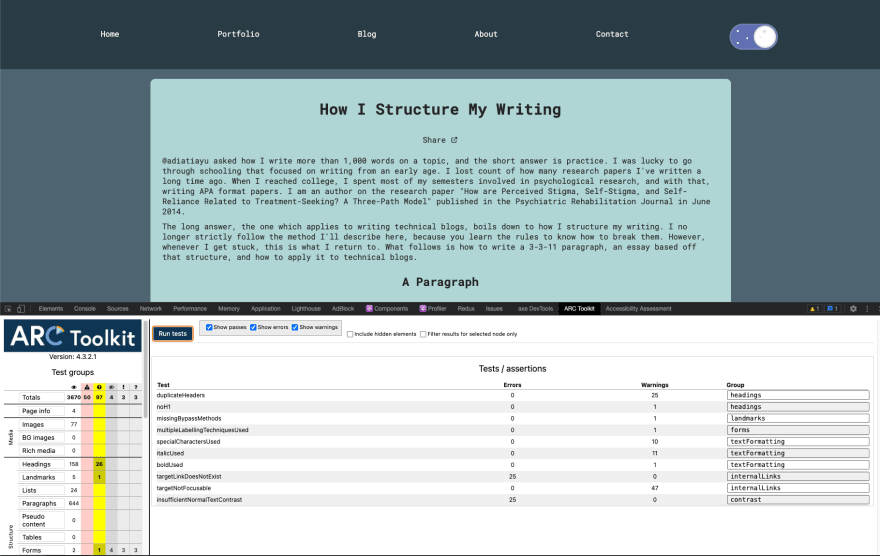
In Part 1, I used 6 of the tools Todd used: WAVE browser extension, Firefox's accessibility dev tools tab, AXE DevTools extension, ARC dev toolkit for chrome dev tools, IBM Equal Access Accessibility checker, and Microsoft Accessibility Insights. So let's go through that list again and see what we find.
Most of the tools returned an error about not having an <h1>, because I want it to be visually hidden, I'll be fixing that when I get to this Github issue.
WAVE mostly returned errors I had already vetted. It did actually catch one of the many broken links that I'll be fixing in this Github issue. It returned 27 long alt-text warnings on my blog page, but they're all less than 150 characters. I also got false positive contrast errors for my visually hidden skip links.
ARC is down to primarily false positives. There were a couple I had to look up to make sure they were ok, like buttons with transparent backgrounds and using images with alt-text or an aria-label instead of text in links.
The IBM Equal Access Accessibility checker just stopped working. It refused to scan even after I restarted Chrome, uninstalled and reinstalled it in Chrome, and installed it in Firefox. I saw something about the ruleset being undefined, so hopefully they fix that soon. Luckily, I ran it multiple times in Part 5 so I'm comfortable with moving on.
The Microsoft Accessibility Insights Fast Pass didn't find anything that wasn't already on my radar, but I will be using the Assessment option as a guide for my manual testing again.
Manual Testing
The Microsoft Accessibility Insights Assessment is such a great testing resource. Many of the tabs break down exactly what information is returned by the relevant elements on the page and others tell you what to look for when you're manually testing with a keyboard or screen reader. Some of them have a visual helper toggle that will highlight relevant elements or apply the relevant settings so you can test. It's a very long list of tests, but luckily there are many tabs I know I can skip because they either don't apply or I haven't changed any code related to them since the last time I checked. Ultimately, these tests don't return anything I didn't already know about.
Not a single automated tool returned a warning or error about the contrast of the toggle itself, but based on reader feedback, I want to manually check it has sufficient color contrast in light mode. The Microsoft Accessibility Insights Assessment repeatedly suggested using the Color Contrast Checker on a Mac, so I went ahead and installed it. It didn't work very well, so I took the hex color codes from my CSS and plugged them into my go to contrast checker from WebAIM.
I need a 3:1 contrast ratio, and the border of the toggle (#72CCE3) only comes in at 1.44:1 on the light mode background (#DBE7E4). Next, I head to coolors and start looking at shades that might get me up to 3 without straying too far from the original color scheme. It involves a lot of hex code typing and using saturation and brightness sliders, but the coolors tools make it way easier. I consistently find the shade that meets minimum contrast and looks the most blue is a color coolors calls "Blue Munsell" (#108DAD). While we're here, I go ahead and test the dark mode contrast and find it fails as well. The border color (#5d6baa) looks fine lightened to "Cool Grey" (#808CBC) and that makes a minimum 3:1 contrast, so I update my CSS variables.
:root { /** sunny side **/ --blue-background: #c2e9f6; --blue-border: #108DAD; --blue-color: #96dcee; --yellow-background: #fffaa8; --yellow-border: #f5eb71; /** dark side **/ --indigo-background: #808fc7; --indigo-border: #808CBC; --indigo-color: #6b7abb; --gray-border: #e8e8ea; --gray-dots: #e8e8ea;}Another thing about the toggle I said I'd look into again was whether the animated focus outline has sufficient contrast from the start. While I know the contrast is sufficient down to small text, it needs to be obvious right when the user focuses on it. I like it and can see it immediately, but I also don't have vision problems and am very good at differentiating colors. (If you too like looking at hues of colors, check out the I Love Hue mobile game.) After playing around with it, I add this transition rule to my :focus ruleset:
.toggle--checkbox:focus + .toggle--label { outline: solid 3px var(--button-border); transition: outline 100ms ease-in;}This cancels out the transition: all 350ms ease-in; rule in my regular .toggle--label ruleset, and the outline is easier to see right when the toggle is focused.
Multiple Screen readers
There were a couple warnings from tools about multiple labels being used on components. I applied aria-labels liberally based on what I was hearing from the screen reader. Now that the bulk of the work is done, I want to go back through with multiple screen readers and find the optimal balance. Specifically, I want to make sure a screen reader says "dark mode toggle, on" or "dark mode toggle, off" when the toggle is selected and that things like buttons in headings don't have redundant labels read.
I've been working with VoiceOver, so I'm going to switch to NVDA for Windows first. After that, I'll try tdsr. All the other screen readers I researched involved paying a sizable sum, installing Linux on one of my machines, or were no longer available.
The first thing I notice about NVDA is it starts making noise as soon as you open the .exe and it has way fewer instructions pop ups. Then I'm struck by the excellent sound effects. The interesting thing is NVDA navigation doesn't trigger focus. It is hard to tell where you are in the page. My buttons, headings, and regions are being read very similarly to the way VoiceOver reads them. Initially, I thought my dark mode toggle wasn't being read correctly, but then I realized instead of "on" and "off" it was saying "checked" and "unchecked." If role="switch" wasn't working like I expected, it would be saying "unchecked" while the site was in dark mode, which would be extremely confusing for a screen reader user.
Finally, I try to get tdsr working and my homebrew python installation is broken. I try a few different versions of uninstalling and reinstalling and linking and unlinking before giving up. I'll get a 3rd screen reader working when I come back to those Github issues.
I'm leaving my aria-labels the way they are because I added them in response to VoiceOver not providing enough information. The NVDA experience is very similar and the tool are returning warnings to try and prevent lots of redundant text from being read to the user.
Cross-browser Testing
In the spirit of completing testing I should have done a long time ago, I want to click through my site in multiple browsers and verify nothing's broken. I try and make sure to check MDN's browser support table for pretty much everything, but it never hurts to verify in the browser itself.
The Firefox dev tools accessibility tab didn't return any errors, but I took the opportunity to click around while I had it open, and everything's looking good.
In Safari, my blog preview component has square edges around the scrollbar I was able to prevent in Chrome and Firefox. I mess around with it for a little bit, but my solution is the recommended solution and none of the CSS I tried in dev tools affected it. Everything else looks fine.
Final Fix
I wanted to sift through all my blogs to make sure I'm not using words like "above" and "below" where they wouldn't make sense without visual context. The warnings came from the IBM Equal Access Accessibility checker, so while that's broken, I'm relegated to using ctrl + F to find "above", "below", "left", and "right." Lo and behold, I've already used "above" a couple times since I fixed the instances of "below" on my main page! This is a hard habit to break.
For the most part, I can just remove the word without issue. In some places, I replace "above" with "before" and "below" with "following." I quickly find I sure do love a good "comment below."
Things to Revisit
I opened 5 issues on Github over the course of this series. #3, #9, and #11 are easily large enough accessibility projects to deserve standalone blog posts.
Updating my skills section is just something I need to keep on top of as I grow as a developer. Moving my CSS away from dozens of margins will make it much easier to add to my site in the future. Similarly, I need to come up with a solution for my local lambda server environment variables that doesn't involve hardcoded links and pasting in my DEV API key.
I also need to transfer changes I've made to blogs on DEV to Hashnode and maybe Medium. If I changed words, I made sure to make changes everywhere. I didn't transfer the heading and formatting changes because they often vary across sites and the last blog was a slog. Plus, I'm in the middle of cross posting everything to Tealfeed and reformatting Part 5 for Medium was a nightmare, so I may be ditching Medium. I need to make some decisions before I spend time on this.

Main Takeaways
Running ARC Toolkit on my blog page now vs when I started is like night and day. I got a huge amount of errors back in Part 1, but now it's all warnings and two things I'm going to fix in those Github issues. On the flip side, I don't think IBM Equal Access Accessibility checker's % of components without issues metric moved during this entire series. I'm pretty sure I saw 93% the whole time.
Quite a few of these things get harder to maintain the more blogs I write. I feel like I could use an editorial team for making sure I stick to one way of doing things in my blog text already (e.g. do I capitalize "Part" and link to the blog every time I refer to another part of this series?). Similarly, I'm not sure I'm applying the recommended approach the same way across the board for some of the errors and warnings I tried to fix, like using <q> and <quoteblocks>. I went through and made sure that what I have won't leave a screen reader user without required context, but in the case of <q>s, I use quotes stylistically a lot, so they're not really conveying meaning, but are still triggering automated tool warnings.
Honestly, if I only had the bandwidth to do one thing, I would manually test with a screen reader and just aim for making that navigation more straightforward. It was shocking how easy it was to take screen reader navigation from hot garbage to fairly sensical. A close second/fairly intertwined task would be doing the same with a keyboard.
Just like learning a new language or technology, a lot of these things need practice. Alt-text and color contrast are great examples of this. I encourage you to look at websites you visit and think about what the experience would be like for a disabled user while you browse. You should definitely be writing alt-text or captions for every image you use in your social media posts both for other users and for your own practice. My alt-text writing has improved significantly in the last 8 months just from tweeting.
Final Thoughts
I want to emphasize that if you want to improve your site's accessibility, an audit and fix process this intense right off the bat is not necessary.
In code, like in life, it is nigh impossible to reach 100% perfection and you certainly cannot do it quickly. Part 2 demonstrates that starting with small, simple fixes can still make a decent improvement. Had I not literally heard Todd say "No site is 100% accessible, especially as you update it, but we can aim to get close," I may have given in to the pressure to strive for perfection and never finished.
All of the tools I used gave me a ginormous list of things to check. That was after I knew I could ignore quite a few of the warnings. When I was watching Todd's Lunch and Learn, I was struck by how many of the rules he knew off the top of his head. If you had to research whether each and every false positive, warning, and recommendation was pertinent, it would get very overwhelming very fast.
The topic of accessibility is huge and not black and white. What may work in one screen reader in one browser may not work in others. You can't know every disability your users will have. Plus, if you've ever posted anything that got remotely popular on the internet, you know that you can never please every user. All you can do is aim to improve the experience for as many users as possible and be open to feedback.
Original Link: https://dev.to/abbeyperini/accessibility-auditing-my-portfolio-site-part-6-254l
Dev To
 An online community for sharing and discovering great ideas, having debates, and making friends
More About this Source Visit Dev To