
An Interest In:
Web News this Week
- April 3, 2024
- April 2, 2024
- April 1, 2024
- March 31, 2024
- March 30, 2024
- March 29, 2024
- March 28, 2024
Some of Our Sources
- Slashdot
- BoingBoing
- Technology Review
- Fuel Your Creativity
- Web Design Ledger
- Reencoded
- Design Modo
- Codrops
- Willems Lab
- Dev To
Help Webnuz
Referal links:
Grid practice
I've been using flex more and haven't really used float or grid. I think I should try to use them more often when I write code.
Grid is suitable for complex layout since you can organise content both into columns and rows.
As it is with flex, grid also has grid container and grid items which are the children of the container. So the whole space of the container gets affected by the grid and according to the each properties and values of each items, the layout changes.
You can specify it as display: grid in container.

Grid track is row and column of grid, grid cell is a cell of grid. Grid line is the line that divide grid cells. To use grid, we write this in container first.
.container { display: grid; /* display: inline-grid; */}However, nothing will change if the (grid)items are block elements. Inline-grid also behaves like inline-block.
grid-template-rows, grid-template columns : these specify size of grid tracks.
.container { grid-template-columns: 200px 200px 500px; /* grid-template-columns: 1fr 1fr 1fr */ /* grid-template-columns: repeat(3, 1fr) */ /* grid-template-columns: 200px 1fr */ /* grid-template-columns: 100px 200px auto */ grid-template-rows: 200px 200px 500px; /* grid-template-rows: 1fr 1fr 1fr */ /* grid-template-rows: repeat(3, 1fr) */ /* grid-template-rows: 200px 1fr */ /* grid-template-rows: 100px 200px auto */}fr = fraction. (you can consider it as ratio)
If grid-template-columns: 1fr 1fr 1fr;, this will make three columns which are 1:1:1.
If grid-template-columns: 100px 2fr 1fr;, this will set the first column on the left to 100px, second and third column to have 2:1 ratio.
repeat
.container { grid-template-columns: repeat(5, 1fr); /* The code above is the same as below */ /* grid-template-columns: 1fr 1fr 1fr 1fr 1fr */}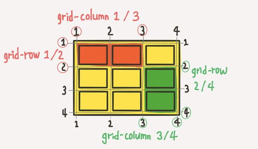
/* These two select the same area */.item:nth-child(1) { grid-column-start: 1; grid-column-end: 3; grid-row-start: 1; grid-row-end: 2;}.item:nth-child(1) { grid-column: 1 / 3; grid-row: 1 / 2;}grid-area
<!DOCTYPE html><html lang="ko"><head> <meta charset="UTF-8"> <meta http-equiv="X-UA-Compatible" content="IE=edge"> <meta name="viewport" content="width=device-width, initial-scale=1.0"> <title>flex-1</title> <style> * { box-sizing: border-box; } .container-color { background-color: cornsilk; border: solid 3px black; border-radius: 10px; margin: 5px; padding: 5px; } .item-color { background-color: darkcyan; border: solid 3px black; border-radius: 10px; margin: 5px; padding: 5px; } .container { display: grid; border: 10px solid black; gap: 10px; grid-template-areas: 'header header header' 'section section section' 'footer footer footer'; } .header { grid-area: header; border: 10px solid tomato; } .section { grid-area: section; border: 10px solid blue; } .footer { grid-area: footer; border: 10px solid deeppink; } </style></head><body> <div class="container-color container"> <div class="item-color item header">Lorem.</div> <div class="item-color item section">Lorem, ipsum.</div> <div class="item-color item footer">Lorem ipsum dolor sit.</div> </div></body></html> grid-row, grid-column
<!DOCTYPE html><html lang="ko"><head> <meta charset="UTF-8"> <meta http-equiv="X-UA-Compatible" content="IE=edge"> <meta name="viewport" content="width=device-width, initial-scale=1.0"> <title>flex-1</title> <style> * { box-sizing: border-box; } .container-color { background-color: cornsilk; border: solid 3px black; border-radius: 10px; /* height: 500px; */ margin: 5px; padding: 5px; } .item-color { background-color: darkcyan; border: solid 3px black; border-radius: 10px; margin: 5px; padding: 5px; } .container { display: grid; } .header { grid-row: 1 / 2; grid-column: 1 / 4; } .section { grid-row: 2 / 3; grid-column: 1 / 3; } .aside { grid-row: 2 / 3; grid-column: 3 / 4; } .footer { grid-row: 3 / 4; grid-column: 1 / 4; } </style></head><body> <div class="container-color container"> <div class="item-color item header">Lorem.</div> <div class="item-color item section">Lorem, ipsum.</div> <div class="item-color item aside">Lorem, ipsum dolor.</div> <div class="item-color item footer">Lorem ipsum dolor sit.</div> </div></body></html>Grid practice

code
Some issue from code above
If the element has transform, z-index gets ignored and the background cards came to the front on the top of other elements.
So, instead of using transform: translate(), used top and left to move element.Something to read: Why z-index isn't working?
in Korean
+ You can also check grid on developer's tool as well.

Game to practice CSS grid
Original Link: https://dev.to/daaahailey/grid-practice-14ac
Dev To
 An online community for sharing and discovering great ideas, having debates, and making friends
More About this Source Visit Dev To