
An Interest In:
Web News this Week
- April 23, 2024
- April 22, 2024
- April 21, 2024
- April 20, 2024
- April 19, 2024
- April 18, 2024
- April 17, 2024
Some of Our Sources
- Techcrunch
- Just Creative
- Spoon Graphics
- Web Designer Depot
- My Ink Blog
- CSS Globe
- 24 Ways
- Android Headlines
- Daily Now
- Hashedout
Help Webnuz
Referal links:
Flying Helicopter with CSS Animation (step-by-step guide)
Hey, Welcome back. In this blog we gonna build a beautiful animation project using only HTML & CSS. This project is part of my "The Complete CSS3 Animations Course" on Educative Inc. I assume that you are an intermediate-level CSS developer.
CSS3 Animation Properties That I used In this Project:
- CSS Transformations
- 3D Transformations
- CSS Transitions
- Animation
- Custom Timing Function(keyframes)
So are you excited to build this project? I'm too. Let's Begin
Defining Helicopter Structure Using HTML
Let's define a container in the main element called helicopter and inside this container write 4 div elements with class in order:
- cockpit
- tail
- main
- rotor
Inside this rotor class you have to add a div with class rotator along with two empty div inside this rotator class.
<html> <head> </head> <body> <main class="helicopter"> <div class="cockpit"></div> <div class="tail"></div> <div class="main"></div> <div class="rotor"> <div class="rotator"> <div></div> <div></div> </div> </div> <main> </body></html>Helicopter Design
In this section, we will design our HTML structure to turn into a helicopter shape.
Body
body { /* put elements into center */ width: 100%; height: 100vh; display: flex; align-items: center; justify-content: center;} .cockpit class
.cockpit { position: absolute; overflow: hidden; z-index: 1; width: 195px; height: 195px; border-radius: 100px 40px 50px 50px; background-color: #44d2fd;}Output:
Then we have to add glass on this cockpit class. So let's define glass shapes on .cockpit :before and :after:
.cockpit::before { content: ""; position: absolute; z-index: 1; top: -10px; left: -25px; width: 170px; height: 170px; border-radius: 40px; background-color: #302e37;}.cockpit::after { content: ""; position: absolute; z-index: 1; top: -60px; left: -60px; width: 170px; height: 170px; border-radius: 40px; background-color: rgba(255, 255, 255, 0.05);}Output:
.tail class
Now, we have to apply styles on .tail class:
.tail { position: absolute; top: 50px; left: 150px; transform-origin: left center; border-top: 10px solid transparent; border-bottom: 80px solid transparent; border-left: 350px solid #2fadd2; border-bottom-right-radius: 10px; height: 10px;}Ouput:
.main class
This will be helicopter rotator main body shape:
.main { position: absolute; left: 130px; top: -10px; width: 40px; height: 20px; background: #302e37;}Output:
.rotor class
.rotor { width: 700px; height: 700px; border-radius: 350px; position: absolute; top: -360px; left: -200px; z-index: 2; overflow: hidden; background-color: #a299ab; opacity: 0.12; transform: scaleY(0.075);}Output: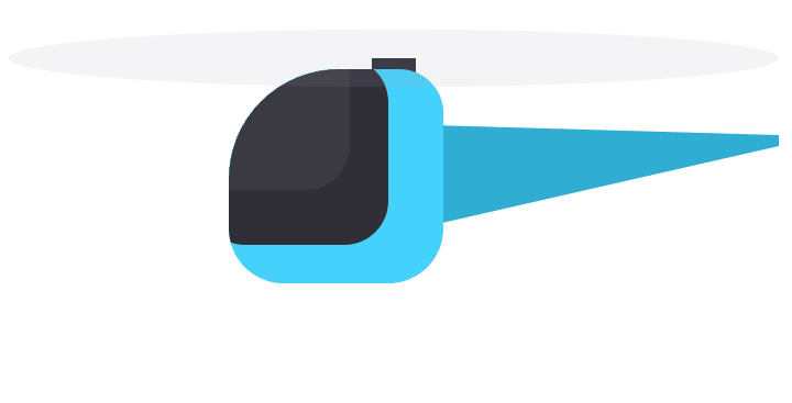
After styling the main rotor, we have to target the two empty div inside this rotor to make this rotor realistic. You will see beautiful animation when we will apply rotate animation in the next lesson.
.rotator div { position: absolute; top: 50%; left: 50%; margin-left: -350px; margin-top: -30px; width: 700px; height: 80px; background-color: #fff;}.rotator div:nth-child(1){ transform: rotate(0deg);}.rotor div:nth-child(2) { transform: rotate(90deg);}Output:
Flying Capability
Up until now, we created our helicopter shape and design. But without animations and keyframes, there is no life. Let's give it flying power.
Defining @Keyframes
Before using the animation property, we need to create keyframes. For this project, we will create two @keyframs called:
- bounce
- rotate
bounce
@keyframes bounce { 0%,100%{ transform: translate(0px, -50px) rotate(-15deg); } 50% { transform: translate(0px, 50px) rotate(-10deg); }} rotate
@keyframes rotate { 0% { transform: rotate(0deg); } 100%{ transform: rotate(360deg); }}Using Animation Property
So far, we defined two @keyframes for our helicopter project. Now, add them in our .helicopter & .rotator class.
.helicopter class
.helicopter { animation: bounce 5s infinite; /* adding bounce keyframes with duration 5s and infinite loop */} .rotator class
.rotator { position: absolute; width: 700px; height: 700px; border-radius: 350px; animation: rotate 0.6s linear infinite; /* added rotate @keyframs */}Output:
Full Tutorial
You can code along to build this project from scratch by following this video.
Conclusion
So from this article, we learned how to create complex shape and animation using only CSS. You even don't have to touch JavaScript. Hope you enjoy this project. You can subscribe to my YT channel if you are interested in Front-end dev.
Let me know what do you think after completing this project. Feel free to leave a comment below .
You can follow me on:
Twitter
Github
Insta
Happy Coding!
Original Link: https://dev.to/codewithshahan/flying-helicopter-with-css-animation-2no9
Dev To
 An online community for sharing and discovering great ideas, having debates, and making friends
More About this Source Visit Dev To