
An Interest In:
Web News this Week
- April 23, 2024
- April 22, 2024
- April 21, 2024
- April 20, 2024
- April 19, 2024
- April 18, 2024
- April 17, 2024
Some of Our Sources
- Slashdot
- Smashing Magazine
- Vandelay Design
- Inspiredology
- FanExtra - PSD
- Noupe
- Wal You
- Specky Boy
- Spyre Studios
- The Verge
Help Webnuz
Referal links:
Custom styling similar to Android for iOS
Motivation
When deciding the architecture for Playtomic mobile apps we took the approach of creating shared architecture with native apps (you can read more about it here).
But this doesn't only apply to code or architecture. Creating a common structure in the way styles and resources are organized not only help developers, but also helps to make Android and iOS code look similar.
How did we achieve that?
Styles in Android
Styles are a set of attributes that could be set to a view. In android these styles are defined inside an XML file in the resources folder.
We can encapsulate some attributes in a style...
<style name="custom_style" parent="@style/Widget.AppCompat.Button.Borderless"> <item name="android:layout_height">60dp</item> <item name="android:paddingStart">@dimen/small_horizontal</item> <item name="android:paddingEnd">@dimen/small_horizontal</item> <item name="android:textSize">14sp</item> <item name="android:fontFamily">@font/playtomic_semibold</item> <item name="android:gravity">center</item> <item name="android:textColor">@drawable/button_main_text_color</item> <item name="android:background">@drawable/button_primary_background</item> </style>... apply the style to the view ...
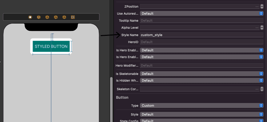
<Button android:id="@+id/social_profile_follow_button" android:layout_width="160dp" style="@style/social_button_primary" android:text="STYLED BUTTON" />or
... and get a customized component:
Styles are a good way to reuse resources and keep visual coherence inside the app. They also help to keep clean the layout files.
R class in iOS
All resources in Android are referenced in a static class called R, so accessing to individual resources is pretty easy using R.[typeOfResource].resourceName.
For iOS we use a library that does something similar, is called R.swift
With that we can access resources in iOS using an 'Android like' sintax
//Instead of let icon = UIImage(named: "settings-icon")let font = UIFont(name: "San Francisco", size: 42)let color = UIColor(named: "indicator highlight")//R.swift allows us to uselet icon = R.image.settingsIcon()let font = R.font.sanFrancisco(size: 42)let color = R.color.indicatorHighlight()Creating Android Styles in iOS
To achieve something similar as the Android styles in iOS we need to create a structure containing the possible attributes for a view, then use an @IBInspectable for being able to set the style in the storyboard and, last but not least, apply the style to the view.
So, for the style, we create an structure like this one:
public struct Style { public let parent: String? public let font: UIFont? public let textColors: [UIControl.State: UIColor]? public let textAlignment: NSTextAlignment? public let alphaLevel: CGFloat? public let images: [UIControl.State: UIImage]? public let backgroundColor: UIColor? public let backgroundImages: [UIControl.State: UIImage]? public let tintColor: UIColor? public let capitalize: Bool? public let cornerRadius: CGFloat? public let borderColor: UIColor? public let height: CGFloat? public let drawableStart: UIImage?//...}Some caveats here:parent: In Android one style can inherit properties from another, in iOS we will use this parent to be able to do that.textColors, images and backgroundimages are arrays because in Android they can be selectors (have a different value based on the state of the view).
To keep it in the Android style, we create a extension to the R class created by R.swift to store the styles:
public extension R { struct style {} struct color {}}public extension R.style { static let appStyles: [String: Style] = [ "custom_style": Style( font: R.font.playtomicSemibold(size: 14), textColors: [ .normal: R.color.playtomicSocial.socialWhite(), .highlighted: R.color.playtomicSocial.socialWhite(), .selected: R.color.playtomicSocial.socialWhite(), .disabled: R.color.playtomicSocial.socialWhite().withAlphaComponent(0.4) ], backgroundColor: UIColor.clear, backgroundImages: [ .normal: R.image.socialColor.social_primary, .highlighted: R.image.socialColor.social_primary_pressed, .selected: R.image.socialColor.social_primary_pressed, .disabled: R.image.socialColor.social_primary_disabled ], cornerRadius: 4, height: 180 ) ]}With this we have the style defined. Now we need to link styles and views.
To do that magic we create an extension to View containing an @IBInspectable that is going to be used to get the style name from the Interface Builder.
Then we will look for that style in the previous defined map and apply it to the view.
How?
First, let's see the extension:
public extension UIView { @IBInspectable var styleName: String? { get { return nil } set { guard let name = newValue else { return } applyStyle(name: name) } func applyStyle(_ style: Style) { style.parent.map { applyStyle(name: $0) } if let view = self as? UIView { applyStyle(style, view: view) } if let label = self as? UILabel { applyStyle(style, label: label) } if let button = self as? UIButton { applyStyle(style, button: button) } //... }What are we doing there?
After setting the value in the storyboard we apply the style to the view and then, based on the view type, we set the style attributes to each concrete type of view:
//We set the attributes that are common to all the viewsprivate func applyStyle(_ style: Style, view: UIView) { style.backgroundColor.map { view.backgroundColor = $0 } style.cornerRadius.map { view.cornerRadius = $0 } style.alphaLevel.map { view.alphaLevel = $0 } //...}//And then, the particular attributes to each kind of view: //UILabelprivate func applyStyle(_ style: Style, label: UILabel) { style.font.map { label.font = $0 } style.capitalize.map { label.capitalize = $0 } //...}//UIButtonprivate func applyStyle(_ style: Style, button: UIButton) { assert(button.buttonType == .custom, "Button type for '\(button.titleLabel?.text ?? "")' is not custom") style.font.map { button.titleLabel?.font = $0 } style.textColors?.forEach { state, color in button.setTitleColor(color, for: state) } style.images?.forEach { state, image in button.setImage(image, for: state) } style.backgroundImages?.forEach { state, image in button.setBackgroundImage(image, for: state) } style.capitalize.map { button.titleLabel?.capitalize = $0 } //...}Result
What do we get?
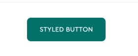
A beautiful and fully customized button!
But not only that, now we also have a place where we can set app styles that could be easily applied to the views and a style structure that resembles Android and makes styling apps easier.
Original Link: https://dev.to/ude/custom-styling-similar-to-android-for-ios-4ddf
Dev To
 An online community for sharing and discovering great ideas, having debates, and making friends
More About this Source Visit Dev To