
An Interest In:
Web News this Week
- March 21, 2024
- March 20, 2024
- March 19, 2024
- March 18, 2024
- March 17, 2024
- March 16, 2024
- March 15, 2024
Some of Our Sources
- TutsPlus - Code
- Six Revisions
- Creative Curio
- Naldz Graphics
- Noupe
- Reencoded
- Wal You
- Design Modo
- Android Dissected
- Android Headlines
Help Webnuz
Referal links:
Autocomplete through ReactJS Custom Hook
Autocomplete is a software feature that makes some suggestions based on what the user is currently typing. This functionality is widely used, from search engines to online shops.
This article shows how to use ReactJS custom Hook to enable simple autocomplete on a country search input.
UI structure
We have an input that aims to help users search for a country name. As the user types, we want to show some suggestions.

The following shows the code's structure and styling of the search form:
// src/autocomplete/index.jsimport styled from 'styled-components';import { ReactComponent as SearchIcon } from './search-icon.svg';import countries from './countries';const SearchForm = () => { const handleSubmit = (e) => { e.preventDefault(); }; return ( <div> <Form autoComplete="off" // disable the browser built-in autocomplete onSubmit={handleSubmit} > <Container> <Input/> <SubmitButton> <SearchIcon /> </SubmitButton> </Container> </Form> </div> );};const Container = styled.div` position: relative;`;const List = styled.div` position: absolute; top: 100%; left: 0; right: 0; height: 40vh; background-color: #293241; border-radius: 0 0 5px 5px; overflow-y: scroll;`;const Item = styled.div` border-left: 3px solid ${({ active }) => (active ? 'blue' : 'initial')}; background-color: ${({ active }) => (active ? 'gray' : 'initial')}; padding: 0 15px; color: ${({ active }) => (active ? 'white' : '#f2e9e4')}; cursor: pointer; &:hover { background-color: gray; }`;const Input = styled.input` background-color: #293241; color: #f2e9e4; border: none; width: 400px; padding: 15px 15px; border-radius: 5px 0 0 0; &:focus { outline: none; }`;const Match = styled.strong` color: #c9ada7;`;const Form = styled.form` width: 100vw; height: 100vh; background-color: #4a4e69; padding-top: 10%; display: flex; align-items: flex-start; justify-content: center;`;const SubmitButton = styled.button` outline: none; background-color: #293241; padding: 15px 20px; border: none; color: #f2e9e4; border-radius: 0 5px 0 0; &:focus { outline: none; }`;export default Autocomplete;The useAutocomplete Hook
useAutocomplete is the custom Hook that will be responsible for the autocomplete logic. First, we handle the search input value change:
// src/autocomplete/useAutocomplete.jsimport { useState } from 'react';const INITIAL_STATE = { value: '',};const useAutocomplete = () => { const [{ value }, setState] = useState(INITIAL_STATE); const handleValueChange = (newValue) => { setState((s) => ({ ...s, value: newValue, })); }; return { value, handleValueChange, };};export default useAutocomplete;Now let's use it in the search input:
// src/autocomplete/index.js//...import useAutocomplete from './useAutocomplete';const SearchForm = () => { const { value, handleValueChange } = useAutocomplete(); //... return ( <div> //... <Input value={value} onChange={(e) => handleValueChange(e.target.value)} /> //... </div> );};Secondly, we filter the country's names. We get the list of countries as an argument for the handleValueChange function. The result of the filtering, that is, the suggestions, is stored in the Hook's state:
// src/autocomplete/useAutocomplete.js// ...const INITIAL_STATE = { // ... suggestions: [], // contains autocomplete suggestions};const useAutocomplete = () => { const [{ value, suggestions }, setState] = useState(INITIAL_STATE); const handleValueChange = (newValue, items) => { setState((s) => ({ ...s, value: newValue, suggestions: items .filter((item) => { /* if the letters typed by the user match the beginning of the item we keep it */ const match = item.substr(0, newValue.length); return match && match.toLowerCase() === newValue.toLowerCase(); }) .slice(0, 13), // limits the suggestion to 13 items })); }; return { // ... suggestions, // exports the suggestions };};// ...While the user types, we want to style the matching part differently from the rest of each suggestion. To achieve that, we change the suggestion items data structure as follow:
// src/autocomplete/useAutocomplete.js// ... const handleValueChange = (newValue, items) => { setState((s) => ({ // ... suggestions: items .filter((item) => { // ... }) .map((item) => ({ rest: item.substr(newValue.length), itemValue: item })) .slice(0, 13), // ...The caller of handleValueChange might want to provide a custom filtering function. Let's extract the current filtering logic in a separate function and accept a custom filtering function as an option:
// src/autocomplete/useAutocomplete.js// ...const defaultFilter = (inputValue, items) => items .filter((item) => { const match = item.substr(0, inputValue.length); return match && match.toLowerCase() === inputValue.toLowerCase(); }) .map((item) => ({ rest: item.substr(inputValue.length), itemValue: item, })) .slice(0, 13);const useAutocomplete = () => { // ... const handleValueChange = (newValue, items, { customFilter } = {}) => { // uses customFilter if defined const filter = customFilter ?? defaultFilter; setState((s) => ({ // ... suggestions: filter(newValue, items), })); };//...Now, we can show the suggestions to the user:
// src/autocomplete/index.js// ...const SearchForm = () => { const { value, handleValueChange, suggestions } = useAutocomplete() const hasSuggestions = !(Array.isArray(suggestions) && !suggestions.length); // ... <Input value={value} onChange={(e) => handleValueChange(e.target.value, data)} /> <SubmitButton> <SearchIcon /> </SubmitButton> {hasSuggestions && ( <List> {suggestions.map(({ rest, itemValue }, i) => ( <Item key={itemValue}> <Match>{value}</Match> {rest} </Item> ))} </List> )}// ...
The next thing we want is to select one of the suggestions when we click on it. Let's create a select function in the useAutocomplete Hook:
// src/autocomplete/useAutocomplete.js// ...const useAutocomplete = () => { // ... const select = (value) => setState({ ...INITIAL_STATE, value }); return { // ... select, };};// ...The following manage the click event on each suggestion item:
// src/autocomplete/index.js// ...const SearchForm = () => { // imports the select function const { ..., select } = useAutocomplete(); // ... {suggestions.map(({ rest, itemValue }, i) => ( <Item key={itemValue} onClick={() => select(itemValue)}>// ...An autocomplete input usually allows us to move through the suggestion items using the up and down arrow keys. Also, we can select an active suggestion by pressing the "enter" key. We'll add all these features to our search input.
As we move between suggestions, we need to keep track of the current active suggestion in the Hook's state:
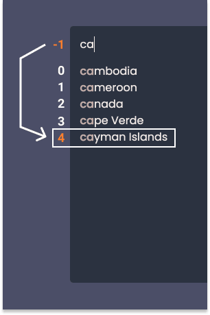
// src/autocomplete/useAutocomplete.jsconst INITIAL_STATE = { // ... currentFocus: null,};Initially, currentFocus is set to null. It means there is no focus at all. As the user starts to type, we want the currentFocus to be -1. In this case, the focus is on the input itself.
Why do we need to consider the text input as a focus-able element? To understand, let's consider a specific case. Say a user starts to type and notices that the suggestion at the very bottom matches what the user is looking for. When the user presses the up arrow key, we want the focus to jump straight to the last suggestion.
Apart from null and -1, currentFocus hold the index of the active suggestion.
With that in mind, the following update the handleValueChange function:
// src/autocomplete/useAutocomplete.js// ...const useAutocomplete = () => {// ... const handleValueChange = (newValue, items) => { setState((s) => ({ ...s, currentFocus: -1, // the focus is on the search input at the beginning value: newValue, // ...Then, we handle three types of keys down events:
- ArrowUp
- ArrowDown
- Enter
// src/autocomplete/useAutocomplete.js// ...const useAutocomplete = () => { const [{ value, suggestions, currentFocus }, setState] = useState(INITIAL_STATE); // ... const handleKeyDown = ({ key }) => { switch (key) { case 'ArrowDown': setState((s) => ({ ...s, currentFocus: s.currentFocus === s.suggestions.length - 1 ? 0 : s.currentFocus + 1, })); break; case 'ArrowUp': setState((s) => ({ ...s, currentFocus: s.currentFocus === 0 || s.currentFocus === -1 ? s.suggestions.length - 1 : s.currentFocus - 1, })); break; case 'Enter': if (currentFocus !== null && currentFocus !== -1) { select(suggestions[currentFocus].itemValue); } break; default: break; } }; return { // ... handleKeyDown, currentFocus, };};// ...For the ArrowDown event we check if the active suggestion is at the very bottom: s.currentFocus === s.result.length - 1. If this is the case, we jump to the very top suggestion of index 0 otherwise we move to the next suggestion (s.currentFocus + 1).
With the ArrowUp event, the process is similar but the other way around. If the current focus is on the first suggestion (s.currentFocus === 0) or the input itself (s.currentFocus === -1) we want to move at the very bottom (s.suggestions.length - 1). If not, we go to the previous suggestion (s.currentFocus - 1).
Next, we handle the Enter event by selecting the current active suggestion's value (
select(suggestions[currentFocus].itemValue)
The following attach the key down handler to our search input:
// src/autocomplete/index.js<Input onKeyDown={handleKeyDown} // .../>Based on the active prop of the styled component, Item, the active suggestion appears differently:
// src/autocomplete/index.js//...{result.map(({ match, rest, value }, i) => ( <Item active={i === currentFocus} // ... >// ...Our simple autocomplete input is now completed.
The complete code can be found in this repo
Conclusion
The useAutocomplete Hook abstracted the autocomplete logic. It took control over the changing input value then created some suggestions. The suggestions have been generated using either a default filtering function or a custom one. Also, useAutocomplete took care of some key-down events.
As a result, we have a clean SearchForm component and gained in code reusability.
Thanks for reading!
Original Link: https://dev.to/nazifbara/autocomplete-through-reactjs-custom-hook-2odo
Dev To
 An online community for sharing and discovering great ideas, having debates, and making friends
More About this Source Visit Dev To