
An Interest In:
Web News this Week
- March 22, 2024
- March 21, 2024
- March 20, 2024
- March 19, 2024
- March 18, 2024
- March 17, 2024
- March 16, 2024
Some of Our Sources
- Techcrunch
- Team Treehouse
- Joshua Blankenship
- Smashing Magazine
- Noupe
- My Ink Blog
- Fudge Graphics
- Android Dissected
- Willems Lab
- TechPowerUp
Help Webnuz
Referal links:
5 Tips for CSS responsive design
Choose Mobile-First Approach For responsive design
The best approach for responsive design is to design a mobile version of your website first.
This allows you to see how the images, text, logos, and other elements will look on smaller screens.
If they display without problems, then you shouldnt have any problems adapting your design to larger screens.
Responsive starts with this meta tag
The first line of code to get started with responsive design is to be placed in the head section of the page. You must start with Responsive Header, placing this code inside the head of the HTML page.
<meta name="viewport" content="width=device-width, initial-scale=1">Concepts covered
- min()
- max()
- clamp()
- box-sizing: border-box
- overflow: hidden
1. Minimum ( min )
min selects the smallest (most negative) value from a list of comma-separated expressions.
For example, in the case of: min(1rem, 50%, 10vw), the browser calculates which of these relative units is the smallest, and uses that value as the actual value.

Reference - web.dev Try out this in codepen
2. Maximum ( Max )
The max() function selects the largest value from a list of comma-separated expressions.
Example: max(50vw, 400px), the browser determines which one is either the largest value respectively.

Reference - web.dev Try out this in codepen
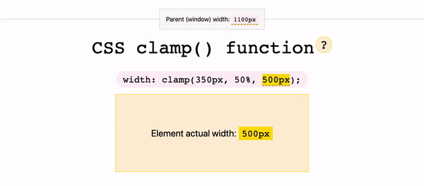
3. Clamping values ( Clamp )
clamp()is the combination of themin()andmax()functions, accepting three parameters:
- the minimum value,
- the preferred value, and
- the maximum value
For example: clamp(45ch, 50%, 75ch)This allows for the browser to determine the width of the paragraph. It will set the width to 50% unless 50% is smaller than 45ch, at which point 45ch will be selected, and visa versa for if 50% is wider than 75ch.
Reference - web.dev Try out this in codepen
4. Box Sizing
One of the God properties of CSS, to overcome your responsive frustrations is box-sizing. It is an essential property for responsive website development.
1. Content box
The size of the box gets elaborate based on the content. When the site is viewed on mobile, the content box grows based on the content which makes the site scroll.
2. Border-box
If you use border-box on an element with a width set in per cent, it will take padding into account, soyoull no longer need to adjust the width.
Needless to say, this trick works best for mobile websites and browsers with CSS3 support.

Reference - Pocket Gopher Try out this in codepen
5. Overflow Properties
Overflow: hidden is a handy CSS property that is helpful in many casesin addition toresponsive design.
Instead of clearing divs,you can clear containers by simply setting the overflow value to hidden.
Overflow: hidden makes value hidden instead of scrolling the content.

Try out this in codepen .
Additional tip
Responsive Images
HTML offers the element that allows us to specify the exact image resource that will be rendered based on the media query we add.
Instead of having one image (usually a large, high-resolution version) sent to all screen sizes and scaling it to the viewport width, we specify a set of images to serve in specific situations.
<picture> <source media="(max-width:1000px)" srcset="picture-lg.png"> <source media="(max-width:600px)" srcset="picture-mid.png"> <source media="(max-width:400px)" srcset="picture-sm.png"> <img src="picture.png" alt="picture"></picture>In this example, picture.png is the full-size image.
From there, we define the next-largest version of the image, picture-lg.png, and the size reduces in descending order until the smallest version, picture-sm.png.
Note that were still using media queries in this approach, but its the element itself that is driving the responsive behaviour rather than defining breakpoints in the CSS.
References
- https://web.dev/min-max-clamp/
- https://www.freecodecamp.org/news/css-properties-examples/
- https://corpocrat.com/2015/11/03/10-cool-css-tricks-for-responsive-design/
- https://www.pixafy.com/blog/5-useful-css-tips-for-responsive-design/
- https://css-tricks.com/beyond-media-queries-using-newer-html-css-features-for-responsive-designs/
Thanks for taking your time and reading this article. This article was originally published in my blog.
If you find this useful kindly like this article and follow me Ramya Chinnadurai on Twitter. Feel free to connect me for sharing your ideas and suggestions.
Original Link: https://dev.to/code_rams/5-tips-for-css-responsive-design-34mb
Dev To
 An online community for sharing and discovering great ideas, having debates, and making friends
More About this Source Visit Dev To