
An Interest In:
Web News this Week
- April 24, 2024
- April 23, 2024
- April 22, 2024
- April 21, 2024
- April 20, 2024
- April 19, 2024
- April 18, 2024
Some of Our Sources
- Engadget
- TutsPlus - Code
- Smashing Magazine
- Smashing Apps
- Fuel Your Creativity
- FanExtra - PSD
- 24 Ways
- Android Dissected
- Android Headlines
- Hashedout
Help Webnuz
Referal links:
Google Charts Dashboard: a Tutorial with an Artistic Touch of MoMA
In this tutorial, we'll learn how to visualize data with Google Charts, a free charting service and JavaScript library by Google. We'll also use Cube, an open-source API for building data apps, to provide access to the public dataset with The Museum of Modern Art collection data. In the end, we'll have a dashboard with charts that tell all about MoMA's contemporary artworks.
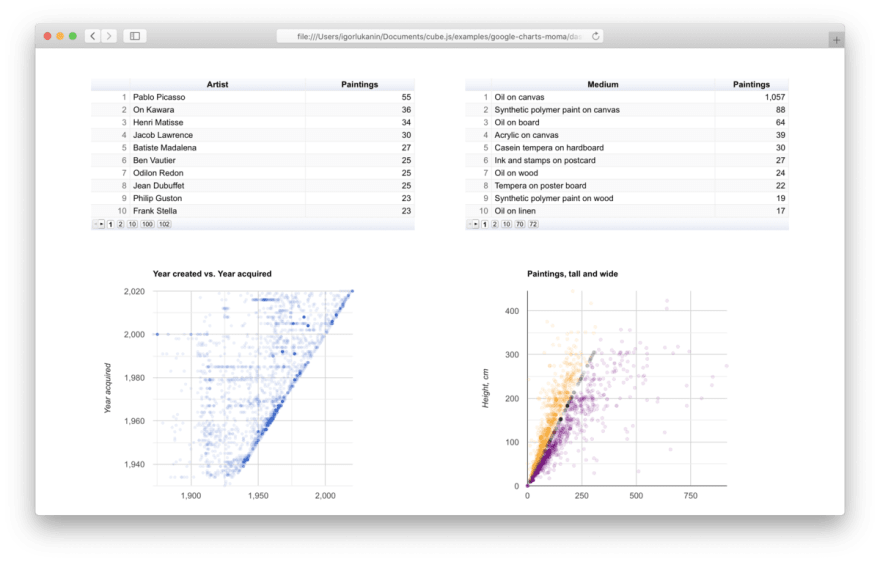
Here's how the end result will look like:

Want to try it? Here's thelive demo you can use right away.Also, the full source code is available onGitHub.
Now we're all set. Please check your ticket and proceed to Floor 1, Charting Gallery
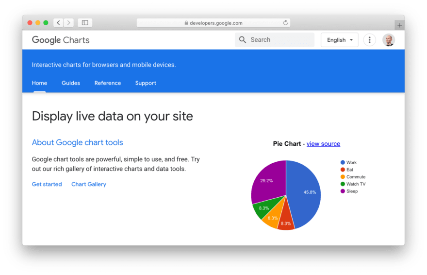
What is Google Charts?
Google Charts is a charting service by Google that provides a rich selection of data visualization types, renders charts using HTML5 and SVG, provides cross-browser compatibility and cross-platform portability (meaning that charts look nice both on desktop and mobile).
Why is it a charting service, not a charting library? Indeed, Google Charts provide a JavaScript library that takes the data and renders charts on the web page. However, unlike other data visualization tools, Google Charts don't render all the charts on the client side. Instead, for some of the charts, they pass the data to Google servers, render a chart there, and then display the result on the page.
Such an approach has its pros:
- Rendering code is browser- and platform-independent which provides increased compatibility and portability. If it renders once, it will render anytime.
- The size of the JavaScript library is fixed and doesn't depend on the features used. And it's actually really tiny less than 20 KB (gzipped).
But it also has its cons:
- For some charts, data has to be uploaded to Google servers for the chart to be rendered. If you deal with sensitive data, please check the Google APIs Terms of Service. Also, make sure to always check the Data Policy sections in the docs. In this tutorial, we'll be using a public dataset, so it's not a big deal.
Which charts are available? Among the usual suspects like line charts, bar charts, or pie charts you can find a few distinctive ones:
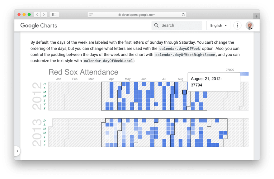
- Calendar charts that you must have seen numerous times at GitHub profiles.
- Gantt charts that you might have wished to never encounter because of their affinity to "enterprise software".
- Diff charts that combine a couple of scatter charts, pie charts, or bar charts into an image that visualizes the difference between two similar datasets.
- Vega charts that provide a way to render charts defined with Vega and Vega-Lite visual grammars in Google Charts.
Enjoying the sight so far? Please proceed to Floor 2, Modern Arts
What is MoMA?
TheMuseum of Modern Art is an art museum in New York, USA. It was established 91 years ago, on November 7, 1929, and it's often identified as one of thelargestand most influential museums of modern art in the world. MoMA's collection includes almost 200,000 works of architectureand design,drawing,painting,sculpture,photography,prints,illustratedbooks,film, andelectronic media.
On GitHub, MoMA publishes and periodically updates a public dataset which contains ~140,000 records, representing all of the works that have been accessioned into MoMAs collection and cataloged in our database. It includes basic metadata for each work (e.g., title, artist, date made, medium, dimensions, and date of acquisition). This dataset is placed in the public domain using a CC0 License (so we're free to use it in this tutorial) and available in CSV and JSON formats.
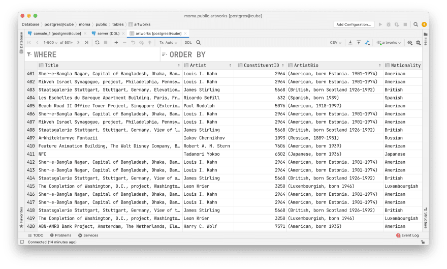
I've imported this dataset to a publicly available Postgres instance that we'll use in a few minutes to explore the data. Proceed to Floor 3, Cubism
What is Cube?
We're building a dashboard, so it would be very convenient to access the data from the front end via an API. Cube comes particularly handy for this purpose.
Cube is a popular open-source product with more than 11,000 stars on GitHub to date. It serves as an API for building data apps. You can configure Cube to connect to any database, describe your data with a declarative data schema, and instantly get an API that you can use in your app.
Let's spin up an API for the MoMA dataset. First, please make sure you haveDockerinstalled on your machine. It's recommended to run Cube withDocker or use a managed instance in Cube Cloud.
Second, let's create a new folder for your Cube app and navigate to it:
mkdir google-charts-momacd google-charts-momaThird, run this snippet to create a newdocker-compose.ymlfile with the configuration. We'll also use environment variables from the.envfile to instruct Cube how to connect to Postgres:
cat > docker-compose.yml << EOLversion: '2.2'services: cube: image: cubejs/cube:latest ports: - 4000:4000 - 3000:3000 env_file: .env volumes: - .:/cube/confEOLThen, run this snippet to create the.envfile with Postgres credentials. In this tutorial, we're using a publicly available Postgres database that I've already set up. Check the docs to learn more about connecting Cube to Postgres or any other database.
cat > .env << EOLCUBEJS_DB_TYPE=postgresCUBEJS_DB_HOST=demo-db-examples.cube.devCUBEJS_DB_NAME=momaCUBEJS_DB_USER=cubeCUBEJS_DB_PASS=12345CUBEJS_API_SECRET=SECRETCUBEJS_DEV_MODE=trueEOLThat is all we need to let Cube connect to Postgres. The last part of configuration is the data schema which declaratively describes the contents of the database. Let's put it under the schema folder:
mkdir schematouch Artworks.jsPlease copy and paste this data schema into Artworks.js, then follow the comments in the file:
cube(`Artworks`, { // Cube definition. // It says that the data is kept in the "artworks" table. // Learn more in the docs: https://cube.dev/docs/schema/getting-started sql: `SELECT * FROM public.artworks`, // Quantitative information about the data, e.g., count of rows. // It makes sense for all rows rather than individual rows measures: { count: { type: `count`, }, minAgeAtAcquisition: { type: `number`, sql: `MIN(${CUBE.ageAtAcquisition})` }, avgAgeAtAcquisition: { type: `number`, sql: `SUM(${CUBE.ageAtAcquisition}) / ${CUBE.count}` }, maxAgeAtAcquisition: { type: `number`, sql: `MAX(${CUBE.ageAtAcquisition})` } }, // Qualitative information about the data, e.g., an artwork's title. // It makes sense for individual rows of data rather than all rows dimensions: { title: { sql: `${CUBE}."Title"`, type: `string` }, artist: { sql: `${CUBE}."Artist"`, type: `string` }, classification: { sql: `${CUBE}."Classification"`, type: `string` }, medium: { sql: `${CUBE}."Medium"`, type: `string` }, // We can use SQL functions here year: { sql: `SUBSTRING(${CUBE}."Date" FROM '[0-9]{4}')`, type: `number` }, date: { sql: `${CUBE}."Date"`, type: `number` }, dateAcquired: { sql: `${CUBE}."DateAcquired"`, type: `time` }, yearAcquired: { sql: `DATE_PART('year', ${CUBE}."DateAcquired")`, type: `number` }, ageAtAcquisition: { case: { when: [ { sql: `${CUBE.yearAcquired}::INT - ${CUBE.year}::INT > 0`, label: { sql: `${CUBE.yearAcquired}::INT - ${CUBE.year}::INT` } } ], else: { label: `0` } }, type: `number` }, heightCm: { sql: `ROUND(${CUBE}."Height (cm)")`, type: `number` }, widthCm: { sql: `ROUND(${CUBE}."Width (cm)")`, type: `number` }, }, dataSource: `default`});Whew! Now we're finally ready to run Cube:
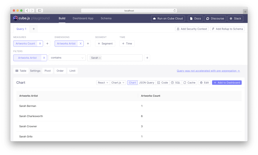
docker compose upNow, let's review the data in the MoMA dataset. Cube provides theDeveloper Playground, a convenient web-based tool that helps explore the data, atlocalhost:4000. Navigate to the Developer Playground in your browser and explore the UI. You can retrieve arbitrary data, slice and dice the dataset by selecting dimensions and measures.
For example, you can check how many artworks MoMA has for the artists that have "Sarah" in their name. To do so, select the Artworks.count measure, the Artworks.artist dimension, and also make sure to add a filter for the Artworks.artist dimension that allows only the names containing "Sarah".
Feel free to tinker with other measures and dimensions. Once you're done, let's get to building the dashboard. Proceed to Floor 4, Abstract Art
Building a dashboard with Google Charts
Now it's time to develop a front-end application telling the story behind the MoMA artworks collection with charts and other types of data visualizations. For simplicity, let's build it with pure JavaScript and without any frameworks (however, unofficial packages are available on NPM for React, Angular, and Vue as well as TypeScript definitions in the DefinitelyTyped repository).
Basic dashboard. First, let's create a subfolder for the dashboard under the google-charts-moma folder:
mkdir dashboard-appcd dashboard-appSecond, let's start with an HTML file with the following contents. You can name it basic.html and put in that dashboard-app folder. We'll go through this file line by line. Follow the comments!
<html><head> <!-- Load Cube API library (UMD version for in-browser use) --> <script type="text/javascript" src="https://unpkg.com/@cubejs-client/[email protected]/dist/cubejs-client-core.umd.js"></script> <!-- Load Google Charts API --> <script type="text/javascript" src="https://www.gstatic.com/charts/loader.js"></script> <script type="text/javascript"> // Cube API token and host. // Change to "http://localhost:4000" to use your own Cube. // See the docs to learn more about authentication: https://cube.dev/docs/security const cubeToken = "eyJhbGciOiJIUzI1NiIsInR5cCI6IkpXVCJ9.eyJpYXQiOjEwMDAwMDAwMDAsImV4cCI6NTAwMDAwMDAwMH0.OHZOpOBVKr-sCwn8sbZ5UFsqI3uCs6e4omT7P6WVMFw"; const cubeHost = "https://heavy-lansford.gcp-us-central1.cubecloudapp.dev"; // Instantiate Cube API client const cubeApi = cubejs(cubeToken, { apiUrl: cubeHost + "/cubejs-api/v1" }); // Load Google Charts API and packages ('corechart' is the main one) google.charts.load('current', { packages: [ 'corechart', 'table' ]}); // Set a callback to run when the Google Visualization API is loaded google.charts.setOnLoadCallback(drawCharts); // Function that creates the charts. // We'll start with just a couple of them function drawCharts() { drawChartForArtworkArtists(); drawChartForArtworkYears(); } // Function that creates a table chart. // See the docs to learn more: https://developers.google.com/chart/interactive/docs/gallery/table function drawChartForArtworkArtists() { // Cube query that will fetch: // artists' names (1) // count of artworks for each artist (2) // but only for those artworks that are labeled as paintings (3) // Learn more about query format in the docs: https://cube.dev/docs/query-format const query = { dimensions: [ "Artworks.artist" // 1 ], measures: [ "Artworks.count" // 2 ], filters: [ { member: "Artworks.classification", operator: "equals", values: [ "Painting" ] // 3 } ] }; // Let's execute the query via the Cube API... cubeApi .load(query) .then(resultSet => { // ...and process the result set. // First, let's turn it into an array of two-element arrays with names and counts const rows = resultSet.tablePivot().map(function(row) { return [ row['Artworks.artist'], parseInt(row['Artworks.count']) ]; }); // Second, let's convert it into Google Charts data table. // Note that we're passing an array of column names as the first row const data = google.visualization.arrayToDataTable([ [ 'Artist', 'Paintings' ], ...rows ]); // Third, let's specify a few options like pagination const options = { showRowNumber: true, page: 'enable', pageSize: 20, width: '100%' }; // Eventually, let's render the chart. // It will be inserted in place of an HTML element with a known id const chart = new google.visualization.Table(document.getElementById('chart__artists')); chart.draw(data, options); }); } // Function that creates a scatter chart. // See the docs to learn more: https://developers.google.com/chart/interactive/docs/gallery/scatterchart function drawChartForArtworkYears() { // Cube query that will fetch: // production years (1) // acquisition years (2) // count of artworks for each "year created" / "year acquired" pair (3) // but only for those artworks that are labeled as paintings (4) // and have known production year and acquisition year (5, 6) const query = { dimensions: [ "Artworks.year", // 1 "Artworks.yearAcquired" // 2 ], measures: [ "Artworks.count" // 3 ], filters: [ { member: "Artworks.classification", operator: "equals", values: [ "Painting" ] // 4 }, { member: "Artworks.yearAcquired", operator: "set" // 5 }, { member: "Artworks.year", operator: "set" // 6 } ] }; cubeApi .load(query) .then(resultSet => { const maxCount = resultSet .tablePivot() .reduce(function(max, row) { return max < row['Artworks.count'] ? row['Artworks.count'] : max; }, 0); const rows = resultSet.tablePivot().map(function(row) { return [ parseInt(row['Artworks.year']), parseInt(row['Artworks.yearAcquired']), 'point { opacity: ' + (row['Artworks.count'] / maxCount).toFixed(1) + '; }' ]; }); // Note that the third "column" of data is special. // It says we'll be passing styles of the dots on the scatter chart const data = google.visualization.arrayToDataTable([ [ 'Year created', 'Year acquired', { type: 'string', role: 'style' } ], ...rows ]); // The chart type is different, and the options are different as well const options = { title: 'Year created vs. Year acquired', hAxis: { viewWindowMode: 'maximized', title: 'Year created' }, vAxis: { viewWindowMode: 'maximized', title: 'Year acquired' }, pointSize: 3, height: 500, width: '100%', legend: 'none' }; new google.visualization .ScatterChart(document.getElementById('chart__years')) .draw(data, options); }); } </script> <title>Google Charts Dashboard</title> <style> body { padding: 5em; } .dashboard { display: grid; grid-template-columns: 1fr; grid-column-gap: 5em; } .group { display: grid; grid-template-columns: 1fr 1fr; grid-column-gap: 5em; } </style></head><body><div class="dashboard"> <!-- Charts within the dashboard --> <div class="group"> <div id="chart__artists"></div> <div id="chart__years"></div> </div></div></body></html>Here's what you should get once you save the contents of this file and open it in the browser. It's a table and a fancy diagonal chart because it's unlikely that MoMA can acquire an artwork before it was created, right?

Less than 200 lines of code allowed us to include all libraries, query an API, transform the data, configure charts, and render them side-by-side on the page. Not that bad!
However, I wouldn't call it a full-fledged dashboard until it allows interaction with elements and change how the data is represented. Let's explore how to work with events and cross-link the charts.
Interactive dashboard. Please create another file, you can call it index.html. It will contain 2-3 more lines of code, so we'll have more charts and some bits of code that allow working with events. Copy and paste the code from GitHub and let's go through the most interesting parts together.
Now we have many charts and many functions to draw them:
function drawCharts(artistFilters) { drawChartForArtworkArtists(artistFilters); drawChartForArtworkMediums(artistFilters); drawChartForArtworkYears(artistFilters); drawChartForArtworkWidthsHeights(artistFilters); drawChartForArtworkAcquisitions(artistFilters); drawChartForArtworkAcquisitionsIn1964(artistFilters); drawChartForArtworkAcquisitionsAge(artistFilters);}One of the charts, the table with artists' names, has got an event listener that is fired every time you select one or many table rows or clear the selection. As you can see, we somehow build the filter for the data using the buildQueryFilter function and then pass this filter to every other chart:
google.visualization.events.addListener(chart, 'select', function() { const artistsFilter = buildQueryFilter(resultSet, chart, "Artworks.artist"); drawChartForArtworkMediums(artistsFilter); drawChartForArtworkYears(artistsFilter); drawChartForArtworkWidthsHeights(artistsFilter); drawChartForArtworkAcquisitions(artistsFilter); drawChartForArtworkAcquisitionsIn1964(artistsFilter); drawChartForArtworkAcquisitionsAge(artistsFilter);});Here's how we build the filter. We access selected rows via chart.getSelection(). If there are no rows selected, the filter will be undefined. If there are any, we'll find the values of selected cells and use them as values in the Cube query filter:
function buildQueryFilter(resultSet, chart, member) { const selectedRowNumbers = chart .getSelection() .map(function(x) { return x.row; }); if (selectedRowNumbers.length === 0) return const values = resultSet .tablePivot() .filter(function(row, i) { return selectedRowNumbers.indexOf(i) !== -1 }) .map(function(row) { return row[member] }) return { member, operator: "equals", values };}That's all you need to add interactivity to the dashboard. See how the charts change upon the selection of one or many artists in the first table:
It's a kind of art, isn't it?
Actually, these charts and this whole tutorial are inspired by the work of others that I'd like to mention here: "A Nerds Guide To The 2,229 Paintings At MoMA" by FiveThirtyEight, "MoMA on GitHub" by YYYY-MM-DD, and this tweet by Steven Lubar.
Cleaning Off the Paint
Thank you for reading and following this tutorial! I encourage you to spend some time in the docs and explore what else Google Charts are capable of. You'll find even more chart types, configuration options, and advanced features.
Also, thanks for learning aboutCube and building dashboards. I hope you enjoyed it.
Please don't hesitate to like and bookmark this post, write a comment, and give a star toCubeon GitHub. I hope that you'll try Cube and Google Charts in your next production gig or your next pet project.
Good luck and have fun! Now, proceed to the exit!
Original Link: https://dev.to/cubejs/google-charts-dashboard-a-tutorial-with-an-artistic-touch-of-moma-1jdn
Dev To
More About this Source Visit Dev To