
An Interest In:
Web News this Week
- April 24, 2024
- April 23, 2024
- April 22, 2024
- April 21, 2024
- April 20, 2024
- April 19, 2024
- April 18, 2024
Some of Our Sources
- Techcrunch
- Technology Review
- Simplebits
- Joshua Blankenship
- Spoon Graphics
- Creative Curio
- Fuel Your Creativity
- Line 25
- Web Resource Source
- The Verge
Help Webnuz
Referal links:
Wrapping Angular Material button in custom Angular component (part 1)
I was recently working on a button component as part of a Design System based on Angular Material. While working on this component, I faced some interesting challenges which I would like to share with you in this and following posts.
When you want to build your own Design System on top of Angular Material (or pretty much any other 3rd party component library), you have a couple of options:
- Build a custom Angular Material theme and use the components as they are described in the documentation.
- Build a custom Angular Material theme and build your own component library on top of Angular Material by wrapping their components in your own components.
There are pros and cons with both approaches. That is a topic for another post so Im not going into the details here. Long story short, we went with option 2.
So my task was to wrap an Angular Material button in our own component and expose that for other developers to use in the rest of the app. Interesting, huh?
Lets recreate that component in this series of posts.
Requirements
Well, the first step is to define some basic requirements:
- Call the component
my-button. - Buttons text must go between the opening and closing tags of the component.
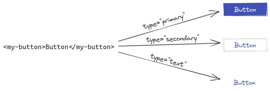
- The button must support three different styles depending on its usage - as a primary, secondary or a text button.
One component or three components?
By reading the second requirement, a valid question might arise. Should we create a single component and control its style with an Input property or three separate components - one for each style? I think having only one component is better because the consumers of the Design System will have only one way to display a button and adding support for more styles later on is easier.
So based on this, two more requirements can be specified:
- The component should have a
typeproperty that takes one of these values - primary, secondary or text. If not specified, the default value should be text. - Depending on the
type, a different button style must be shown. This is illustrated in the image below.
How would you build it?
Implementation
There are a number of ways to approach the problem. In this, and following posts, Im going to share my solution(s). If you have a different solution, questions, or tips that can help me improve my solution(s), please let me know. Ill be happy to learn from you!
Solution 1
Lets start with something simple to see if we can make it work.
// my-button.component.tsimport { Component, Input } from "@angular/core";@Component({ selector: "my-button", templateUrl: "./my-button.component.html",})export class MyButtonComponent { @Input() type: "primary" | "secondary" | "text" = "text";}<!-- my-button.component.html --><ng-container *ngIf="type === 'primary'"> <button mat-flat-button color="primary"> <ng-content></ng-content> </button></ng-container><ng-container *ngIf="type === 'secondary'"> <button mat-stroked-button color="primary"> <ng-content></ng-content> </button></ng-container><ng-container *ngIf="type === 'text'"> <button mat-button color="primary"> <ng-content></ng-content> </button></ng-container>At first, the above solution might look kinda ok. Directives in Angular cannot be applied dynamically based on some logic so ngIf is used to decide which button style to display depending on the value of type.
Demo time (StackBlitz)
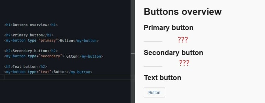
Well, something is clearly not working.
The problem here lies in the way <ng-content> works inside ngIf. If we look at the "Conditional content projection" section in the Angular docs, we can read that [...] when the consumer of a component supplies the content, that content is always initialized, even if the component does not define an <ng-content> element or if that <ng-content> element is inside of an ngIf statement.
What I get out of this is that we cannot use more than one <ng-content> element in the same template when a condition is used to decide where to place the projected content. The recommendation for such scenarios is to use <ng-template>.
So solution 1 cannot be used to implement the requirements. We need to find something else.
Solution 2
In this solution were going to take Angulars recommendation and use <ng-template>. Some minor adjustments in the HTML template are necessary. Components class can stay the same.
<!-- my-button.component.html --><ng-container *ngIf="type === 'primary'"> <button mat-flat-button color="primary"> <ng-container [ngTemplateOutlet]="buttonContent"></ng-container> </button></ng-container><ng-container *ngIf="type === 'secondary'"> <button mat-stroked-button color="primary"> <ng-container [ngTemplateOutlet]="buttonContent"></ng-container> </button></ng-container><ng-container *ngIf="type === 'text'"> <button mat-button color="primary"> <ng-container [ngTemplateOutlet]="buttonContent"></ng-container> </button></ng-container><ng-template #buttonContent> <ng-content></ng-content></ng-template>There are a couple of new things here. First, the <ng-content> inside each button is moved inside the ng-template. Then a template variable #buttonContent that holds a references to the ng-template is defined. Lastly, ngTemplateOutlet is used inside each button to render the given <ng-template>.
Demo time (StackBlitz)
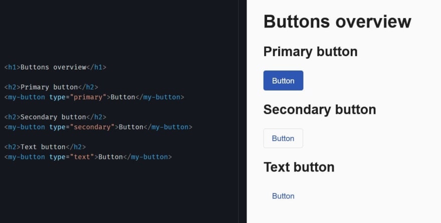
It works! The reason why it works is because Angular will not initialize the content of an <ng-template> element until that element is explicitly rendered.
Is the task done? Should we open a pull request (PR) and call it a day?
Before we do that, lets ask ourselves some questions:
- What are the downsides of this solution?
- Can the component easily be extended to support further requirements like more button styles, displaying of icon(s), disabled and/or loading state, links?
A downside is that the template will grow in size if more button styles have to be supported. The same will happen if the same component should also be used for links (yes, because a button and a link should be one component) Another downside is that the template contains repetitive logic that doesnt belong there - deciding which button style to show using a bunch of ngIfs. There are other Angular APIs that can help us achieve the same result by moving the logic in the components class instead thus keeping the template small and tidy.
As for adding more requirements, thats a valid concern. New use cases come up all the time and some of them will probably need to be supported at some point. Is the component flexible enough to allow that?
Some might stop here and say that the solution is good enough. After all, it fulfills the current requirements. Others might be curious to see other solutions and see how we can extend the component to support more requirements. That is what were going to explore in part 2 (coming soon).
Thanks to Lars Gyrup Brink Nielsen for reviewing this post.
Photo by Chris Lawton on Unsplash
Original Link: https://dev.to/this-is-angular/wrapping-angular-material-button-in-custom-angular-component-part-1-1ph1
Dev To
 An online community for sharing and discovering great ideas, having debates, and making friends
More About this Source Visit Dev To