
An Interest In:
Web News this Week
- April 18, 2024
- April 17, 2024
- April 16, 2024
- April 15, 2024
- April 14, 2024
- April 13, 2024
- April 12, 2024
Some of Our Sources
- Techcrunch
- Simplebits
- Just Creative
- My Ink Blog
- Fudge Graphics
- Wal You
- Specky Boy
- Spyre Studios
- Web Resource Source
- Android Dissected
Help Webnuz
Referal links:
Day 9: Picking the dark-mode color palette for web app buttons logically
TL;DR
To design the dark mode color scheme for buttons on a web app with embedded Google Maps, I apply the same logic, wherever possible, as used for designing the light mode color scheme so that the dark mode UI appears visually consistent with the light mode counterpart.
But Ive learned that there are a couple of things unique about the dark mode.
The opacity level needs to be lower than in the light mode, to achieve a visually similar level of translucency (see Section 2).
Also, the shadows blur radius for the glow effect needs to be longer than in the light mode, to make the glowing light appear natural (see Section 6).
Introduction
I'm designing/coding My Ideal Map App, a web app that improves the user experience of Google Maps (see Day 1 of this blog series for detail).
The app's main user interface embeds Google Maps full-screen, with the buttons for main features positioned at screen corners on top of the map.
The design and coding for these buttons has been described in this blog series:

This article is the third one for button design, describing how I've designed the dark mode color scheme for the buttons.
1. Consistency with light mode
If the color scheme is inconsistent between dark and light modes, the user may perceive each mode as a different app. It'll be the failure of branding the app.
One way to make light and dark modes consistent with each other is to use the same logic behind the choice of color for both modes as much as possible.
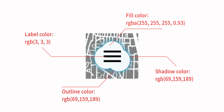
In My Ideal Map App, the light mode color scheme for buttons is as follows:
 Light mode color scheme for button's default state (image source: the author)
 Light mode color scheme for button's focus/hover state (image source: the author)
Each color is chosen for a reason (see Day 7 of this blog series for detail). I follow the same reason wherever possible, to pick the corresponding color for the dark mode.
2. Fill color
For the light mode, I chose rgba(255, 255, 255, 0.93), a semi-transparent white, for the reason as follows:
Clouds are white. Making the button semi-transparent allows the map beneath to be partially visible, creating an impression that the cloud-shaped button is floating over the map. The opacity value of 0.93 is chosen to strike the balance between making it recognized as a button and creating the floating impression. Section 6.1 of Day 7 of this blog series
For the dark mode, a pure white would be too glaring for the user's eye. To avoid any glare, the button's color should have a similar level of luminance to the brightest color on the map, which is the dark orange (#ae6f2f) of streets (see Day 5 of this blog series for detail):

The embedded Google Maps in the dark theme of My Ideal Map App (screenshot by the author)
In the above screenshot, notice how glaring Google Maps's white default search box buttons are against the dark theme of the map.
For the dark theme fill color of buttons, therefore, I pick rgb(123,123,123) whose luminance is similar to the dark orange of streets:

Luminance contrast ratio between rgb(123, 123, 123) and #ae6f2f (image source: contrast-ratio.com)
To reinforce the appearance of a cloud, I want the button to be semi-transparent (as I did for the light mode). I tried several values of opacity, and the opacity of 0.8 looks best, allowing the map beneath to be slightly shown without losing an impression of being a button.
Interestingly, this is lower than the opacity of 0.93 for the daytime color scheme. I've learned that a lower level of overall luminance of the dark theme requires a lower level of opacity to achieve the semi-transparent look.
3. Outline color
For the button's outline in the light mode, I've picked rgb(148,148,148) for the following reason:
The relative luminance in the maps color scheme ranges from 6 of the gray of city blocks (#898989 ) to 21 of the pure white of streets (where the value refers to the contrast ratio against pure black). ... If the cloud-shaped button is above streets on the map, however, it visually merges with them due to the lack of luminance contrast. A solution is to outline the cloud-shaped button with a shade of gray thats just enough to satisfy the 3-to-1 contrast ratio against pure white. Section 6.3 of Day 7 of this blog series
In the dark mode, I've just set the button's fill color to have a similar level of luminance to the color of streets on the map. So the same consideration needs to be applied as in the light mode.
So I add an outline in the same shade of gray as city blocks, #2b2b2b, to the button. Since the color of city blocks and streets was chosen to satisfy the 3-to-1 contrast ratio in luminance (see Section 2.5 of Day 5 of this blog series), this ensures the perceptually distinct button against its background.
4. Shadow color
In the light mode, the button's shadow color is rgba(0,0,0,0.33), a semi-transparent black. This shadow color was chosen so that
the distinction between the button outline and the shadow gets blurry, and the outlines gray will be perceived as part of the shadow. Section 7.5 of Day 7 of this blog series
To implement this design strategy for the dark mode as well, I search for the level of opacity of black whose luminance contrast against the background of dark orange streets on the map will be similar to the dark gray of the button's outline (i.e., #2b2b2b). It turns out that the opacity level of 0.65 does the job:

Luminance contrast between #ae6f2f and rgba(0, 0, 0, 0.65) when the former is used as the background (image source: contrast-ratio.com)

Luminance contrast between #ae6f2f and #2b2b2b (image source: contrast-ratio.com)
But I cannot use rgba(0,0,0,0.65) as the shadow color, because for the button's shadow to be natural-looking, it needs to be three layers of drop shadows with different degrees of blur radius (see Section 7.4 of Day 7 of this blog series for why; see also Ahlin 2019).
To achieve the opacity of 0.65 (or 35% transparency) with three layers of shadow, each layer needs to have the opacity of 0.3 (or 70% transparency), because 0.7 to the power of 3 is close to 0.35. With a positive value of blur-radius, the opacity of a shadow at the edge of a shadowed element is half the value specified. So we need to double the opacity of 0.3 and get rgba(0,0,0,0.6) as the color of shadow.
The CSS declaration for the button's shadow will be as follows:
filter: drop-shadow(0px 0px 1px rgba(0,0,0,0.6)) drop-shadow(0px 0px 2px rgba(0,0,0,0.6)) drop-shadow(0px 0px 4px rgba(0,0,0,0.6)); We use filter: drop-shadow() instead of the box-shadow property because our buttons are made of SVG code (see Olawanle 2021).
This way, the button outline blends nicely into the shadow.
5. Button label color
For the dark mode's button label color, we need a different logic from the light mode. In the light mode, the button's fill color is white, against which a wide range of gray shades are visually distinctive. In the dark mode, however, the button's fill color is a medium shade of gray, against which there is only a limited range of lighter shades of gray with a sufficient level of luminance contrast.
I go for rgb(218,218,218) whose luminance contrast ratio is 3.02 to 1 against the button's fill color of rgb(123,123,123):
 Luminance contrast ratio between
 rgb(123,123,123) and rgb(218,218,218) (image source: contrast-ratio.com)
Let me summarize the dark mode color scheme of the button's default state:

Dark mode color scheme for button's default state (image source: the author)
6. Focus/Hover states style
For the light mode, the button's focus and hover states feature a shade of cyan blue (rgb(69, 159, 189)) as its outline and shadow color, creating a glowing effect. And this color satisfies the 3-to-1 luminance contrast ratio against the button's fill color, that is white.
For the dark mode, I want the button to look illuminated with moonlight when it's in focus. A simple way to go is to use pure white for the single layer of shadow and semi-transparent white for the outline. So I go with the following CSS code:
button:focus #cloud,button:hover #cloud { stroke: rgba(255,255,255,0.4);}button:focus svg,button:hover svg { filter: drop-shadow(0 0 10px rgb(255,255,255));}I use the storke property, not the border, to specify the outline color because the button is drawn with SVG's <path id="#cloud"> element.
I use rgba(255,255,255,0.4) as the outline color. The opacity of 0.4 ensures that the outline is not too obvious.
Then I set the blur radius of 10px for the shadow, larger than the 5px I used for the daytime style. I don't know exactly why, but these adjustments make the glow look more natural than otherwise. Perhaps it's because glowing light appears to spread wider at night than at daytime.
Correspondingly, I set the button label color for the focus/hover states to be pure white (rgb(255,255,255)) as well:
button:focus svg,button:hover svg { fill: rgb(255, 255, 255);}where I use the fill property, not the color property, because the button label is an SVG image.
Let me summarize the dark mode color scheme for the focus/hover states:

Dark mode color scheme for button's focus/hover state (image source: the author)
Pure white may be glaring when seen at night. I'll review this decision as I modify the focus state for the light mode (see Section 8 of Day 7 of this blog series).
7. Active state style
For the light mode, the active state (i.e., the appearance when the user taps/clicks the button) is styled so that it removes the outline and the shadow to make the button flicker briefly in response to the user's action.
There's no reason why we change this for the dark mode. Therefore:
button:active #cloud { stroke: none; } button:active svg { filter: none; }Next step
With the dark mode theme for buttons all set, My Ideal Map App should show its dark mode UI as follows:

Dark mode buttons on the dark mode embedded Google Maps (screenshot by the author)
It should be a piece of cake to implement the dark mode UI with CSS and JavaScript: the standard technique is to use CSS variables with attribute selectors and to toggle the attribute when switching on and off the dark mode (see Adhuham 2020 and Dodds 2020).
Well, that was my initial thought. And I was wrong...
(To be continued to the next article of this blog series.)
References
Adhuham (2020) A Complete Guide to Dark Mode on the Web, CSS-Tricks, Jul 1, 2020.
Ahlin, Tobias (2019) Smoother & sharper shadows with layered box-shadows, tobiasahlin.com, Sep 19, 2019.
Dodds, Kent C. (2020) Use CSS Variables instead of React Context, Epic React, Oct 2020.
Olawanle, Joel (2021) Adding Shadows to SVG Icons With CSS and SVG Filters, CSS-Tricks, Jun 11, 2021.
Original Link: https://dev.to/masakudamatsu/day-9-picking-the-dark-mode-color-palette-for-web-app-buttons-logically-mao
Dev To
 An online community for sharing and discovering great ideas, having debates, and making friends
More About this Source Visit Dev To