
An Interest In:
Web News this Week
- April 21, 2024
- April 20, 2024
- April 19, 2024
- April 18, 2024
- April 17, 2024
- April 16, 2024
- April 15, 2024
Some of Our Sources
- BoingBoing
- Engadget
- Pearsonified
- The Logo Smith
- Smashing Magazine
- Abduzeedo
- Reencoded
- Freelance Switch
- Codrops
- Dev To
Help Webnuz
Referal links:
Confused About rem and em units in CSS?
rem and em units in CSS is creating confusion for beginners,
Most beginners don't understand the correct meaning of both units and then use them without thinking much and it creates lots of problems for them.
em and rem both are known as relative units in CSS.
You've probably been using em and rem units now for a while already, but still, you might be confused about which unit is best in which scenario.
What is em?
An em value is equal to the computed font size of the parent of that element. example if font size of parent element is 20 px then 1em is equal to 20px.
if the font size is not specified in the parent element then it will look continues up until the root element.
Root element font size is provided by the browser and by default it is 16px.
in this case, 1em is equal to 16px.
compounding effect of em -
check the below challenge, and then jump on the answer and understand how em works.
 CSS challenge for Everyone
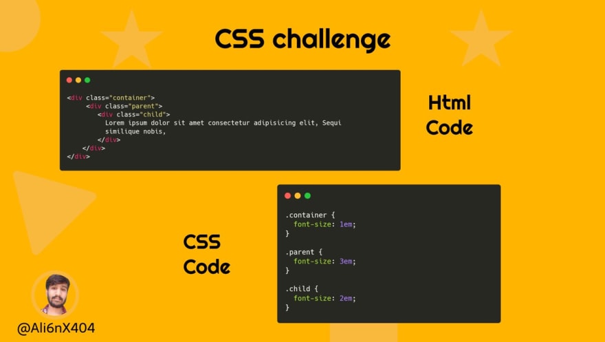
Tell the exact computed font size of the child element?
HTML & CSS code below16:37 PM - 05 Oct 2021


We have three divs, container, parent, and child and respectively are specified font-size 1em, 3em, and 2em.
font-size of container is 1em eqaul to 16px.
font size of parent is 3em means 3 * 16px ( parent font-size) so it becomes 48px now.
font size of child is 2em means 2 * 48px ( size of parent element) so it becomes 96px now.
the final size of the child becomes 96px, power of compounding.
check live example
let's see this in action

What is rem?
While em is relative to the font size of its direct or nearest parent, rem is only relative to the Html (root) font size.
by default, it is 16px until we didn't specify in the Html element.
rem value is not much convenient when it comes to specifying such as
1rem = 16px
But what if we want to use 10px than we need to calculate the rem value which is equal to 0.625rem.
To solve this problem we have one trick, specify the Html element font size as 62.5%.
than our 1rem becomes 10px and now we are able to calculate size easily.
Which is better?
Theres no better unit really, and it all depends on your personal choice. Some people like to use rem units for consistency and scalability,
while some like to use em units in places where the influence of nearby parent elements would make sense.
I personally use rem more than em but be careful with both, em becomes a trouble when you don't understand the relation between parents and child,
and we already see the example of compounding effect in em. so I like to say use rem more often than em.
If you want to calculate the accurate size in rem and em, then pxtoem website is pretty useful.
Conclusion -
Trying both units and understanding the use cases is most important. I would like to suggest you play with both units and understand both of them.
Let's Connect -
Original Link: https://dev.to/ali6nx404/confused-about-rem-and-em-units-in-css-26go
Dev To
 An online community for sharing and discovering great ideas, having debates, and making friends
More About this Source Visit Dev To