
An Interest In:
Web News this Week
- April 24, 2024
- April 23, 2024
- April 22, 2024
- April 21, 2024
- April 20, 2024
- April 19, 2024
- April 18, 2024
Some of Our Sources
- Team Treehouse
- Smashing Magazine
- Smashing Apps
- TutsPlus - Design
- Vandelay Design
- You The Designer
- Fuel Your Creativity
- Inspiredology
- Line 25
- Freelance Switch
Help Webnuz
Referal links:
Create a Responsive Landing Page using HTML CSS & JS

Hello, Dear developers , Today we'll see, how we can easily create another Responsive Landing page using HTML, CSS, and JS with GreenSock Animation library for creating those animations.
Making a landing page with HTML & CSS is a pretty easy & simple task, but did you know what makes our post more interesting! Okay, will discuss it.
But Before that, For demo with code tutorial. You can watch the video below.
Code Tutorial
If you want to see more web design tutorials just like these! Please consider subscribing to our Youtube Channel.
Source Code for this post is available on Github with all images and much more so please visit the below-given link to get source code
So in this coding blog post, we cover the two most fundamental & modern layout building systems which are CSS Flexbox & CSS Grid.
Did you know that what is the main difference between?
If yes you're an absolute genius but if no, let me explain to you in simple words that is CSS Flexbox is a one Dimensional Layout system, while CSS grid is a Two Dimensional Layout system.
Okay , that's it for now! Let's get into the coding part for which we are here!!!
Starting with our project folder structure first 
Typically we have used 4 external libraries which includes
- Remixicon-An Open Source icons library.
- Google Fonts-a font embedding service library.
- Animate on scroll-Small library to animate elements on your page as you scroll.
- GSAP by GreenSock-Create Professional-grade JavaScript animation for the modern web.
So from the above project folder structure, we required index.html, style.css, script.js & IMG folder where a single image file is stored.
So after creating those files let's jump into your favorite code editor.
First of all, we will look at making some basic changes in our CSS file which includes resets of the root, HTML & variables.
Style.css
/* ==== "Inter" FONT-FAMILY FROM FONTS.GOOGLE.COM ==== */@import url("https://fonts.googleapis.com/css2?family=Inter:wght@400;500&display=swap");/* ==== ROOT RESET ==== */* {margin: 0;padding: 0;box-sizing: border-box;font-family: "Inter", sans-serif;}*,*::before,*::after {box-sizing: border-box;}/* ==== CSS VARIABLES ==== */:root {-primary-color: #335eea;-link-color: #506690;-btn-hover-color: #2b50c7;-lg-heading: #161c2d;-text-content: #869ab8;-fixed-header-height: 4.5rem;}/* ==== RESET HTML ==== */body {width: 100%;height: 100vh;overflow-x: hidden;background-color: #fafbfb;}ul li {list-style-type: none;}a {text-decoration: none;}button {background-color: transparent;border: none;outline: none;cursor: pointer;}Okay Nice! we are moving further to add skeleton that is to add HTML.
so come inside in our index.html file to make add basic markup.
index.html
<!DOCTYPE html><html lang="en"><head><meta charset="UTF-8" /><meta http-equiv="X-UA-Compatible" content="IE=edge" /><meta name="viewport" content="width=device-width, initial-scale=1.0" /><title>Responsive Landing Page using HTML, CSS & Javascript</title><!-==== STYLE.CSS ==== <link rel="stylesheet" href="./css/style.css" /><!-==== REMIXICON CDN ==== <link href="https://cdn.jsdelivr.net/npm/[email protected]/fonts/remixicon.css" rel="stylesheet" /><!-==== ANIMATE ON SCROLL CSS CDN ==== <link href="https://unpkg.com/[email protected]/dist/aos.css" rel="stylesheet" /></head><body><!-==== ANIMATE ON SCROLL JS CDN <script src="https://unpkg.com/[email protected]/dist/aos.js"></script><!-==== GSAP CDN ==== <script src="https://cdnjs.cloudflare.com/ajax/libs/gsap/3.8.0/gsap.min.js"></script><!-==== SCRIPT.JS ==== <script src="./script.js" defer></script></body></html>Okay Great! Now moving a bit further to make our navbar,
Did you know that? Navigation bar is a section of a graphical user interface intended to aid visitors in accessing information.
Okay , Now Let's add markup for navbar inside index.html file
index.html
<!DOCTYPE html><html lang="en"><head><meta charset="UTF-8" /><meta http-equiv="X-UA-Compatible" content="IE=edge" /><meta name="viewport" content="width=device-width, initial-scale=1.0" /><title>Responsive Landing Page using HTML, CSS & Javascript</title><!-==== STYLE.CSS ==== <link rel="stylesheet" href="./css/style.css" /><!-==== REMIXICON CDN ==== <linkhref="https://cdn.jsdelivr.net/npm/[email protected]/fonts/remixicon.css" rel="stylesheet" /><!-==== ANIMATE ON SCROLL CSS CDN ==== <link href="https://unpkg.com/[email protected]/dist/aos.css" rel="stylesheet" /></head><body><!-==== HEADER ==== <header class="container header"><!-==== NAVBAR ==== <nav class="nav"><div class="logo"><h2>Devkit.</h2></div><div class="nav_menu" id="nav_menu"><button class="close_btn" id="close_btn"><i class="ri-close-fill"></i></button><ul class="nav_menu_list"><li class="nav_menu_item"><a href="#" class="nav_menu_link">account</a></li><li class="nav_menu_item"><a href="#" class="nav_menu_link">about</a></li><li class="nav_menu_item"><a href="#" class="nav_menu_link">service</a></li><li class="nav_menu_item"><a href="#" class="nav_menu_link">contact</a></li></ul></div><button class="toggle_btn" id="toggle_btn"><i class="ri-menu-line"></i></button></nav></header><!-==== ANIMATE ON SCROLL JS CDN <script src="https://unpkg.com/[email protected]/dist/aos.js"></script><!-==== GSAP CDN ==== <script src="https://cdnjs.cloudflare.com/ajax/libs/gsap/3.8.0/gsap.min.js"></script><!-==== SCRIPT.JS ==== <script src="./script.js" defer></script></body></html>
Let's Add styles on it took look more better.
Style.css
/* ==== CONTAINER ==== */.container {width: 100%;}@media screen and (min-width: 1040px) {.container {width: 1040px;margin: 0 auto;}}/* ==== HEADER ==== */.header {height: var(-fixed-header-height);padding: 0 1.7rem;}/* ==== NAV ==== */.nav {width: 100%;height: 100%;display: flex;align-items: center;justify-content: space-between;}/* ==== LOGO ==== */.logo h2 {font-size: 28px;color: var(-primary-color);}/* ==== NAV-MENU ==== */.nav_menu_list {display: flex;align-items: center;}.nav_menu_list.nav_menu_item {margin: 0 2rem;}.nav_menu_item.nav_menu_link {font-size: 16.5px;line-height: 27px;color: var(-link-color);text-transform: capitalize;letter-spacing: 0.5px;}.nav_menu_link:hover {color: var(-primary-color);}.toggle_btn {font-size: 20px;font-weight: 600;color: var(-lg-heading);z-index: 4;}.nav_menu,.close_btn {display: none;}.show {right: 3%!important;}Result

Now final move to make it responsive to diffrent on devices,
So to achieve this we need to add some media queries to our navbar, come inside in our style.css file and make so changes.
Style.css
/* ==== MEDIA QURIES FOR RESPONSIVE DESIGN ==== */@media screen and (min-width: 768px) {.toggle_btn {display: none;}.nav_menu {display: block;}}@media screen and (max-width: 768px) {.logo h2 {font-size: 23px;}.nav_menu {position: fixed;width: 93%;height: 100%;display: block;top: 2.5%;right: -100%;background-color: #fff;padding: 3rem;border-radius: 10px;box-shadow: 0 0.5rem 1.5rem rgba(22, 28, 45, 0.1);z-index: 50;transition: 0.4s;}.nav_menu_list {flex-direction: column;align-items: flex-start;margin-top: 4rem;}.nav_menu_list.nav_menu_item {margin: 1rem 0;}.nav_menu_item.nav_menu_link {font-size: 18px;}}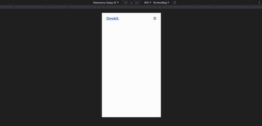
here we go we observe that nav-links we hidden on mobile screen while they were visible on desktop screen. so here we add some little Javascript to make nav-links visible after clicking on toggle menu button
Now come inside our script.js file to add logic
Script.js
const navId = document.getElementById("nav_menu"),ToggleBtnId = document.getElementById("toggle_btn"),CloseBtnId = document.getElementById("close_btn");// ==== SHOW MENU ==== //ToggleBtnId.addEventListener("click", () => {navId.classList.add("show");});// ==== HIDE MENU ==== //CloseBtnId.addEventListener("click", () => {navId.classList.remove("show");});Result in GIF Format

Moving further to make hero section which defines a glimpse of your company and offers.
index.html
<!DOCTYPE html><html lang="en"><head><meta charset="UTF-8" /><meta http-equiv="X-UA-Compatible" content="IE=edge" /><meta name="viewport" content="width=device-width, initial-scale=1.0" /><title>Responsive Landing Page using HTML, CSS & Javascript</title><!-==== STYLE.CSS ==== <link rel="stylesheet" href="./css/style.css" /><!-==== REMIXICON CDN ==== <linkhref="https://cdn.jsdelivr.net/npm/[email protected]/fonts/remixicon.css"rel="stylesheet"/><!-==== ANIMATE ON SCROLL CSS CDN ==== <link href="https://unpkg.com/[email protected]/dist/aos.css" rel="stylesheet" /></head><body><!-==== HEADER ==== <header class="container header"><!-==== NAVBAR ==== <nav class="nav"><div class="logo"><h2>Devkit.</h2></div><div class="nav_menu" id="nav_menu"><button class="close_btn" id="close_btn"><i class="ri-close-fill"></i></button><ul class="nav_menu_list"><li class="nav_menu_item"><a href="#" class="nav_menu_link">account</a></li><li class="nav_menu_item"><a href="#" class="nav_menu_link">about</a></li><li class="nav_menu_item"><a href="#" class="nav_menu_link">service</a></li><li class="nav_menu_item"><a href="#" class="nav_menu_link">contact</a></li></ul></div><button class="toggle_btn" id="toggle_btn"><i class="ri-menu-line"></i></button></nav></header><!-==== HERO ==== <section class="wrapper"><div class="container"><div class="grid-cols-2"><div class="grid-item-1"><h1 class="main-heading">Welcome to <span>Devkit.</span><br />Develop anything.</h1><p class="info-text">Build a beautiful, modern website with flexible components builtfrom scratch.</p><div class="btn_wrapper"><button class="btn view_more_btn">view all pages <i class="ri-arrow-right-line"></i></button><button class="btn documentation_btn">documentation</button></div></div><div class="grid-item-2"><div class="team_img_wrapper"><img src="./img/team.svg" alt="team-img" /></div></div></div></div></section><!-==== ANIMATE ON SCROLL JS CDN <script src="https://unpkg.com/[email protected]/dist/aos.js"></script><!-==== GSAP CDN ==== <script src="https://cdnjs.cloudflare.com/ajax/libs/gsap/3.8.0/gsap.min.js"></script><!-==== SCRIPT.JS ==== <script src="./script.js" defer></script>style.css
/* ==== WRAPPER ==== */.wrapper {width: 100%;padding-left: 1.7rem;padding-right: 1.7rem;padding-top: 5rem;margin-bottom: 5rem;}.grid-cols-2 {width: 100%;height: 100%;display: grid;grid-template-columns: repeat(2, 1fr);gap: 4rem;}.grid-item-1 {padding-top: 5rem;padding-left: 1.5rem;}.main-heading {font-weight: 300;font-size: 40px;line-height: 55px;}.main-heading span {color: var(-primary-color);}.info-text {margin-top: 1.5rem;font-size: 19px;line-height: 28px;color: #334157;}.btn_wrapper {margin-top: 3.5rem;display: flex;width: 100%;}.btn {width: 110px;height: 50px;background-color: var(-primary-color);display: block;font-size: 16px;color: #fff;text-transform: capitalize;border-radius: 7px;letter-spacing: 1px;transition: 0.4s;}.btn:hover {transform: translateY(-3px);background-color: var(-btn-hover-color);}.view_more_btn {width: 180px;height: 55px;display: flex;align-items: center;justify-content: center;font-size: 16px;letter-spacing: 0;color: #fff;font-weight: 500;margin-right: 10px;box-shadow: 0 0.5rem 1.5rem rgba(22, 28, 45, 0.1);}.view_more_btn i {margin-left: 0.7rem;}.view_more_btn:hover {transition: box-shadow 0.25s ease, transform 0.25s ease;}.documentation_btn {width: 150px;height: 55px;font-size: 16px;font-weight: 500;color: #fff;letter-spacing: 0;background-color: #e1e7fc;color: #0e2a86;box-shadow: 0 0.5rem 1.5rem rgba(22, 28, 45, 0.1);}.documentation_btn:hover {background-color: #d7ddf1;transition: box-shadow 0.25s ease, transform 0.25s ease;}.grid-item-2 {width: 100%;height: 100%;}.team_img_wrapper {width: 500px;max-width: 100%;height: 440px;}.team_img_wrapper img {width: 100%;height: 100%;object-fit: contain;}@media screen and (max-width: 768px) {.logo h2 {font-size: 23px;}.nav_menu {position: fixed;width: 93%;height: 100%;display: block;top: 2.5%;right: -100%;background-color: #fff;padding: 3rem;border-radius: 10px;box-shadow: 0 0.5rem 1.5rem rgba(22, 28, 45, 0.1);z-index: 50;transition: 0.4s;}.nav_menu_list {flex-direction: column;align-items: flex-start;margin-top: 4rem;}.nav_menu_list.nav_menu_item {margin: 1rem 0;}.nav_menu_item.nav_menu_link {font-size: 18px;}.close_btn {display: block;position: absolute;right: 10%;font-size: 25px;color: #50689e;}.close_btn:hover {color: #000;}.wrapper {padding: 0 0.7rem;}.grid-item-1 {padding-left: 0rem;}.main-heading {font-size: 35px;}.view_more_btn {width: 140px;height: 55px;font-size: 13.5px;margin-right: 1rem;}}@media screen and (max-width: 991px) {.wrapper {padding-top: 3rem;}.grid-cols-2 {grid-template-columns: repeat(auto-fit, minmax(100%, 1fr));}.grid-item-1 {order: 2;display: flex;flex-direction: column;align-items: center;justify-content: center;padding-top: 0;}.main-heading {font-size: 32px;text-align: center;line-height: 40px;}.info-text {font-size: 16px;text-align: center;padding: 0.7rem;}.btn_wrapper {width: 100%;display: flex;align-items: center;justify-content: center;}.grid-item-2 {order: 1;display: flex;flex-direction: column;align-items: center;justify-content: center;}.team_img_wrapper {width: 350px;height: 350px;}}Result


Nice We are making great progress Now let's move on to the final components which is featured info and footer
index.html
<!-==== NAVBAR ==== <!-==== HERO ==== <section class="wrapper"><div class="container"><div class="grid-cols-3"><div class="grid-col-item"><div class="icon"><svgxmlns="http://www.w3.org/2000/svg"fill="none"viewBox="0 0 24 24"stroke="currentColor"><pathstroke-linecap="round"stroke-linejoin="round"stroke-width="2"d="M9.75 17L9 20l-1 1h8l-11-.753M3 13h18M5 17h14a2 2 0 0022V5a2 2 0 0022H5a2 2 0 002 2v10a2 2 0 002 2z"/></svg></div><div class="featured_info"><span>Built for developers </span><p>Lorem ipsum dolor sit amet consectetur adipisicing elit. Temporeratione facilis animi voluptas exercitationem molestiae.</p></div></div><div class="grid-col-item"><div class="icon"><svgxmlns="http://www.w3.org/2000/svg"fill="none"viewBox="0 0 24 24"stroke="currentColor"><pathstroke-linecap="round"stroke-linejoin="round"stroke-width="2"d="M17 14v6m-33h6M6 10h2a2 2 0 0022V6a2 2 0 0022H6a2 2 0 002 2v2a2 2 0 002 2zm10 0h2a2 2 0 0022V6a2 2 0 0022h-2a2 2 0 002 2v2a2 2 0 002 2zM6 20h2a2 2 0 0022v-2a2 2 0 0022H6a2 2 0 002 2v2a2 2 0 002 2z"/></svg></div><div class="featured_info"><span>Designed to be modern</span><p>Lorem ipsum dolor sit amet consectetur adipisicing elit. Utipsum esse corrupti. Quo, labore debitis!</p></div></div><div class="grid-col-item"><div class="icon"><svgxmlns="http://www.w3.org/2000/svg"fill="none"viewBox="0 0 24 24"stroke="currentColor"><pathstroke-linecap="round"stroke-linejoin="round"stroke-width="2"d="M10 20l416m4 4l4 44 4M6 16l-44 44"/></svg></div><div class="featured_info"><span>Documentation for everything</span><p>Lorem ipsum dolor sit amet consectetur adipisicing elit. Nonnostrum voluptate totam ipsa corrupti vero!</p></div></div></div></div></section><footer></footer>style.css
/* ==== RESET CSS ==== *//* ==== Navbar ==== *//* ==== Hero Section ==== *//*.....*/.grid-cols-3 {width: 100%;height: 100%;display: grid;grid-template-columns: repeat(3, 1fr);column-gap: 3rem;row-gap: 2rem;padding: 1rem;}.grid-col-item {height: 100%;}.icon {width: 100%;line-height: 40px;}.icon svg {width: 30px;height: 30px;color: #6b85d8;}.featured_info {width: 100%;}.featured_info span {width: 100%;display: block;font-size: 21px;line-height: 33px;color: var(-lg-heading);}.featured_info p {display: block;width: 100%;margin-top: 7px;font-weight: 400;color: #334157;line-height: 25px;font-size: 15.5px;}footer {width: 100%;background-color: var(-primary-color);height: 12px;margin-top: 8rem;}@media screen and (max-width: 768px) {.grid-cols-3 {grid-template-columns: repeat(auto-fit, minmax(100%, 1fr));}.featured_info p {line-height: 23px;font-size: 14px;}}@media screen and (max-width: 991px) {.featured_info span {font-size: 19px;}}Result

Now we come to a very end in this post, Now Let's add Animate on scroll properties, in order to add them first we have to add them with the data- attribute in our HTML file and late we have initialized them inside script js.
Let's make little change at our featured section that is
<section class="wrapper"><!-==== ADDITION OF data- attribute ==== <div class="container" data-aos="fade-up" data-aos-duration="1000"><div class="grid-cols-3"><div class="grid-col-item"><div class="icon"><svgxmlns="http://www.w3.org/2000/svg"fill="none"viewBox="0 0 24 24"stroke="currentColor"><pathstroke-linecap="round"stroke-linejoin="round"stroke-width="2"d="M9.75 17L9 20l-1 1h8l-11-.753M3 13h18M5 17h14a2 2 0 0022V5a2 2 0 0022H5a2 2 0 002 2v10a2 2 0 002 2z"/></svg></div><div class="featured_info"><span>Built for developers </span><p>Lorem ipsum dolor sit amet consectetur adipisicing elit. Temporeratione facilis animi voluptas exercitationem molestiae.</p></div></div><div class="grid-col-item"><div class="icon"><svgxmlns="http://www.w3.org/2000/svg"fill="none"viewBox="0 0 24 24"stroke="currentColor"><pathstroke-linecap="round"stroke-linejoin="round"stroke-width="2"d="M17 14v6m-33h6M6 10h2a2 2 0 0022V6a2 2 0 0022H6a2 2 0 002 2v2a2 2 0 002 2zm10 0h2a2 2 0 0022V6a2 2 0 0022h-2a2 2 0 002 2v2a2 2 0 002 2zM6 20h2a2 2 0 0022v-2a2 2 0 0022H6a2 2 0 002 2v2a2 2 0 002 2z"/></svg></div><div class="featured_info"><span>Designed to be modern</span><p>Lorem ipsum dolor sit amet consectetur adipisicing elit. Utipsum esse corrupti. Quo, labore debitis!</p></div></div><div class="grid-col-item"><div class="icon"><svgxmlns="http://www.w3.org/2000/svg"fill="none"viewBox="0 0 24 24"stroke="currentColor"><pathstroke-linecap="round"stroke-linejoin="round"stroke-width="2"d="M10 20l416m4 4l4 44 4M6 16l-44 44"/></svg></div><div class="featured_info"><span>Documentation for everything</span><p>Lorem ipsum dolor sit amet consectetur adipisicing elit. Nonnostrum voluptate totam ipsa corrupti vero!</p></div></div></div></div></section>Script.js
// ==== Animate on Scroll Initialize ==== //AOS.init();by adding data- attribute & initialize AOS in our js file it gives us a small fade up effect.
Perfect! Now gone end our project by adding GSAP animations using javascript.
Script.js
// ==== GSAP Animations ==== //// ==== LOGO ==== //gsap.from(".logo", {opacity: 0,y: -10,delay: 1,duration: 0.5,});// ==== NAV-MENU ==== //gsap.from(".nav_menu_list.nav_menu_item", {opacity: 0,y: -10,delay: 1.4,duration: 0.5,stagger: 0.3,});// ==== TOGGLE BTN ==== //gsap.from(".toggle_btn", {opacity: 0,y: -10,delay: 1.4,duration: 0.5,});// ==== MAIN HEADING ==== //gsap.from(".main-heading", {opacity: 0,y: 20,delay: 2.4,duration: 1,});// ==== INFO TEXT ==== //gsap.from(".info-text", {opacity: 0,y: 20,delay: 2.8,duration: 1,});// ==== CTA BUTTONS ==== //gsap.from(".btn_wrapper",opacity: 0,y: 20,delay: 2.8,duration: 1,});// ==== TEAM IMAGE ==== //gsap.from(".team_img_wrapper img", {opacity: 0,y: 20,delay: 3,duration: 1,});And that's it guys here we end our project! Thank you so much for reading the post till the end!!! Please Make sure you check out my Youtube Channel where I post this kind of coding tutorial.
Thank You! Happy Coding
Original Link: https://dev.to/ananiket/create-a-responsive-landing-page-using-html-css-js-b7m
Dev To
 An online community for sharing and discovering great ideas, having debates, and making friends
More About this Source Visit Dev To