
An Interest In:
Web News this Week
- March 21, 2024
- March 20, 2024
- March 19, 2024
- March 18, 2024
- March 17, 2024
- March 16, 2024
- March 15, 2024
Some of Our Sources
- Mashable
- Techcrunch
- Smashing Apps
- Abduzeedo
- Fuel Your Creativity
- Line 25
- Android Headlines
- Willems Lab
- Daily Now
- Hashedout
Help Webnuz
Referal links:
Adding Storybook to your Expo project
Imagine having a web portal to showcase, document, test, and improve all your React Native components. A place where you can build your own library over time and then use that library to quickly build and release all those app ideas you have.
If that sounds appealing to you, you'll love Storybook.
In this post, I'll talk about what Storybook is, how it can help you, and how to add it to your Expo project.
What is Storybook, and how can it help you?
Storybook is an open-source tool for building UI components and pages in isolation. In other words, it's a library you can add to your project to test and document your components.
Are you still confused? No worries. I had to read the official documentation and search for real-life examples before genuinely understanding how powerful this tool is. So, follow me with this basic example.
Let's say we have a simple component called "Hero." It receives the following props:
- Title
- ButtonText
- OnButtonPress
The code for that component will look like this:
import React from "react"import { Button, StyleSheet, Text, View } from "react-native"type HeroProps = { title: string buttonText: string onButtonPress: () => void}const Hero: React.FC<HeroProps> = (props) => { const { title, buttonText, onButtonPress } = props return ( <View> <Text style={styles.title}></Text> <Button title={buttonText} onPress={onButtonPress}></Button> </View> )}const styles = StyleSheet.create({ title: { fontSize: 32, marginBottom: 10, textAlign: "center" }})export default HeroI'm using TypeScript for all the code examples on this article, but you can use Storybook with plain js too.
If we want to reference this component on your React Native app, we will use it like this:
<Hero title="Welcome to my App" buttonText="Sign in" onButtonPress={() => Alert.alert("Signed in")}></Hero>And f we run the app, we should see something like this:
If you are working for a company, chances are that you'll have to communicate how your new component works to the rest of the team.
Besides, your teammates must know that your Hero component exists to avoid code duplication.
Last but not least, you will need to test your component with different props combinations to make sure everything works as expected. For example, what happens if we use a really long text for our button? Is our component responsive?
Storybook is the solution for all the problems I mentioned before. It help's you build a centralized component library with rich and interactive documentation so your teammates can reuse it or even improve it.
Here's an example of how a storybook portal will look like with our Hero component: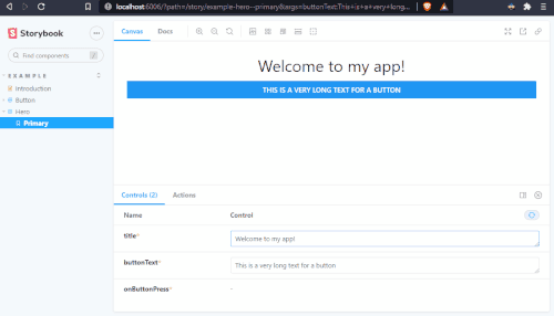
As you can see, you can change the value of any prop in real-time, read the autogenerated documentation (which can be manually improved), and copy an example of the code required to use the component.
Storybook also lets you create "Stories," which represent different states for the same component.
If we now add a new prop to our component called "hideButton," we should create a new story to see how the component looks like with and without the button:

Setup options
There are three main ways to use Storybook with Expo. Based on what you choose, the installation process will be different.
Storybook 100% Web

This is my favorite setup. You work on your React Native components as usual and reference those components as Stories that can be rendered directly into the browser.
Pros
- You can publish your Storybook web portal and share it with your teammates. Everyone can access the documentation and play with the components without having to install anything.
Cons
- Any native component like a Date time picker won't be rendered. For those components, you will need to use the other methods described below.
Storybook Hybrid
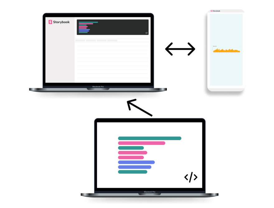
With this setup, you still get a web portal, but it uses web sockets to connect to a native device. The documentation for the components still is presented on the web, but the rendering of the components will require an actual device connected.
Pros
- You don't have any limitations to render native components like Date Time Picker because everything runs on your phone.
Cons
- The documentation is not easy to share or consume by the rest of the team. Because the web portal is searching for a device to connect with, you won't see the documentation until everything is wired up with a device.
Storybook 100% native
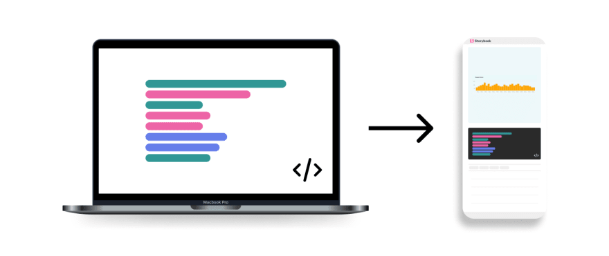
With this setup, you replace the entry point of your React Native app with the Storybook UI. Everything is presented directly within your phone.
Pros
- Same as the hybrid approach.
- It could be helpful if you want to make an app to showcase your component library.
Cons
- Reading documentation directly from your phone is not the best option if you want to promote collaboration within your team. Having a web interface is always better for developers who will spend hours a day working with a design system.
Installation
I'll focus this guide on the first setup, but please send a DM through my Twitter if you want me to cover the other available options.
To use Storybook, we'll need an existing Expo project. If you already have a project, you can skip the first step.
1. Creating a new expo project
Create a new Expo project, choose a template and a name for your project
expo initYou'll need to install the Expo CLI globally: npm i -g expo-cli:
npm i -g expo-cli
2. Adding Storybook
Navigate to your new project root directory and run the following command to add Storybook
npx -p @storybook/cli sb init --type reactOnce the installation is complete, you'll see two new directories on your project:
- .storybook
- Here is where your storybook configuration files will live. You can customize the Storybook UI using a custom theme or by adding plugins.> I'll cover all the customization options in another post.
- stories
- Here is where you'll add all the stories you need to test each component. This is the best place to mock dependencies or add any required Provider. Besides, you can augment the component documentation and add custom pages if needed.
3. Adding your first stories
The basic installation already includes a few stories that serve as an example. However, if you want to learn more about stories, here is the official documentation.
Let's add two stories for our "Hero" component. The button will only be visible in the first story.
Add a new file called Hero.stories.tsx or Hero.stories.jsx with the following code:
import React from "react";import { ComponentStory, ComponentMeta } from "@storybook/react";import Hero from "../src/components/Hero";import { Alert } from "react-native";export default { title: "Example/Hero", component: Hero,} as ComponentMeta<typeof Hero>;const Template: ComponentStory<typeof Hero> = (args) => <Hero {...args} />;export const WithButton = Template.bind({});WithButton.storyName = "With button";WithButton.args = { title: "Welcome to my App", buttonText: "Sign in", hideButton: false, onButtonPress: () => Alert.alert("Signed in"),};export const WithoutButton = Template.bind({});WithoutButton.storyName = "Without button";WithoutButton.args = { title: "Welcome to my App", buttonText: "Sign in", hideButton: true, onButtonPress: () => Alert.alert("Signed in"),};Finally, run the yarn storybook, or npm run storybook command to start your Storybook server and test your stories. If you want to customize your existing stories or add new ones, Storybook comes with hot reload by default, so you'll instantly see any change after saving.
In upcoming posts, I will talk more about Storybook UI customization and how you can improve your stories and docs.
If you don't want to miss these series, follow me on Twitter

Also, I'm currently working on a Design System called SpiroKit. You can pre-purchase the Figma file + the React Native library with a 50% discount using the code "HUNT" for a limited time.
Original Link: https://dev.to/mauro_codes/adding-storybook-to-your-expo-project-4nh4
Dev To
 An online community for sharing and discovering great ideas, having debates, and making friends
More About this Source Visit Dev To