
An Interest In:
Web News this Week
- April 24, 2024
- April 23, 2024
- April 22, 2024
- April 21, 2024
- April 20, 2024
- April 19, 2024
- April 18, 2024
Some of Our Sources
- BoingBoing
- Simplebits
- Web Designer Wall
- The Logo Smith
- Fuel Your Creativity
- Web Designer Depot
- Freelance Switch
- Design Modo
- Web Resource Source
- Android Headlines
Help Webnuz
Referal links:
Basic Responsive Websites
In this blog, I will share some general concepts of how to implement a responsive design to your website that it is easy to follow. Creating a responsive website can be a bit confusing at first, but once you understand the basic foundations you will be good to go!
What is a Responsive Website?
Responsive Websites allow websites and pages to display on all devices and screen sizes by automatically adapting to the screen, whether it's a desktop, laptop, tablet, or smartphone. We do this by working with CSS using various settings to deliver the best experience to users. To better understand we will discuss the basic concepts of Media Queries and CSS Units.
Media Queries
Media Queries are conditions that you apply to your CSS. You tell the browser to add or remove specific css rules depending on the capabilities of a device. As the screen size changes, we need rearrange our layout. Typically, it would be structured vertically as the screen size decreases.
The syntax for a media query looks like this:
@media <media-type> and (expressions) { CSS code; }- @media tells the browser that we are starting a media query.
- media-type describes the kind of device rules we will apply to. For ex: we can place media-type "screen" here. This is an optional input. If we do not use it the rules will be used for all devices.
- (expression) can be a be the width or orientation of the device.
- Inside the media query we can specify some css rules that should be applied
Here is an real-life example of Media Query:
@media (max-width: 500px) { .Projects .Container .img width: 80%; padding-right: 20%}In this example we did not use the optional media-type. Instead we have the expression max-width: 500px (our breaking point) which tells the browser that the rules inside our media query should be limited to devices that have a screen width of 500px or smaller. Inside our media query we have our regular css code with values of your choice.
CSS Units
CSS Units determine the size of a property you're setting for an element or its content.
Here is an example of a CSS unit:
font-size: 16px;The font-size is the property, 16px is the value of the property. Px is a css unit called pixel.
CSS Units can be categorized by Absolute Units and Relative Units:
| ABSOLUTE UNITS | RELATIVE UNITS |
|---|---|
| Fixed Value | Scaled Values |
| does not scale when the screen size changes | they scale relative to something else |
| Ex: px (pixels) | Ex: Relative to their parent (%), viewport (vw, vh), font size (em, rem) |
Relative Units is what will help us build responsive websites. Let's discuss in detail about the most common units.
Relative to their parent(%):
CSS FILE.App .Parent { background-color: blue; width: 100%}.App .Child { background-color: yellow; width: 50%}- In the example, inside a parent div, we have a child div. The child div will be 50% of the parent div.

Viewport (vw, vh)
- The viewport is the user's visible area. Whether it is a desktop or a smartphone. vw stands for viewport width. vh stands for viewport height. For example: 100vh is 100% of the viewport height (100% height of a smartphone or 100% height of a desktop).
Font size (em, rem)
- em - are relative to the font size (always x times of the parent). For instance, 1em is equal to the font-size of the parent. 2em is twice the font size of the parent. 3em is 3 times the font size of the parent.
HTML:<div className="Parent"> <h1>Main Title</h1> <h2>Next Title</h2></div>CSS:.App .Parent { font-size:16px}.App .Parent h1 { font-size: 3em;}.App .Parent h2 { font-size: 2em;}In our Parent div we have a font size of 16px. In our h1 we have a font size of 3em which is 3 times the font size of its parent with 16px. Therefore our h1 has 48px (16px*3em) and our h2 has 32px (16px*2em).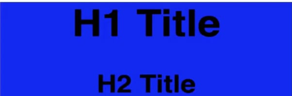
- rem - are relative to the roots html font size. If the root html is not defined then it will be equal to the default font size of the browser (16px usually). This is a more preferred method.
CSS:html { font-size: 20px;}.App .Parent h1 { font-size: 3rem;}.App .Parent h2 { font-size: 2rem;}In this example the root font-size is 20px. Our h1 is 3 times the root (20px*3rem).
Applying Relative Units
In order to apply these relative units for responsive websites, we can go into our CSS file and change our absolute units to relative units where it is needed. We can also add media queries throughout our css file. Now that you understand the basic concepts of making responsive websites try it out. For more complex websites, more concepts will need to be applied. There are many resources you can use for further details such as: YouTube videos and popular sites such as Udemy, Codecademy, Treehouse, etc.
Original Link: https://dev.to/thedanielleellis/basic-responsive-websites-473d
Dev To
 An online community for sharing and discovering great ideas, having debates, and making friends
More About this Source Visit Dev To