
An Interest In:
Web News this Week
- April 18, 2024
- April 17, 2024
- April 16, 2024
- April 15, 2024
- April 14, 2024
- April 13, 2024
- April 12, 2024
Some of Our Sources
- Engadget
- Mashable
- Web Designer Wall
- Spoon Graphics
- Fuel Your Creativity
- Inspiredology
- Web Designer Depot
- CSS Globe
- Freelance Switch
- Android Dissected
Help Webnuz
Referal links:
Step by Step: Block and Inline CSS (2021)
I usually use display: block, display: inline to CSS the HTML elements. But I only stop at the basic level of understanding these. In this post, I'm going to discover some properties that I thought it is interesting about block, inline.
Review
Before I go forward, let's take a slight review of what I know so far.
Block
When I set:
display: block;The HTML element can have some benefits like:
- Be able to set width, height.
- Break the next element to new line.
- Be able to set padding, margin, border.
- Element's width automatically is the full width of its parent.
Inline
When I set:
display: inline;The HTML element can be had some benefits like:
- Don't be able to set width, height.
- Don't break the next element to new line.
- Be able to set padding, margin, border.
- Element's width doesn't automatically be the full width of its parent.
It's simple! Right! But I think it's not enough to make sure we can custom the layout of content. Let's move on next step to see what we can discover further.
Writing Mode
Normally, text in the HTML element has the layout from left to right( some language that renders from right to left). If I want to set the direction of my content from right to left, how can I handle it?
Fortunately, we have writing mode, we can set the direction: horizontal, vertical for our content.
You might think: what am I talking about? Does it relate to block and inline?
Don't rush! My friend! We will learn about it step by step.
Writing Mode CSS
In order to turn on writing mode, I need to use the CSS below.
/* The content will be normal(horizontal direction) */writing-mode: horizontal-tb;/* The content will be vertical(left to right) */writing-mode: vertical-lr;/* The content will be vertical(right to left) */writing-mode: vertical-rl;Toggle the comment that was defined in style element, you can see the difference in the layout in three cases.
horizontal-tb: content is rendered normally.vertical-lr: content is rendered vertical direction, header appear on the left side, paragraph on the right side.vertical-rl: content is rendered vertical direction, header appear on the right side, paragraph on the left side.
So far, nothing special! But I want to introduce to you one thing in writing mode.
When we turn on writing mode, it creates two directions, they are: inline, block, both of them are injected into the HTML element, and the direction of them depends on the property that we set on writing-mode CSS.
Hmm, It might look a little bit confusing here. Let's see three pictures below.
writing-mode: horizontal-tb
writing-mode: vertical-lr
writing-mode: vertical-rl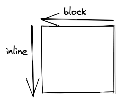
What do inline, block mean in these pictures above?.
These directions are defined in writing-mode for making the base, and other properties CSS in writing-mode will be based on these directions(block, inline) to reflect. We need to use them later on.
Tip: For easy to remember what directions will be
blockorinline.
The
blockdirection: the flow that content is displayed.The
inlinedirection: the sentences flow
Let's use the tip above.
writting-mode: horizontal-tb
- header -> paragraph is displayed from top to bottom, you can see they take a break from header to paragraph -> vertical is the
blockdirection. - The sentences flow is horizontal -> horizontal is the
inlinedirection.
writting-mode: vertical-lr
- header -> paragraph is displayed from left to right, you can see they take a break from header to paragraph -> horizontal is the
blockdirection. - The sentences flow is vertical -> vertical is the
inlinedirection.
writting-mode: vertical-rl I save it for you.
Custom Content
Now, we already had the basic knowledge about writing-mode. Let's use it to custom the content.
I have two blocks: writing-mode: horizontal-tb, writing-mode: vertical-lr.
Using the tip above I can determine that:
- The first block directions: horizontal:
inline, vertical:block. - The second block directions: horizontal:
block, vertical:inline.
Now, I'm able to use other CSS(logical CSS: the CSS use for writing-mode) to
custom the content.
I'm going to use the inline-size property. You need to remember thatinline-size will define the dimension for inline direction that we talked
about above. In this case, inline-size will define the dimension of horizontal
for the first block(you can think it defines width dimension), and define the
dimension of vertical for the second block(height dimension).
Replace width: 100px using
inline-size: 200px;I will have the result below.
Go further
There are tons of properties in writing-mode, and they are called Logical Properties.
You can learn more here.
I have ever met some CSS like margin-block-start, and didn't know what is it?
It turns out I met Logical Properties CSS.
Let's use some Logical Properties to illustrate.
/*- The first case - margin-top: 20px, padding-left: 20px, border-right: solid 2px red;- The second case - margin-left: 20px, padding-top: 20px, border-bottom: solid 2px red; */margin-block-start: 20px;padding-inline-start: 20px;border-inline-end: solid 2px red;And we have the result below.
Conclusion
I have covered about writing-mode in this article. But can you remember the most important concept? Why don't take a review and practice with some example ?
I think it's worth understanding the concepts of writing-mode before we moving on to CSS layout.
Original Link: https://dev.to/thangphan37/step-by-step-block-and-inline-css-2021-4ekn
Dev To
 An online community for sharing and discovering great ideas, having debates, and making friends
More About this Source Visit Dev To