
An Interest In:
Web News this Week
- April 24, 2024
- April 23, 2024
- April 22, 2024
- April 21, 2024
- April 20, 2024
- April 19, 2024
- April 18, 2024
Some of Our Sources
- Just Creative
- Pearsonified
- Smashing Magazine
- FanExtra - PSD
- Crazy Leaf Design
- My Ink Blog
- Fudge Graphics
- CSS Tricks
- Willems Lab
- Dev To
Help Webnuz
Referal links:
Frosted glass on CSS
Another week of learning something new! In this blog I am going to share with you how to make frosted glass just through CSS! There are a lot of variations you can do and that you can definitely find online. So let's go and explore together!
By the end of this blog, we should have something like Kyle Wetton's frosted glass on CodePen:
So first of, let's make an html with all the elements we need. In my case, I wanted to make a mock login screen with that frosted glass design.
Now on our CSS file, we can apply our background-image to our 'body', adjust positioning and indicate the sizes you need then we'll get into the frosted glass.
There's a lot of ways to implement this. Below are what I've tried:
Glass 1
On your 'formDiv', you can apply backdrop-filter and box-shadow. In this case, box-shadow is inset with 200px spread with its shade and color opacity has been set. While backdrop-filter is set to blur at 8px. More of backdrop-filter on my next blog!
-webkit-backdrop-filter: blur(8px); /* Safari 9+ */backdrop-filter: blur(8px); /* Chrome and Opera */box-shadow: inset 0 0 0 200px rgba(255,255,255,0.08);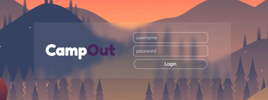 We got our frost! This looks more likely of a frosted film than glass.
Glass 2
In this glass, we're setting the box-shadow darker, outset(the default by removing 'inset'), & less transparent, plus adding a background-color.
-webkit-backdrop-filter: blur(8px); /* Safari 9+ */backdrop-filter: blur(8px); /* Chrome and Opera */box-shadow: 0px 10px 15px 10px rgb(0 0 0 / 15%);background-color: rgb(228 228 228 / 15%);  The shadow gives it a bit more perspective. But still similar to our first one.
Glass 3
Another thing I have tried is using filter! but instead of using blur as the filter, I used drop-shadow with combination of background-color, and box-shadow(inset).
filter: drop-shadow(2px 4px 6px black);background-color: rgb(152 151 151 / 25%); // You can definitely adjust the color or opacity to make the text pop!box-shadow: inset 0 0 0 200px rgb(255 255 255 / 8%);
Glass 4
If play around with it until you get the blur you want and want to add a little spice, you can also attach another backdrop-filter and some border!
backdrop-filter: grayscale(.8) blur(5px);box-shadow: inset 0 0 0 200px rgba(255,255,255,0.08);border-top: 2px solid rgba(225, 225, 225, 0.3);border-left: 2px solid rgba(225, 225, 225, 0.1);border-right: 1px solid rgba(225, 225, 225, 0.2); See that grayscale take effect anything under the glass and the border gives it thickness!
Check out my CodePen for the final results!
I had so much fun making this! I hope you did too!
Until the next!
References/Links:
- CSS Tricks - Frosted Glass on CSS using filter()
- Background photo - Vector Nature wallpaper
- Google Fonts used:
Original Link: https://dev.to/tolentinoel/frosted-glass-on-css-37bg
Dev To
 An online community for sharing and discovering great ideas, having debates, and making friends
More About this Source Visit Dev To