
An Interest In:
Web News this Week
- April 1, 2024
- March 31, 2024
- March 30, 2024
- March 29, 2024
- March 28, 2024
- March 27, 2024
- March 26, 2024
Some of Our Sources
- Technology Review
- Web Designer Wall
- Team Treehouse
- Spoon Graphics
- Smashing Apps
- Six Revisions
- Creative Curio
- Web Design Ledger
- Stylized Web
- Web Resource Source
Help Webnuz
Referal links:
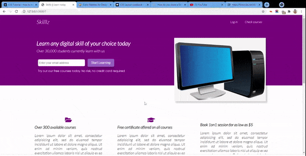
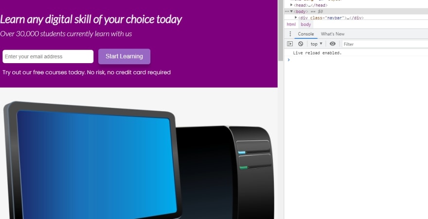
CSS Tutorial - How to Make a Page Responsive using CSS Media Queries
This tutorial is a follow up to the first tutorial . You might want to first check that one out.
In this tutorial, we will be adding a footer to our landing page:

We will also make our page more responsive by styling it to tablet and mobile devices
Lets dive in!
Implementing the Footer Section
The final part of our landing page building process is the footer section. The footer section will comprise of a copyright text, three navigation links to other parts and finally a group of social media icons from Font Awesome.

Here is the HTML Markup for the footer section of the page
<footer> <div class="container grid-3"> <div class="copyright"> <h1>Skilllz</h1> <p>Copyright © 2021</p> </div> <nav class="links"> <ul> <li><a href="" class="outline">Home</a></li> <li><a href="" class="outline">Tutors</a></li> <li><a href="" class="outline">Categories</a></li> </ul> </nav> <div class="profiles"> <a href=""><i class="fab fa-twitter fa-2x"></i></a> <a href=""><i class="fab fa-instagram fa-2x"></i></a> <a href=""><i class="fab fa-facebook fa-2x"></i></a> <a href=""><i class="fab fa-whatsapp fa-2x"></i></a> </div> </div> </footer>The footer section will look unattractive without any styling

Applying Styling to the Footer
First, we need to set the background colour for the footer section as well as the color for all links to white
/* Add padding around the footer as well */footer { background-color: purple; padding: 20px 10px;}/* Sets all link texts to white and puts margin to the left and right */footer a { color: white; margin: 0 10px;}Now the footer will look like this

If you check the first gif, you will notice that when I hover over any of the links inside of the footer, its color changes to a lighter shade of purple and a border also appears below it.
We achieve this using a :hover selector:
footer a:hover { color: #9867C5; border-bottom: 2px solid #9867C5;}That's all for the footer!
Setting Media Queries
It's now time to make our application more responsive. As we know, majority of users may be viewing an app or site from a tablet or mobile phone. Hence, it is very important to make the site's layout responsive to improve the user experience.
In CSS, we will define media queries which sets breakpoints for the various screen widths of different devices and maps a set of CSS rules for each device.
Designing for Tablets and under
First, we will optimize our site's layout for users viewing from a tablet. In our CSS, we define the following style:
/* Tablets and Under */@media(max-width: 768px) { .grid, .grid-3 { grid-template-columns: 1fr; }Initially we had set two columns for the .grid class and 3 columns for the .grid-3 class. Now, we want to make sure that all grid items take up just a single line.
As a result, our form and image which was formerly displayed side-by-side (horizontally) will now be displayed one after the other (vertically).
Next, we apply the following styles
/* Align all text to the center. This will move all text, including form centrally */.showcase { height: auto; text-align: center; }/* This resets the width of the image container and adds margin space to the left */ .image { width: 600px; margin-left: 80px; }/* Changes the service sections from side-by-side orientation to each taking its own line. Aligns text to the center */.stats .flex { flex-direction: column; } .stats { text-align: center; }/* Makes sure each stat section does not exceed the width of parent */.stat { width: 100%; padding-right: 80px; }/* (re)Moves the circle to the center of the card */.circle { background-color: transparent; border:3px solid purple; height:90px; position: relative; top: -30px; left: 270px; border-radius:50%; -moz-border-radius:50%; -webkit-border-radius:50%; width:90px; }and voila!

Designing for Mobile devices
Most people view a site from a mobile device which typically has the smallest screen size of all devices. Thus, making the page responsive to smaller screens is of utmost importance.
/* Mobile devices */@media(max-width: 500px) { .navbar { height: 100px; }First, we increase the height of our navigation area. Since it will be viewed from a smaller screen, we want the area more accentuated for the user.
Then, we define the following styles
/* Changes the alignment. The logo title stays at the top, the nav links will be below it */.navbar .flex { flex-direction: column; }/* When hovered on, retain white color and change border to black */ .navbar a:hover { color: white; border-bottom: 2px solid black; }/* Set light purple background on nav links, make it a bit round and add some spacing */ .navbar ul { background: #9867C5; border-radius: 5px; padding: 10px 0; }/* Align text to center */ .showcase { height: auto; text-align: center; }/* Reduce font size */.little-info { font-size: 13px; }/* Reduce image width */ .image { width: 350px; margin-left: 70px; } .stat { margin-bottom: 40px; }/* Move circle once again */.circle { background-color: transparent; border:3px solid purple; height:90px; position: relative; top: -30px; left: 150px; border-radius:50%; -moz-border-radius:50%; -webkit-border-radius:50%; width:90px; }}and voila!

Wrapping Up
Responsive web design is arguably one of the most important design principles in web development. We have to always consider the fact that our site will be viewed from various kinds of devices with different screen resolutions. Optimizing our site for different screens will improve the user experience.
In this tutorial, we have designed the footer of our simple landing page using CSS and then gone on to make them responsive.
The full code for this project can be gotten from this GitHub repository.
I hope you learned something useful from this tutorial. If you have any suggestions, reach out to me on Twitter .
Thanks for following along and see you soon.
Original Link: https://dev.to/ubahthebuilder/css-tutorial-how-to-make-a-page-responsive-using-css-media-queries-2fih
Dev To
 An online community for sharing and discovering great ideas, having debates, and making friends
More About this Source Visit Dev To