
An Interest In:
Web News this Week
- April 25, 2024
- April 24, 2024
- April 23, 2024
- April 22, 2024
- April 21, 2024
- April 20, 2024
- April 19, 2024
Some of Our Sources
- Just Creative
- Six Revisions
- Vandelay Design
- You The Designer
- FanExtra - PSD
- Crazy Leaf Design
- CSS Globe
- 24 Ways
- Android Headlines
- Hashedout
Help Webnuz
Referal links:
Animated Skills Bar using HTML and CSS
In this article I am going to show you how to create Animated Skills Bar using only HTML and CSS code. I have designed many more types of progress bars before. But in that case I used JavaScript or JQuery. I have created this Skills Bar only with the help of HTML and CSS code.
First I made a small box on a web page. Then I added a title to that box and used four progress bars. Each progressbar is given a specific value. When you load this page, this animation will reach your pre-determined meaning from zero. It will take you two seconds to reach your predefined value so we can see a kind of animation here.
Here I have created this animation using @keyframes of CSS code.
Below I show you the complete step by step how I created this Animated Skills Bar using HTML and CSS code. You can also download the source code to create it.
Step 1: Design the web page
First I designed the web page using some CSS code below. Here I have used the background color blue of the webpage.
*{ padding: 0; margin: 0; box-sizing: border-box;}body{ height:100vh; background-color: #0a7aca;}
Step 2: Create a box on the webpage
Now I have created a box using the HTML and CSS code below. As I said before there is a box on the web page in which all the progress bars are made.
I used box-shadow: 0 20px 30px rgba (0,0,0,0.2) here to create a color shadow around that box. I used border-radius: 10px to make it a bit round.
<div class="wrapper"> <div class="container"> </div></div>.wrapper{ width: 40%; min-width: 590px; position: absolute; transform: translate(-50%,-50%); left: 50%; top: 50%;}.container{ width: 100%; padding: 30px 30px 50px; background-color: white; border-radius: 10px; box-shadow: 0 20px 30px rgba(0,0,0,0.2);} .container *{ font-family: "Poppins",sans-serif; color: black; font-weight: 500;}
Step 3: Add the title to the box
Now I have created a heading using the code below. A heading has been used here as you can see in the picture above. The font-size: 33px of this heading and text-align: center has been used to place it in the middle.
<h2>Animated Skills </h2>h2{ margin-bottom: 50px; letter-spacing: 2px; text-align: center; font-size: 33px; font-weight: bold;}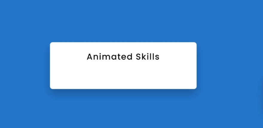
Step 4: Add all the information in the Skills bar
Now I have added all the basic information of this Animated Skills Bar using HTML code. First, I have added information from one of the four bars in this progress bar. And its possible result I have shown in the picture below.
<div class="skills"> <div class="details"> <span>HTML</span> <span>90%</span> </div> <div class="bar"> <div id="html-bar"></div> </div> </div>
Above we have added a Skills bar information. Now I have added the information of the other three progress bars.
<div class="skills"> <div class="details"> <span>CSS</span> <span>75%</span> </div> <div class="bar"> <div id="css-bar"></div> </div> </div> <div class="skills"> <div class="details"> <span>Javascript</span> <span>72%</span> </div> <div class="bar"> <div id="javascript-bar"></div> </div> </div> <div class="skills"> <div class="details"> <span>jQuery</span> <span>68%</span> </div> <div class="bar"> <div id="jQuery-bar"></div> </div> </div>
Step 6: Design the skills bar with css code
Now I have designed the above added information with the help of CSS code. Here a border is used around the animation line for which I have used border: 2px solid # 0d96e0. Here I have used the height of the animation line: 9px.
I used border-radius: 10px to make the two ends of the line even and round. I have used the width: 0 of this progress bar animation line, which means that under normal circumstances no skills animation will be seen here. Later I gave different values for each using @keyframes.
.details{ width: 100%; display: flex; justify-content: space-between; margin-bottom: 10px;}.bar{ position: relative; border: 2px solid #0d96e0; border-radius: 20px;}.bar div{ position: relative; width: 0; height: 9px; border-radius: 10px; background-color: #0d96e0;}Using the CSS code below I have created a distance between each of the skills bars. For this margin-bottom: 30px is used which will create a distance of 30px between each bar.
.skills:not(:last-child){ margin-bottom: 30px;}
Step 7: Set a specific value for the animation of each Skills bar
As I said above, I used the width: 0 of the progress bar animation line here, which means that the animation line cannot be seen under normal conditions. Now I have given different values for each.
I have used width: 90% for the first line here, which means that this colorful line will stop at 90% when it is loaded. I set a time of two seconds to do this animation with it.
#html-bar{ animation: html-fill 2s forwards;}@keyframes html-fill{ 100%{ width: 90%; }}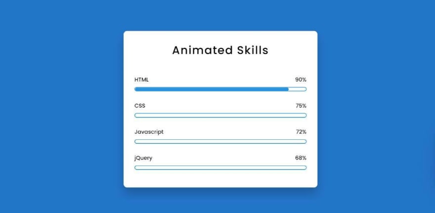
In the same way I have added specific values for three more CSS progress bars. The more you change the value of width, the more the value of the colorful line will change.
#css-bar{ animation: css-fill 2s forwards;}@keyframes css-fill{ 100%{ width: 75%; }}#js-bar{ animation: js-fill 2s forwards;}@keyframes js-fill { 100%{ width: 72%; }}#jQuery-bar{ animation: jQuery-fill 2s forwards;}@keyframes jQuery-fill{ 100%{ width: 58%; }} 
Hopefully from this tutorial above you have fully learned how I created this Animated Skills Bar using only HTML and CSS code. In the meantime I have created many more designs using HTML and CSS code. You can see those designs if you want. You will let us know how you like this skills bar by commenting.
You can visit my blog for more tutorials like this.
https://www.foolishdeveloper.com/
Original Link: https://dev.to/shantanu_jana/animated-skills-bar-html-and-css-1fbl
Dev To
 An online community for sharing and discovering great ideas, having debates, and making friends
More About this Source Visit Dev To