
An Interest In:
Web News this Week
- April 19, 2024
- April 18, 2024
- April 17, 2024
- April 16, 2024
- April 15, 2024
- April 14, 2024
- April 13, 2024
Some of Our Sources
- Techcrunch
- Spoon Graphics
- Six Revisions
- Reencoded
- 24 Ways
- Spyre Studios
- Web Resource Source
- Android Dissected
- Dev To
- TechPowerUp
Help Webnuz
Referal links:
How to make fully responsive modern portfolio using pure HTML, CSS and JS.
Hello, Today we'll see how to make a fully responsive modern portfolio using pure HTML, CSS and JS. No other library. You learn to create responsive design, you'll learn about CSS pseudo elements. You'll learn about nodemailer to make a working contact form. And much more.
To see demo or you want coding tutorial with explanation. You can watch the tutorial below.
Video Tutorial
I appreciate if you can support me by subscribing my youtube channel.
So, without wasting more time let's see how to code this.
Code
Before we start writing our code. Let's see its folder structure.

And yes, it is a nodeJS app because we want working mailing system and only servers can send mail not client side browser.
As you can notice, we have project.js file. This files contain our project data. Having a project data make easier for you to add and delete or edit any project you want. Let's see its data structure.
let projects = [ { name: "project one", tags: "#javascript, #fullstack, #ui/ux, #backend", image: "project (1).png", }, { name: "project two", tags: "#javascript, #fullstack", image: "project (2).png", }, // +8 more]You can see we have project name, its tags, and image path. This way we can easily handle our projects without editing any code.
So let's start by initializing NPM.
NPM init
Inside your root directory outside public folder, open your command prompt or terminal and run npm init cmd. This will initialize NPM to your projects.
Now run this command to install these libraries.
npm i express.js nodemon nodemailer dotenvexpress.js - is to create a servernodemon - is to run server continuouslynodemailer - is to send mailsdotenv - is for making environment variable. We'll use this store our email id and password outside of server.
After done installing libraries. Let's make some changes in package.json. Open it. And change its scripts data.
"scripts": { "start": "nodemon server.js" },Then make server.js file inside your root directory (not in public folder). Open it.
Server.js
Start by importing libraries/packages.
const express = require('express');const path = require('path');const nodemailer = require('nodemailer');const dotenv = require('dotenv');Setup dotenv so we can access environment variable.
dotenv.config();Then store your public folder path to a variable and make server.
let initialPath = path.join(__dirname, "public");let app = express();Now use app.use method to setup middlewares.
app.use(express.static(initialPath));app.use(express.json());They both are important, express.json will enable form data sharing and express.static will set public folder as a static path.
After this make home route. And send index.html file.
app.get('/', (req, res) => { res.sendFile(path.join(initialPath, "index.html"));})And at last, make server listen on 3000 port.
app.listen(3000, () => { console.log('listening.....');})So, our server is done for now. Let's run the server by running npm start cmd on your terminal.
Now let's start working on portfolio.
Portfolio
Open index.html and write basic HTML structure. Then link style.css and app.js to the file. After that make navbar.
<!-- navbar --><nav class="navbar"> <h1 class="brand">logo</h1> <div class="toggle-btn"> <span></span> <span></span> </div> <ul class="links-container"> <li class="links-item"><a href="#" class="link active">home</a></li> <li class="links-item"><a href="#project-section" class="link">project</a></li> <li class="links-item"><a href="#about-section" class="link">about</a></li> <li class="links-item"><a href="#contact-section" class="link">contact</a></li> </ul></nav>And give it some styles.
*{ margin: 0; padding: 0; box-sizing: border-box;}html{ scroll-behavior: smooth;}body{ width: 100%; position: relative; background: #1d1d1d; color: #fff; font-family: 'roboto', sans-serif;}/* navbar */.navbar{ position: fixed; top: 0; left: 0; width: 100%; height: 60px; background: #1d1d1d; padding: 0 10vw; display: flex; justify-content: space-between; align-items: center; z-index: 9;}.brand{ text-transform: capitalize; font-weight: 500;}.links-container{ display: flex; list-style: none;}.link{ text-transform: capitalize; color: #fff; text-decoration: none; margin: 0 10px; padding: 10px; position: relative;}.link:hover:not(.active){ opacity: 0.7;}.link.active::before,.seperator::before{ content: ''; position: absolute; bottom: 0; left: 50%; transform: translateX(-50%); width: 5px; height: 5px; border-radius: 50%; background: #fff;}.link.active::after,.seperator::after{ content: ''; position: absolute; bottom: 2px; left: 0; width: 100%; height: 1px; background: #fff;}Note
- You can see
scroll-behaviorgiven tohtml. If you don't give this you'll not be able to get smooth scrolling effect. - you can also see
seperatorelement in the styles but don't worry we'll create this later.
Output

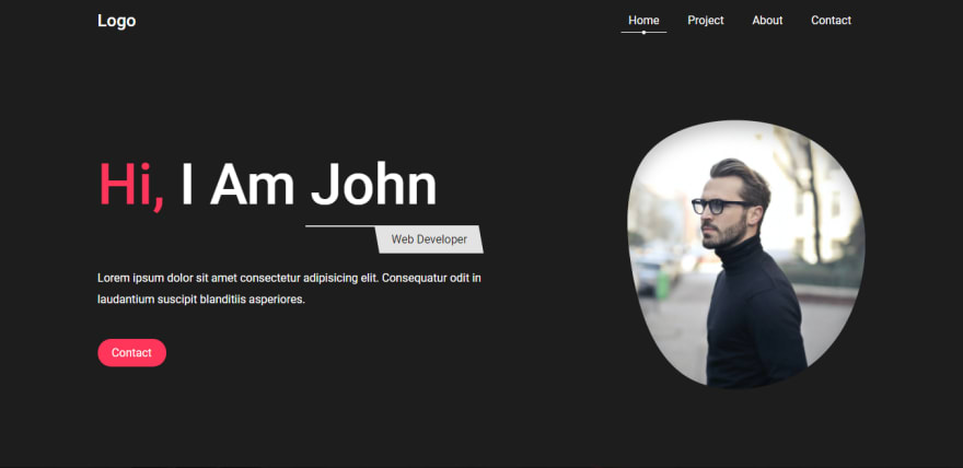
Now create header section
<!-- home section --><section class="home"> <div class="hero-content"> <h1 class="hero-heading"><span class="highlight">hi, </span>i am john</h1> <p class="profession">web developer</p> <p class="info">Lorem ipsum dolor sit amet consectetur adipisicing elit. Consequatur odit in laudantium suscipit blanditiis asperiores.</p> <a href="#contact-section" class="btn">contact</a> </div> <img src="img/img1.png" class="image" alt=""></section>/* home section */.home{ width: 100%; min-height: calc(100vh - 60px); height: auto; margin-top: 60px; padding: 0 10vw; display: flex; align-items: center; justify-content: space-between; position: relative;}.hero-content{ width: 50%;}.hero-heading{ font-size: 5rem; text-transform: capitalize; font-weight: 500;}.highlight{ color: #ff3559;}.profession{ width: fit-content; display: block; margin: 10px 0 20px; margin-left: auto; text-transform: capitalize; position: relative; padding: 10px 20px; color: #1d1d1d; z-index: 2;}.profession::before{ content: ''; position: absolute; top: 0; left: 0; width: 100%; height: 100%; background: #e3e3e3; z-index: -1; transform: skewX(10deg);}.profession::after{ content: ''; position: absolute; top: 0; left: -100px; width: 100px; height: 2px; background: #e3e3e3;}.info{ line-height: 30px; margin-bottom: 50px;}.btn{ padding: 10px 20px; text-decoration: none; border-radius: 50px; background: #ff3559; color: #fff; text-transform: capitalize; border: none;}Output
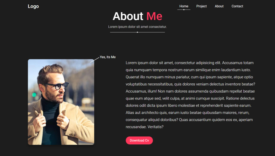
Great! now make about section.
<!-- about section --><section class="about" id="about-section"> <h2 class="heading">about <span class="highlight">me</span></h2> <p class="sub-heading">Lorem ipsum dolor sit amet consectetur. </p> <div class="seperator"></div> <div class="about-me-container"> <div class="left-col"> <img src="img/img2.png" class="about-image" alt=""> </div> <div class="right-col"> <p class="about-para">Lorem ipsum dolor sit amet, consectetur adipisicing elit. Accusamus totam quia numquam tempora nostrum earum similique enim laudantium iusto. Quaerat illo numquam minus pariatur, cum qui ipsum sapiente, atque optio voluptatibus necessitatibus, quis dolores veniam delectus inventore beatae? Accusamus, illum! Non nam dolores assumenda quibusdam repellat beatae quae eum atque sed, velit culpa, at animi cumque suscipit. Ratione delectus dolores odit dicta ipsum libero molestiae et reprehenderit sapiente earum. Alias aut architecto quis, earum iusto beatae quibusdam maiores, rerum, consequatur aliquid doloribus? Quas accusantium quidem eos ex, aperiam recusandae. Veritatis?</p> <a href="#" class="btn">download cv</a> </div> </div></section>/* about section */.about{ width: 100%; height: auto; padding: 50px 10vw;}.heading{ text-align: center; font-weight: 500; font-size: 3.5rem; text-transform: capitalize;}.sub-heading{ text-align: center; font-size: 1rem; margin: 10px; opacity: 0.7;}.seperator{ width: 25%; margin: 20px auto; position: relative;}.about-me-container{ margin: 150px 0 100px; width: 100%; display: grid; grid-template-columns: 40% 60%; grid-gap: 50px;}.left-col, .right-col{ position: relative;}.left-col::before{ content: 'yes, its me'; text-transform: capitalize; position: absolute; right: 0; top: -20px;}.left-col::after{ content: ''; position: absolute; top: -10px; right: 80px; width: 50px; height: 2px; background: #fff; transform-origin: right; transform: rotate(-30deg);}.about-image{ border-radius: 10px; box-shadow: 0 10px 10px rgba(0, 0, 0, 0.25);}.about-para{ font-size: 1.2rem; font-weight: 300; line-height: 35px; margin-bottom: 40px;}Output
And now create skills section. Add this structure inside about section.
<section class="about" id="about-section"> //previous elements<h2 class="heading">languages and framework i know</h2> <div class="seperator"></div> <div class="skill-container"> <div class="skill-card" style="--bg: #f06529"> <p class="skill">HTML</p> </div> <div class="skill-card" style="--bg: #379ad6"> <p class="skill">CSS</p> </div> <div class="skill-card" style="--bg: #cc6699"> <p class="skill">SCSS</p> </div> <div class="skill-card" style="--bg: #f7df1e"> <p class="skill">JavaScript</p> </div> <div class="skill-card large" style="--bg: #5ed9fb"> <p class="skill">ReactJS</p> </div> <div class="skill-card large" style="--bg: #83cd29"> <p class="skill">NodeJS</p> </div> <div class="skill-card" style="--bg: #326690"> <p class="skill">Postgres SQL</p> </div> <div class="skill-card" style="--bg: #ffa000"> <p class="skill">Firebase</p> </div> <div class="skill-card large" style="--bg: #5ed9fb"> <p class="skill">Much More</p> </div> </div></section>You can notice we have style="--bg: value" to skill-card element. What this is doing is, it is setting up different --bg CSS variable for different elements. So this way we can add same effect with different colors.
.skill-container{ position: relative; margin-top: 100px; display: grid; grid-template-columns: repeat(4, 1fr); grid-gap: 20px;}.skill-card{ height: 200px; border-radius: 10px; border: 1px solid #464646; text-align: center; position: relative; cursor: pointer; transition: .5s;}.skill{ font-size: 2rem; color: #464646; line-height: 200px;}.skill-card:hover{ background: var(--bg);}.skill-card:hover .skill{ color: #fff;}.skill-card.large{ grid-column: 2 span;}Output

background color is showing on hover
Now, let's create project section. In project section first make filter buttons.
<!-- project section --><section class="project" id="project-section"> <h2 class="heading">Project<span class="highlight">s</span></h2> <p class="sub-heading">Lorem ipsum dolor sit amet consectetur. </p> <div class="seperator"></div> <div class="filters"> <button class="filter-btn active" id="all">all</button> <button class="filter-btn" id="javascript">javaScript</button> <button class="filter-btn" id="ui">ui/ux</button> <button class="filter-btn" id="backend">backend</button> <button class="filter-btn" id="fullstack">fullStack</button> </div></section>The id attribute in filters will help us in filtering the projects.
/* project section */.project, .contact{ position: relative; padding: 50px 10vw;}.filters{ width: fit-content; display: block; margin: 100px auto;}.filter-btn{ padding: 10px 20px; border-radius: 5px; border: none; text-transform: capitalize; margin: 0 5px 10px; cursor: pointer;}.filter-btn.active{ background: #ff3559; color: #fff;}Output

And now just for styling purpose make single project card.
<div class="project-container"> <div class="project-card"> <img src="img/project (1).png" alt=""> <div class="content"> <h1 class="project-name">project one</h1> <span class="tags">#javascript</span> </div> </div></div>.project-container{ width: 100%; display: grid; grid-template-columns: repeat(4, 1fr); grid-gap: 20px;}.project-card{ position: relative; cursor: pointer; display: block;}.project-card img{ width: 100%; height: 100%; object-fit: cover;}.project-card .content{ position: absolute; top: 0; left: 0; width: 100%; height: 100%; background: rgba(0, 0, 0, 0.7); display: flex; justify-content: center; align-items: center; transition: .5s; text-transform: capitalize; opacity: 0;}.project-name{ font-weight: 300; font-size: 2.5rem; text-align: center;}.tags{ position: absolute; bottom: 20px; opacity: 0.6; width: 90%;}.project-card:hover .content{ opacity: 1;}.project-card.hide{ display: none;}Output
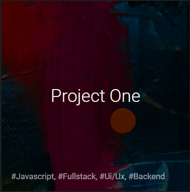
Content is showing on hover
Now you can comment the project card.
<div class="project-container"> <!-- <div class="project-card"> <img src="img/project (1).png" alt=""> <div class="content"> <h1 class="project-name">project one</h1> <span class="tags">#javascript</span> </div> </div> --></div>And let's make project card dynamically. But before doing that. Add you project.js file before app.js file. Otherwise you'll not be able to access project data.
<script src="project.js"></script><script src="app.js"></script>Now open app.js. And before making project card. Let make the links toggle active class. For that code this.
// linksconst links = document.querySelectorAll('.link');links.forEach(link => { link.addEventListener('click', () => { links.forEach(ele => ele.classList.remove('active')); link.classList.add('active'); })})And after doing that we are good to go on project cards. So code this.
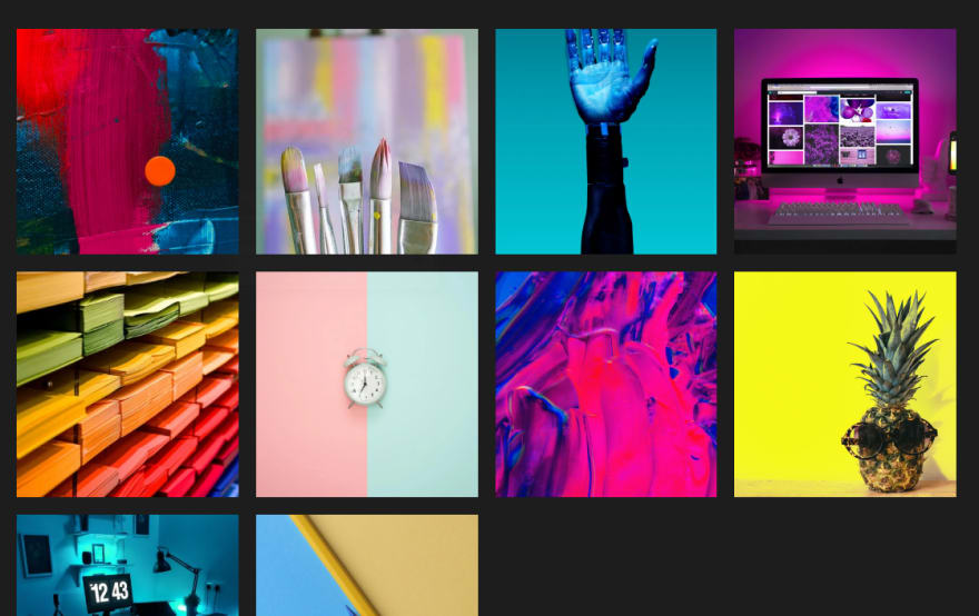
// creating dynamic project cardconst projectContainer = document.querySelector('.project-container');projects.forEach(project => { projectContainer.innerHTML += ` <div class="project-card" data-tags="#all, ${project.tags}"> <img src="img/${project.image}" alt=""> <div class="content"> <h1 class="project-name">${project.name}</h1> <span class="tags">${project.tags}</span> </div> </div> `;})You can see we are just selecting the project container and then looping through the data to make cards.
Output
Great! now make filter button functional.
// filtersconst filters = document.querySelectorAll('.filter-btn');filters.forEach(filterBtn => { filterBtn.addEventListener('click', () => { let id = filterBtn.getAttribute('id'); let projectCards = document.querySelectorAll('.project-card'); projectCards.forEach(card => { if(card.getAttribute('data-tags').includes(id)){ card.classList.remove('hide'); } else{ card.classList.add('hide'); } }) filters.forEach(btn => btn.classList.remove('active')); filterBtn.classList.add('active'); })})In above code, we are just adding click event to filter button and toggling some elements class.
So out project section is fully done. Now, make contact form.
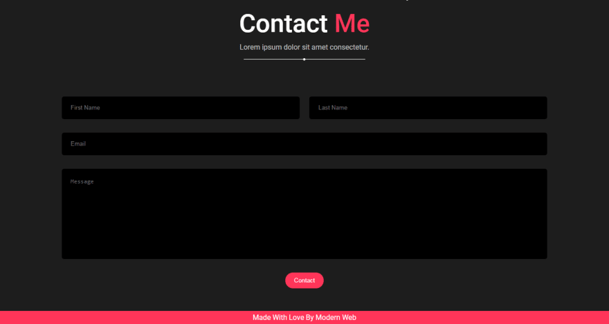
<!-- contact form --><section class="contact" id="contact-section"> <h2 class="heading">Contact<span class="highlight"> me</span></h2> <p class="sub-heading">Lorem ipsum dolor sit amet consectetur. </p> <div class="seperator"></div> <div class="contact-form"> <div class="name"> <input type="text" class="first-name" required placeholder="first name"> <input type="text" class="last-name" required placeholder="last name"> </div> <input type="email" required class="email" placeholder="email"> <textarea class="message" placeholder="message" required></textarea> <button class="btn contact-btn">contact</button> </div></section><footer class="footer">made with love by modern web</footer>/* contact form */.contact-form{ width: 100%; margin-top: 100px; position: relative;}.contact-form input, .message{ width: 100%; display: block; height: 50px; padding: 20px; border-radius: 5px; background: #000; color: #fff; border: none; outline: none; margin: 30px 0; text-transform: capitalize; resize: none;}.message{ height: 200px;}.contact-form .name{ display: flex; justify-content: space-between;}.name input{ width: 49%; margin: 0;}.contact-form .btn{ display: block; margin: auto; cursor: pointer;}/* footer */.footer{ width: 100%; height: 30px; text-align: center; background-color: #ff3559; text-transform: capitalize; line-height: 30px;}Output
Now, let's make mail route inside server.js
app.post('/mail', (req, res) => {    const { firstname, lastname, email, msg } = req.body;    const transporter = nodemailer.createTransport({        service: 'gmail',        auth: {            user: process.env.EMAIL,            pass: process.env.PASSWORD        }    })    const mailOptions = {        from: 'sender email',        to: 'receiver email',        subject: 'Postfolio',        text: `First name: ${firstname},
Last name: ${lastname},
Email: ${email},
Message: ${msg}`    }    transporter.sendMail(mailOptions, (err, result) => {        if (err){            console.log(err);            res.json('opps! it seems like some error occured plz. try again.')        } else{            res.json('thanks for e-mailing me. I will reply to you within 2 working days');        }    })})
This is a way to send mail with nodemailer. There are some thing you have to notice.
process.env.EMAIL&process.env.PASSWORDthis keyword give you access to environment variable but we haven't made any variable, for that. Create a file in your root directory.env. Name should be the same. Open it and type this.
EMAIL=your emailPASSWORD=your email's passwordSo now if you understand, process.env will access these variables.
from&toparameters. In the code above I have not entered my email's but in order to make mail work you have to give email id as their params. You can give same email id to both.
So out server is fully done. Now, make contact form working.
//contact formconst contactBtn = document.querySelector('.contact-btn');const firstName = document.querySelector('.first-name');const lastName = document.querySelector('.last-name');const email = document.querySelector('.email');const msg = document.querySelector('.message');contactBtn.addEventListener('click', () => { if(firstName.value.length && lastName.value.length && email.value.length && msg.value.length){ fetch('/mail', { method: 'post', headers: new Headers({'Content-Type': 'application/json'}), body: JSON.stringify({ firstname: firstName.value, lastname: lastName.value, email: email.value, msg: msg.value, }) }) .then(res => res.json()) .then(data => { alert(data); }) }})In above code, I am just selecting all forms input and making POST request to /mail route.
Our contact form is also. Done.
Now make this website responsive.
Responsive - Tablet
/* tablet view */@media (max-width: 996px){ html{ font-size: 14px; } /* toggle btn */ .toggle-btn{ position: absolute; width: 40px; height: 40px; right: 10vw; cursor: pointer; } .toggle-btn span{ position: absolute; width: 100%; height: 2px; background: #fff; top: 30%; transition: .5s; } .toggle-btn span:nth-child(2){ top: 70%; } .toggle-btn.active span:nth-child(1){ top: 50%; transform: rotate(45deg); } .toggle-btn.active span:nth-child(2){ top: 50%; transform: rotate(-45deg); } /* links */ .links-container{ position: absolute; top: 60px; background: #1d1d1d; width: 100%; left: 0; padding: 0 10vw; flex-direction: column; transition: .5s; opacity: 0; pointer-events: none; } .links-container.show{ opacity: 1; pointer-events: all; } .link{ margin-left: auto; text-align: center; display: block; height: 50px; } /* home section */ .home{ flex-direction: column-reverse; height: fit-content; padding-bottom: 50px; } .home .image{ width: 250px; margin: 40px; } .hero-content{ width: 70%; min-width: 350px; text-align: center; } .hero-heading{ font-size: 4.5rem; } /* about-section */ .about-me-container{ grid-template-columns: 1fr; } .left-col{ margin: auto; width: 50%; min-width: 320px; } .skill-container, .project-container{ grid-template-columns: repeat(2, 1fr); } .skill-card{ grid-column: 1 span !important; }}You can see we are styling toggle-btn here. But to make it function you need to code this inside app.js.
//toggle buttonconst toggleBtn = document.querySelector('.toggle-btn');const linkContainer = document.querySelector('.links-container');toggleBtn.addEventListener('click', () => { toggleBtn.classList.toggle('active'); linkContainer.classList.toggle('show');})Responsive - Mobile
/* mobile view */@media (max-width: 500px){ html{ font-size: 12px; } p, .sub-heading, .about-para, .left-col::before, .tags{ font-size: 1.4rem; } .about-image{ width: 90%; margin: auto; display: block; } .skill-container, .project-container{ grid-template-columns: 1fr; } .skill{ font-size: 2.5rem; } .project-name{ font-size: 3rem; } .name{ flex-direction: column; } .name input{ width: 100%; } .first-name{ margin-bottom: 20px !important; }}You can watch responsive part on video tutorial for output
So that's it. I hope you understood each and everything. If you have doubt or I missed something let me know in the comments.
Articles you may find Useful
I really appreciate if you can subscribe my youtube channel. I create awesome web contents.

Thanks For reading.
Original Link: https://dev.to/kunaal438/how-to-make-fully-responsive-modern-portfolio-using-pure-html-css-and-js-1p65
Dev To
 An online community for sharing and discovering great ideas, having debates, and making friends
More About this Source Visit Dev To