
An Interest In:
Web News this Week
- April 19, 2024
- April 18, 2024
- April 17, 2024
- April 16, 2024
- April 15, 2024
- April 14, 2024
- April 13, 2024
Some of Our Sources
- Mashable
- Spoon Graphics
- Smashing Apps
- FanExtra - PSD
- My Ink Blog
- Fudge Graphics
- Stylized Web
- Wal You
- Dev To
- TechPowerUp
Help Webnuz
Referal links:
Building charts in React with Nivo
Written by Leonardo Maldonado
The React ecosystem has a very rich and vast community with many open-source libraries available to help us solve a wide range of problems from the most basic, common problems, such as state management and forms, to the most complex challenges, such as visual representation of data. For the latter, it can be hard to find the right library for the job.
React libraries are often created and rendered obsolete within a matter of months, and a decision to use a particular library impacts the whole development team. Thats why its important to choose the right library for any task or feature you plan to build into your app. Data visualization is no exception.
In this tutorial, well show you how to use Nivo, a data visualization library for React, by building a few charts and implementing them in a React app. Well highlight a few key components and show how they work together to make data more visually appealing to your users.
Why use a React chart library?
The most important benefit of using a library for data visualization in React is the ability to implement a wide variety of charts and graphs without reinventing the wheel. You shouldnt need to spend hours of your precious time trying to implement a simple bar char. A powerful chart library such as Nivo can help you save time, achieve better results, and create a unique user experience for your React app.
Representing data in an aesthetically pleasing way can give your application a fresher, more modern look. Nowadays, most companies use some kind of data visualization feature to deliver an insightful and enjoyable user experience.
Building your own data visualization or chart library is difficult and time-consuming. Many developers who have set out to do so have found that the juice wasnt worth the squeeze.
What is Nivo?
Nivo is a rich set of data visualization components for React applications. It includes a variety of components that can be used to show graphs and data numbers in modern React apps.
Nivo is built on top of D3.js and comes with powerful extra features such as server-side rendering and declarative charts. It's a highly customizable data visualization library that provides well-written documentation with many examples and responsive data visualization components. It also supports motion and transitions out-of-the-box.
Why use Nivo instead of D3?
One of the most popular data visualization tools for JavaScript applications is the D3.js library. D3 is a powerful chart library that enables you to bring data to life using HTML, SVG, and CSS.
The only problem with D3.js is that it has a steep learning curve and your code is bound to become quite complex. D3.js makes heavy use of SVG, HTML, and CSS. To use the library correctly, you must have a good understanding of how SVGs and the DOM work.
Dont get me wrong D3.js is a very powerful and useful library for building data visualization in modern applications. But most of the time, you don't want to spend hours trying to create a simple bar chart. React is all about reusability, and Nivo enables you to create reusable components and, in doing so, eliminate hours of debugging.
Nivo is a better choice for data visualization in React because it removes the complexity of building components. with Nivo, you can work more efficiently, customize your components, and create a wide variety of data visualizations with ease.
Installing Nivo
The first step to using Nivo in your React app is to install it in your project:
yarn add @nivo/coreWhen we install the core package, it doesn't come with all the components of the library. This might sound like a disadvantage, but its actually a good thing.
We dont want to add a heave package that would increase our bundle size just to use a single component. Instead, we can add the specific package that we need to use a specific component.
Let's add our first Nivo component package to our React application.
Building a bar chart
To start, well add the bar chart component to use it in our React application:
yarn add @nivo/barThe bar chart component has many features. It can show data stacked or side by side. It supports both vertical and horizontal layouts and can be customized to render any valid SVG element.
We're going to import the bar component into our file so we can start to create our first bar chart using Nivo.
import { ResponsiveBar } from '@nivo/bar'To get started with the bar component, we need a single prop: data. The data prop is an array of objects that we pass to the ResponsiveBar component. Each object should have a lest one key property to index the data and a key property to determine each series.
We're going to use the following object:
const data = [ { day: "Monday", degress: 59 }, { day: "Tuesday", degress: 61 }, { day: "Wednesday", degress: 55 }, { day: "Thursday", degress: 78 }, { day: "Friday", degress: 71 }, { day: "Saturday", degress: 56 }, { day: "Sunday", degress: 67 }];We pass this data array to our ResponsiveBar component. The ResponsiveBar component needs an indexBy string to index the data and a keys property, which is an array of string to use to determine each series.
We're going to pass our degrees property as keys and we want to index our data by days. Our component will end up like this after all that:
const Bar = () => { return ( <ResponsiveBar data={data} keys={["degress"]} indexBy="day" margin={{ top: 50, right: 130, bottom: 50, left: 60 }} padding={0.4} valueScale={{ type: "linear" }} colors="#3182CE" animate={true} enableLabel={false} axisTop={null} axisRight={null} axisLeft={{ tickSize: 5, tickPadding: 5, tickRotation: 0, legend: "degrees", legendPosition: "middle", legendOffset: -40 }} /> );};Now we have a beautiful and powerful data visualization component using Nivo! As you can see, with just a few lines of code, we can achieve a powerful result like this:

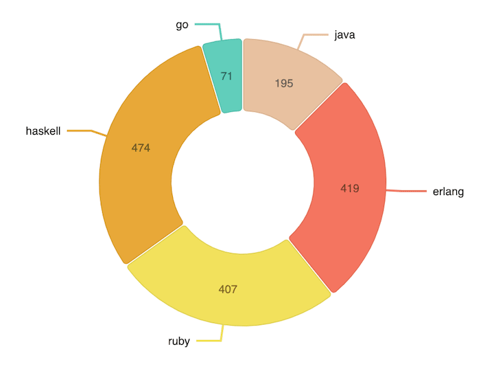
Building a pie chart
A pie chart displays numerical data as slices of a single circle. This type of data visualization is applicable in virtually all industries and for a wide variety of use cases.
Nivo has apie chart component, which you can install with the following command:
yarn add @nivo/pieSimilar to the bar component, the pie component requires a few props to work: the data array of objects and the width and height for showing your pie chart.
The data object that we pass to the pie component can be a little bit different. We can use many properties, such as id, label, value, and color, to customize our pie chart.
We have an array of objects, and each object has a specific property that is going to be used in our pie chart:
- The
idproperty is a unique value for each object of our array - The
valueproperty is the value of our object that is going to be rendered on our chart - The
colorobject is a string that we are going to pass as the color of our object on our chart - The
labelproperty is the label name of our object
const data = [ { id: "java", label: "java", value: 195, color: "hsl(90, 70%, 50%)" }, { id: "erlang", label: "erlang", value: 419, color: "hsl(56, 70%, 50%)" }, { id: "ruby", label: "ruby", value: 407, color: "hsl(103, 70%, 50%)" }, { id: "haskell", label: "haskell", value: 474, color: "hsl(186, 70%, 50%)" }, { id: "go", label: "go", value: 71, color: "hsl(104, 70%, 50%)" }];We can also customize our pie component by passing properties such as padAngle and cornerRadius. The padAngle prop determines the angle between each object in our chart. The cornerRadius prop is the value we can pass as the border radius of each object.
Our final component ends up like this:
const Pie = () => { return ( <ResponsivePie data={pieData} margin={{ top: 40, right: 80, bottom: 80, left: 80 }} innerRadius={0.5} padAngle={0.7} cornerRadius={3} activeOuterRadiusOffset={8} borderWidth={1} borderColor={{ from: "color", modifiers: [["darker", 0.2]] }} arcLinkLabelsSkipAngle={10} arcLinkLabelsTextColor="#333333" arcLinkLabelsThickness={2} arcLinkLabelsColor={{ from: "color" }} arcLabelsSkipAngle={10} arcLabelsTextColor={{ from: "color", modifiers: [["darker", 2]] }} /> );};The final result should look like this:
Conclusion
Nivo provides many different components for creating data visualization in React applications. Its vast list of components includes a calendar component, a Choropleth component (a divided geographical area component), a tree map component, and many more.
You can apply most of the techniques we learned in this tutorial to create other types of data visualization components besides the bar and pie chart. The idea here was to give a glimpse of what you can achieve using Nivo and how powerful this data visualization library is.
There is no right or wrong chart library for a given task; it all depends on the results youre aiming to achieve and the requirements of your project. That said, the tools and features available with Nivo make it an excellent chart library for creating stunning, impactful data visualizations in React.
Nivo is open-source and the community around it is very active and helpful. The documentation is well-written and you can learn how to use some components in mere minutes. At the end of the day, the wide selection of components and variety of use cases they serve makes Nivo one of the best React chart libraries hands down.
Full visibility into production React apps
Debugging React applications can be difficult, especially when users experience issues that are hard to reproduce. If youre interested in monitoring and tracking Redux state, automatically surfacing JavaScript errors, and tracking slow network requests and component load time, try LogRocket.

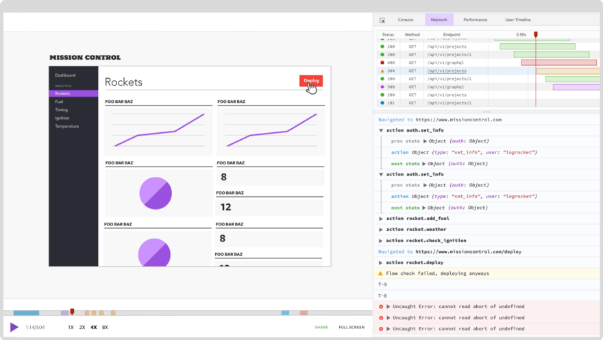
LogRocket is like a DVR for web apps, recording literally everything that happens on your React app. Instead of guessing why problems happen, you can aggregate and report on what state your application was in when an issue occurred. LogRocket also monitors your app's performance, reporting with metrics like client CPU load, client memory usage, and more.
The LogRocket Redux middleware package adds an extra layer of visibility into your user sessions. LogRocket logs all actions and state from your Redux stores.
Modernize how you debug your React apps start monitoring for free.
Original Link: https://dev.to/logrocket/building-charts-in-react-with-nivo-25en
Dev To
More About this Source Visit Dev To