
An Interest In:
Web News this Week
- April 23, 2024
- April 22, 2024
- April 21, 2024
- April 20, 2024
- April 19, 2024
- April 18, 2024
- April 17, 2024
Some of Our Sources
- Slashdot
- Engadget
- Pearsonified
- Six Revisions
- TutsPlus - Design
- Creative Curio
- Naldz Graphics
- Web Resource Source
- Codrops
- Daily Now
Help Webnuz
Referal links:
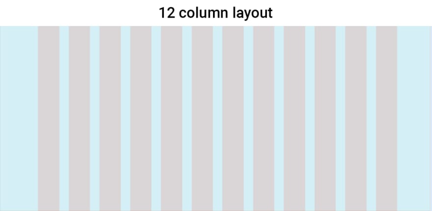
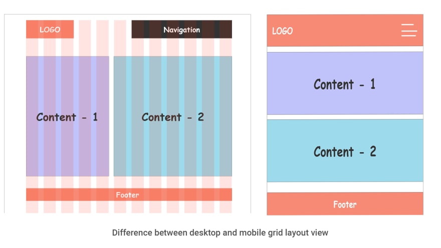
- Responsive Web Design (RWD)
, , , ,
, ,
-
?
:
<img> 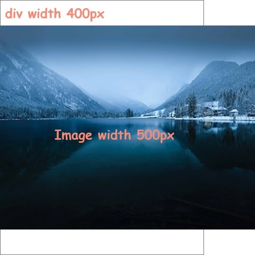
, div width 500px img { max-width: 100% }
height-width -

html5 <picture>
<picture> <source srcset="./small-image.jpg" media="(max-width: 400px)"> <source srcset="./big-image.jpg" media="(max-width: 768px)"> <img src="./default.jpg" /></picture> 
background-image background-size: cover
@media CSS2 , printer, tablet, desktop, phone
CSS2 @media CSS3 @media query
@media query
- -
- -
- Orientation ( Landscape & portrait )
@media query -, -, Orientation, , Breakpoint ,
@media only screen and (max-width: 768px) { .content { text-align: center; } .content img { max-width: 80%; } .content p { padding: 0 70px; } } 
% 768px %
-
@media only screen and (max-width: 600px) { // 600px 600px }@media only screen and (min-width: 600px) { // 600px 600px }@media only screen and (min-width: 768px) { // 768px 768px }@media only screen and (min-width: 992px) { // 992px 992px - }@media only screen and (min-width: 1200px) { // 1200px 1200px }google chrome toggle device toolbar


Bootstrap
, , - @media query
Reference:
Original Link: https://dev.to/tamalnh/responsive-web-design-rwd-12d9
Dev To
 An online community for sharing and discovering great ideas, having debates, and making friends
More About this Source Visit Dev To