
An Interest In:
Web News this Week
- April 19, 2024
- April 18, 2024
- April 17, 2024
- April 16, 2024
- April 15, 2024
- April 14, 2024
- April 13, 2024
Some of Our Sources
- Simplebits
- Just Creative
- Smashing Magazine
- Inspiredology
- FanExtra - PSD
- Freelance Switch
- Web Resource Source
- Android Headlines
- Hashedout
- The Verge
Help Webnuz
Referal links:
Master Web Performance like a Jedi
Why do we keep hearing about Web Performance?
WPO or Web Performance Optimization analyses how efficient is a website or application when it comes to "being ready to be used".
A User Interface (UI) with minimalistic design could perform badly if we don't take good practices into our code, and therefore WPO is a strong tool we need to learn how to use.
How do we measure Web Performance?
Let's divide this concept into pieces:
- FCP First Contentful Paint:It measures the time from the moment your page starts loading to when its content (such as images, logos, text, etc.) will be rendered on the screen.
 source: web.dev
 - LCP - Largest Contentful Paint:Very similar to the FCP mentioned above, it measures the time until the largest image or text block (with visible display) is rendered. For this measurement, the size of the image taken into account would be the smaller from either the original size or the displayed size on the website/application.
- FID - First Input Delay: If we knock on a door and no one answers until 5 minutes go by, in the meantime we could think the doorbell didn't work or perform as it should be. In our website the FID measures the time between the instant we as users interact (click event on a button for example) and the moment when the browser starts processing.
Open Source Tools to measure Web Performance
- Lighthouse: You can use this tool from your Chrome DevTools, either directly from the command line, or installed locally.
- PageSpeed Insights
- Webpage Test
Good practices when coding:
As usual, basics can help us avoid big problems with our performance.
External Libraries:
What if I told you that you might be only using 10% of a heavy package that is making your performance lower?
Libraries help us on a daily basis, and there are great tricks to use them without affecting our performance.
- Bundlephobia This tool helps us identify packages whose dependencies might be too heavy and compare them to other options.

- Chrome DevTools Coverage If you don't want to install local tools to check what is inside a library, you could check with your DevTools the unused components from the libraries in your Web Site. Just type CTRL+SHIFT+P in Windows or CMD+SHIFT+P in Mac inside Chrome DevTools and select show coverage drawer. All that is left to do is reloading and we will see the coverage for all js files and identify which libraries have the most unused components.
- Let's say we checked our libraries and identified one that is too large but we need to use it for our project, here are some additional tricks that you can use:
- Load Library only when necessary for user interaction: In this example we call
notify()when clicking on a button to see a notification.
- Load Library only when necessary for user interaction: In this example we call
const notify = () => { import("react-toastify").then(el => el.toast("Wow so easy!"))}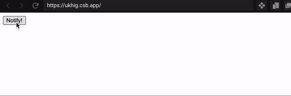
- Some libraries allow you to reduce the size of the bundle importing only the functions you need instead of the full import, like these examples from the documentation of the
date-fnspackage:
// The main submodule:import addDays from 'date-fns/addDays'// FP variation:import addDays from 'date-fns/fp/addDays'- Dynamic import of components when using a Next Application:
import dynamic from 'next/dynamic'const DynamicComponent = dynamic(() => import('../components/hello'))function Home() { return ( <div> <Header /> <DynamicComponent /> <p>HOME PAGE is here!</p> </div> )}export default HomeImages and videos optimization:
These are the steps I follow on a daily basis in order to optimize the media:
- Size: Going back to the basics, a lighter image will always improve the flow of your application, there is a large number of tools that can help us reduce the size (and therefore its weight) like for example:
- Photopea: If you are used to edit pictures this online tool will be no mystery for you. The most basic thing you could do would be resizing your image and saving it to a lighter format.
- Image or video online compressor
- Format: Not all formats are equally efficient, JPEG and PNG are basic depending on how much color we have in our image, but Webp is definitely the best format for website images, even google has its own open script for you to use locally, this way you change the format compressing the image at the same time without losing quality. You need to keep in mind that some formats might not work well on some browsers like format Webp in Safari
- Lazy Loading: Now that you have an optimized image let's talk about lazy loading, as its name says, it loads the image only when needed, so your website doesn't need to load all the media at once when rendering.We have different ways to implement this:
- HTML attribute for
imgtags: This is quite a recent feature for HTML includingloading=lazyas an attribute, however it only works for some browsers. - Intersection Observer
- External lazy loaders like Yall.js: yall.js is a lazy loader for
img,picture,videoandiframeelements, as well as CSS background images. It works in all modern browsers, including IE 11 (it uses Intersection Observer where available, but as of version 3, this API must be polyfilled for older browsers). - Next Image In case you are developing your project with Next.js this will be very useful. Instead of using the tag
<img/>we will use the componentImagefrom Next. First we import the component:import Image from 'next/image'. Last step would be to use it in our code with its corresponding props (Click here to see its documentation):
- HTML attribute for
function Home() { return ( <> <h1>My Homepage</h1> <Image src={profilePic} alt="Picture of the author" /> <p>Welcome to my homepage!</p> </> )}Fonts
Fonts are also a big part of web performance, thought we might never see them as heavy objects.
In order to avoid FOUT (Flash of Unstyled Text), you can preload web fonts that will be required immediately during the first rendering. To do this, add the <link> element at the <head> of the document, including the attribute rel="preload":
<head> <!-- ... --> <link rel="preload" href="/assets/Pacifico-Bold.woff2" as="font" type="font/woff2" crossorigin></head>What do the rest of the attributes mean?
as="font" type="font/woff2"informs to the browser to download this resource as a font and therefore as a priority for the resources list.crossorigintells the browser if the resource should be fetched with a CORS request (the font could come from a different domain). Without this attribute, the preloaded font is ignored by the browser.As we mentioned in this point, this should only be done for required fonts, otherwise it might affect the performance in a negative way if we pre load elements that weren't required at first.
Another way to use optimized fonts is making sure that text remains visible during webfont load, because some browsers hide it until the font loads, causing a flash of invisible text (FOIT)
Here are two tips to avoid FOIT:
- Using
font-display: swapin your@font-facedefinition (this might not work on all major browsers) - In case of Google Fonts, adding
&display=swapparameter to the end of fonts URL<link>:<link href="https://fonts.googleapis.com/css?family=Roboto:400,700&display=swap" rel="stylesheet">
Web Cache
Some performance metrics might always check your website as if the cache were empty, however an optimized cache will always speed the user flow through your application.
That's all folks! I'd like to hear your thoughts about this topic. Feel free to leave a comment below .
Original Link: https://dev.to/dcsl-guidesmiths/master-web-performance-like-a-jedi-4p0j
Dev To
 An online community for sharing and discovering great ideas, having debates, and making friends
More About this Source Visit Dev To