
An Interest In:
Web News this Week
- April 1, 2024
- March 31, 2024
- March 30, 2024
- March 29, 2024
- March 28, 2024
- March 27, 2024
- March 26, 2024
Some of Our Sources
- Mashable
- Techcrunch
- Web Designer Wall
- Just Creative
- Smashing Apps
- Six Revisions
- Vandelay Design
- Inspiredology
- FanExtra - PSD
- Fudge Graphics
Help Webnuz
Referal links:
A quick dive into 3 CSS keywords: min-content, max-content and fit-content
The CSS Box Sizing Module Level 3 specs define 3 new sizing values:
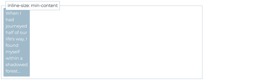
min-content represents the minimum intrinsic size of an element. This means that when it's set as the width (or inline-size) of an element with text content, its size will be as long as the longest word. Every space or non-alphanumeric character (like hyphens, if hyphenation is auto) can be used to apply a soft break, like in this example:
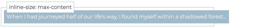
max-content it works in the opposite way than min-content since it represents the maximum intrinsic size of an element.
When this keywords is set as the width (or inline-size) of an element with text content, it will be as long as the content without any line breaks. If the size of the parent is narrower then the element will cause an overflow, as shown below:
fit-content it works like a mix of min-content and max-content: an element sized with this keyword will stretch to contain the text but it won't be never longer than max-content and never shorter than min-content.
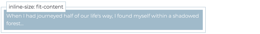
Note that fit-content is not the same as auto: an element with display: block; and width: auto will always take the entire space available while fit-content size is limited by its content.
The last example will be more clear if you try it in this snippet and you resize the result window.
As a side note, these keywords are not animatable and they can't be used inside a calc() expression, like inline-size: calc(min-content + 2rem).
Anyway you can still use them for other properties, like max-width/max-inline-size, min-width/min-inline-size or flex-basis.
A use case for fit-content
Exploring these keywords I've found a scenario where fit-content can be somewhat useful.
Let say that you have a link as the last element inside a paragraph, no <br> element before and no control over the markup: how could you show the link in a new line and centered?
A possibility is to set display: block on the link of course, but this will naturally expand it taking the full width of the parent, so you need to also set a width (or inline-size) to limit its size.
Clearly the size should not be hardcoded with a fixed value, because the content may vary, but if you set instead inline-size: fit-content the content now dictates the size of the element itself
and this is the final result.
If you have found different and creative use cases for these keywords let me know in the comments .
Final words & thoughts
Feel free to follow me on Codepen or Twitter where I usually talk about frontend and trees.
Also, if this post was useful, you may take a look at my other carbon free articles on dev or just retweet the announcement below:
I published a new post on DEV community:
A quick dive into 3 #CSS keywords: min-content, max-content and fit-content
dev.to/fcalderan/a-qu
@ThePracticalDev08:54 AM - 27 Jul 2021


Original Link: https://dev.to/fcalderan/a-quick-dive-into-3-css-keywords-min-content-max-content-and-fit-content-2nkf
Dev To
 An online community for sharing and discovering great ideas, having debates, and making friends
More About this Source Visit Dev To