
An Interest In:
Web News this Week
- April 19, 2024
- April 18, 2024
- April 17, 2024
- April 16, 2024
- April 15, 2024
- April 14, 2024
- April 13, 2024
Some of Our Sources
- The Logo Smith
- Spoon Graphics
- TutsPlus - Design
- Naldz Graphics
- Web Design Ledger
- Wal You
- Specky Boy
- Freelance Switch
- Daily Now
- Dev To
Help Webnuz
Referal links:
Animated placeholder with CSS / Tailwind
Hello everybody, in this article we will create animated placeholder using css and tailwind. To do that, we need to enable JIT on configuration file. Because peer- utility that we will use is working with JIT mode.
So, our tailwind.config.js file should be like this
module.exports = { mode: 'jit', // other configs...}CSS Way
So, let's see first how we can do with css? But first, we need html :)
<div class="input-with-placeholder"> <input type="text" id="username" /> <label for="username">Username</label></div>Basically, when we focus to input, then we need to use + selector to select label comes after input. But before we do that, let's write some css to make sure that example looks pretty :)
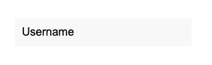
/*some reset css..*/.input-with-placeholder { width: 250px; position: relative;}.input-with-placeholder label { position: absolute; top: 0; left: 0; width: 100%; height: 100%; display: flex; align-items: center; padding-left: 10px; transition: 300ms all;}.input-with-placeholder input { width: 100%; height: 40px; padding: 0 15px; background: #f8f8f8;}now it looks like this
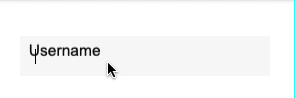
so, what's next? When we focus to input, we will change label position, font-size, height and padding-left properties.
.input-with-placeholder input:focus + label { height: 50%; padding-left: 0; transform: translateY(-100%); font-size: 12px; color: #777;}so now, animation will works perfectly. you can check the gif :)
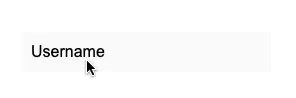
but, when we write something to input, and when it lose focusable, label will back to normal style and we don't wanna do this right? So what can we do? Well, we can add required attribute to input, and then we can control with :valid in css. Let's do that.
add required attribute to input
<input type="text" id="username" required />we will use same css with ":focus" for ":valid", so we don't need to write again. we can use like this
.input-with-placeholder input:focus + label,.input-with-placeholder input:valid + label { height: 50%; padding-left: 0; transform: translateY(-100%); font-size: 12px; color: #777;}we did it!
here's the demo.
Tailwind CSS Way
As I always said, how we can make it faster to development process? Using tailwind css, for sure :)
So, what we will use? We will use group and peer utilities.
Let's create html + css and explain everthing what we did.
<div class="w-56 relative group"> <input type="text" id="username" required class="w-full h-10 px-4 text-sm peer bg-gray-100 outline-none"> <label for="username" class="transform transition-all absolute top-0 left-0 h-full flex items-center pl-2 text-sm group-focus-within:text-xs peer-valid:text-xs group-focus-within:h-1/2 peer-valid:h-1/2 group-focus-within:-translate-y-full peer-valid:-translate-y-full group-focus-within:pl-0 peer-valid:pl-0">Username</label></div>so what we did?
.w-56.relative.group = we set width, relative for absolute label, group for using group-focus-within
.w-full.h-10.px-4.text-sm.peer.bg-gray-100.outline-none = we set width full, height 2.5 rem, padding left and right 1rem, font-size 0.875rem, peer for using peer-valid, background gray and no outline.
.transform.transition-all.absolute.top-0.left-0.h-full.flex.items-center.pl-2.text-sm = we positioned label into input, and we add transition for the animation and transform for using the translate.
when we focus to input, we changed the label styles like what we did in normal css with group-focus-within
group-focus-within:text-xs.group-focus-within:h-1/2.group-focus-within:-translate-y-full.group-focus-within:pl-0 = so basically, we set font-size smaller, half height, -100% translate y and padding-left 0.
remember, when we write something to input, and when it lose focusable, label will back to normal style and we don't wanna do this right? so because of that, we used peer and peer-valid utilities.
we did same thing what we did in group-focus-within. And here's the demo.
Quick tip
When your input in a form and when you don't want to validate some inputs, you can use novalidate attribute for <form> tag. So, css will still work, but you will not see any error message at all.
Thank you for reading, have a nice day.
Original Link: https://dev.to/tayfunerbilen/animated-placeholder-with-css-tailwind-2oc0
Dev To
 An online community for sharing and discovering great ideas, having debates, and making friends
More About this Source Visit Dev To