
An Interest In:
Web News this Week
- April 19, 2024
- April 18, 2024
- April 17, 2024
- April 16, 2024
- April 15, 2024
- April 14, 2024
- April 13, 2024
Some of Our Sources
- Slashdot
- Simplebits
- Vandelay Design
- Fuel Your Creativity
- Noupe
- Web Design Ledger
- Specky Boy
- Design Modo
- Daily Now
- Dev To
Help Webnuz
Referal links:
July 21, 2021 12:07 pm GMT
Original Link: https://dev.to/m_ahmad/let-s-build-hulu-clone-with-next-js-tailwind-5fg3
Let's build Hulu clone with Next.js & Tailwind
I'll be creating a Hulu webpage clone with Next.js and Tailwind.
Live demo: hulu-clone-live
Github repo: hulu-clone-repo
Breaking down the layout of webpage to 6 main sections.
- Header
- Sub header
- Categories
- Live
- Live sports
- Footer
1. Setup the Project
Create a Next.js app
yarn create next-app --typescriptInstall tailwind and configure it
yarn add tailwindcss@latest postcss@latest autoprefixer@latest2. Sections
Header

<header className="header h-530 bg-header-img bg-cover bg-no-repeat bg-center"> <nav className="relative flex justify-end z-20 px-8 py-6"> <ul> <li> <button className="text-white font-bold border-0 bg-none uppercase tracking-widest cursor-pointer"> Log In </button> </li> </ul> </nav> <div className="flex flex-col justify-start items-center mt-10 text-white space-y-6"> <h4 className="uppercase text-sm text-hulu-green font-bold"> Try up to one month free </h4> <img src="/logo.png" alt="Hulu" className="w-200 md:w-270 m-auto m-2" /> <div className="font-bold text-2xl text-center"> Watch thousands of TV shows and movies. </div> <div className="hidden md:block text-lg"> HBO Max, SHOWTIME, CINEMAX and STARZ available as add-ons. </div> <button className="bg-white text-gray-800 px-8 py-5 text-md font-semibold border-0 rounded-md cursor-pointer uppercase tracking-wide leading-3 hover:opacity-80"> Start Your Free Trial </button> <div className="text-xs text-gray-200"> Free trial for new & eligible returning subscribers only. </div> </div> </header>Sub-header

<section className="grid grid-cols-1 md:grid-cols-3 gap-8 items-center px-8 py-6 bg-gradient-to-l from-cstart via-cvia to-cend text-white"> <img src="/logos.png" alt="" className="block w-250 md:w-full m-auto md:m-0" /> <div className="space-y-3 text-center md:text-left"> <h4 className="uppercase text-sm text-hulu-green font-bold"> Bundle with any Hulu plan & save </h4> <h3 className="text-3xl font-light">Get Hulu, Disney+, and ESPN+.</h3> <a href="#" className="block text-gray-300 text-xs underline"> Details </a> </div> <div className="justify-self-center md:justify-self-end space-y-3"> <a href="#" className="block bg-transparent text-white px-8 py-5 text-md font-semibold border-2 border-white rounded-md cursor-pointer uppercase tracking-wide leading-3 hover:opacity-80" > Get Bundle </a> <a href="#" className="block text-center text-gray-300 text-xs underline" > Terms apply </a> </div> </section>Categories
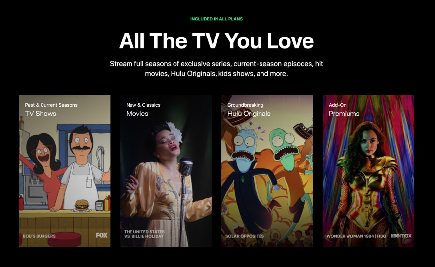
<section className="flex flex-col text-center justify-items-center items-center px-16 py-20 text-white bg-black"> <h4 className="uppercase text-sm text-hulu-green font-bold"> Included in all plans </h4> <div className="font-bold text-5xl md:text-7xl mt-6"> All The TV You Love </div> <div className="text-xl md:text-2xl max-w-3xl mt-6"> Stream full seasons of exclusive series, current-season episodes, hit movies, Hulu Originals, kids shows, and more. </div> <div className="grid grid-cols-1 md:grid-cols-2 xl:grid-cols-4 gap-8 mt-14"> <div className="h-500 w-300 relative bg-cover1-img bg-cover bg-no-repeat bg-center"> <div className="cover-grad absolute h-full w-full top-0 left-0"></div> <div className="absolute top-5 left-5 text-left"> <div className="sub-title">Past & Current Seasons</div> <h3 className="font-light text-2xl">TV Shows</h3> </div> </div> <div className="h-500 w-300 relative bg-cover2-img bg-cover bg-no-repeat bg-center"> <div className="cover-grad absolute h-full w-full top-0 left-0"></div> <div className="absolute top-5 left-5 text-left"> <div className="sub-title">New & Classics</div> <h3 className="font-light text-2xl">Movies</h3> </div> </div> <div className="h-500 w-300 relative bg-cover3-img bg-cover bg-no-repeat bg-center"> <div className="cover-grad absolute h-full w-full top-0 left-0"></div> <div className="absolute top-5 left-5 text-left"> <div className="sub-title">Groundbreaking</div> <h3 className="font-light text-2xl">Hulu Originals</h3> </div> </div> <div className="h-500 w-300 relative bg-cover4-img bg-cover bg-no-repeat bg-center"> <div className="cover-grad absolute h-full w-full top-0 left-0"></div> <div className="absolute top-5 left-5 text-left"> <div className="sub-title">Add-On</div> <h3 className="font-light text-2xl">Premiums</h3> </div> </div> </div> </section>Live

<section className="px-10 py-10 bg-live-section text-white"> <div className="flex flex-col items-center justify-center text-center border-4 border-hulu-green rounded-2xl px-10 py-8 md:p-28 space-y-7"> <h4 className="uppercase text-sm text-hulu-green font-bold"> Hulu + Live TV </h4> <div className="font-bold text-4xl md:text-7xl"> Live TV Makes It Better </div> <div className="text-xl md:text-2xl max-w-3xl"> Make the switch from cable. Get 75+ top channels with your favorite live sports, news, and events - plus the entire Hulu streaming library. </div> <div className="text-gray-300 text-xs"> Live TV plan required. Regional restrictions, blackouts and additional terms apply. See details </div> <a href="#" className="uppercase underline"> View Channels in Your Area </a> </div> </section>Live sports

<section className="h-800 relative bg-livesport-small md:bg-livesport-img bg-cover bg-no-repeat bg-center text-white"> <div className="absolute max-w-550 top-28 left-6 md:top-160 md:left-100 space-y-7"> <div className="font-bold text-5xl md:text-7xl">Live Sports</div> <div className="text-2xl max-w-2xl"> Catch your games at home or on the go. Stream live games from major college and pro leagues including the NCAA, NBA, NHL, NFL, and more. </div> <div className="flex items-center justify-between w-300 space-x-5"> <div className="flex justify-center items-center h-16 w-16 relative bg-network-logo bg-cover bg-no-repeat bg-center"> <img src="/live-sports-logo-1.png" alt="" className="w-10" /> </div> <div className="flex justify-center items-center h-16 w-16 relative bg-network-logo bg-cover bg-no-repeat bg-center"> <img src="/live-sports-logo-2.png" alt="" className="w-10" /> </div> <div className="flex justify-center items-center h-16 w-16 relative bg-network-logo bg-cover bg-no-repeat bg-center"> <img src="/live-sports-logo-3.svg" alt="" className="w-10" /> </div> <div className="flex justify-center items-center h-16 w-16 relative bg-network-logo bg-cover bg-no-repeat bg-center"> <img src="/live-sports-logo-4.png" alt="" className="w-10" /> </div> </div> <div className="text-gray-300 text-xs"> Live TV plan required. Regional restrictions, blackouts and additional terms apply. See details </div> </div> </section>Footer

<footer className="bg-gray-200 text-black"> <div className="p-10 max-w-1100 m-auto"> <div className="flex flex-col md:flex-row justify-between"> <ul> <li className="uppercase font-bold mb-3">BROWSE</li> <li> <a href="#">Streaming Library</a> </li> <li> <a href="#">Live TV</a> </li> <li> <a href="#">Live News</a> </li> <li> <a href="#">Live Sports</a> </li> </ul> <ul> <li> <a href="#">TV Shows</a> </li> <li> <a href="#">Movies</a> </li> <li> <a href="#">Originals</a> </li> <li> <a href="#">Networks</a> </li> <li> <a href="#">Kids</a> </li> <li> <a href="#">FX on Hulu</a> </li> </ul> <ul> <li> <a href="#">Hulu, Disney+, and ESPN+</a> </li> <li> <a href="#">Disney Bundle</a> </li> <li> <a href="#">HBO Max</a> </li> <li> <a href="#">Cinimax</a> </li> <li> <a href="#">Showtime</a> </li> <li> <a href="#">STARZ</a> </li> </ul> <ul> <li className="uppercase font-bold mb-3">HELP</li> <li> <a href="#">Account & Billing</a> </li> <li> <a href="#">Plans & Pricing</a> </li> <li> <a href="#">Supported Devices</a> </li> <li> <a href="#">Accesibility</a> </li> </ul> <ul> <li className="uppercase font-bold mb-3">ABOUT US</li> <li> <a href="#">Press</a> </li> <li> <a href="#">Jobs</a> </li> <li> <a href="#">Contact</a> </li> </ul> </div> <hr className="my-7 border-gray-400" /> <div className="flex items-center"> <a href="#"> <img src="/facebook.svg" alt="" className="w-6 h-6 mr-6" /> </a> <a href="#"> <img src="/twitter.svg" alt="" className="w-6 h-6 mr-6" /> </a> <a href="#"> <img src="/youtube.svg" alt="" className="w-6 h-6 mr-6" /> </a> <a href="#"> <img src="/instagram.svg" alt="" className="w-6 h-6" /> </a> </div> </div> </footer>Original Link: https://dev.to/m_ahmad/let-s-build-hulu-clone-with-next-js-tailwind-5fg3
Share this article:
Tweet

View Full Article
Dev To
 An online community for sharing and discovering great ideas, having debates, and making friends
More About this Source Visit Dev To