
An Interest In:
Web News this Week
- April 18, 2024
- April 17, 2024
- April 16, 2024
- April 15, 2024
- April 14, 2024
- April 13, 2024
- April 12, 2024
Some of Our Sources
- Technology Review
- Pearsonified
- Spoon Graphics
- Abduzeedo
- Creative Curio
- CSS Globe
- Specky Boy
- CSS Tricks
- Spyre Studios
- Willems Lab
Help Webnuz
Referal links:
Rotten Tomatoes star rating system with Web Components
On Rotten Tomatoes, a film can be rated either "fresh" or "rotten". Here's how to build a star rating component that can show both negative and positive values with different icons in this case, "fresh" or "rotten" tomatoes.
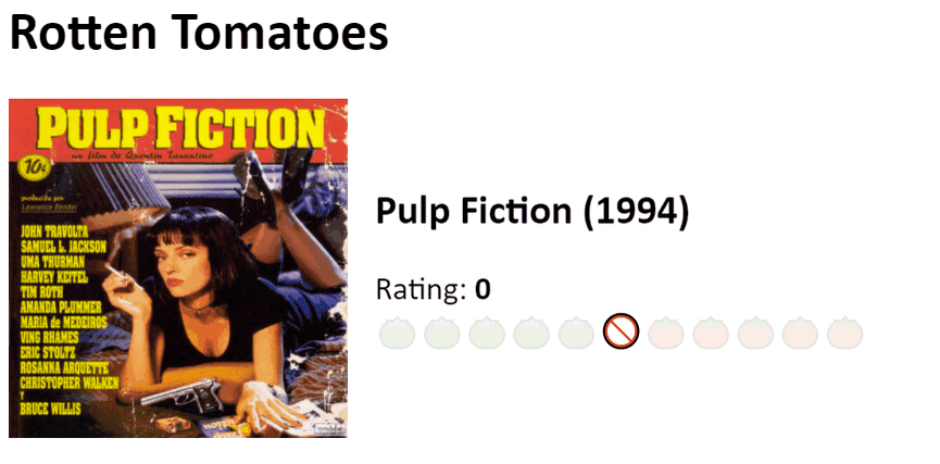
Here's what we'll be building
The API for our Web Component will look like this:
<star-rating min="-5" max="5" value="0"></star-rating>First, we set up a StarRating [Web Component](https://developer.mozilla.org/en-US/docs/Web/Web_Components_:
class StarRating extends HTMLElement { constructor() { super(); }}customElements.define("star-rating", StarRating);Within the constructor, we grab the min, max, and value attributes:
const [min, max, value] = ["min", "max", "value"].map((x) => Number(this.getAttribute(x)));Then, we set up the shadow DOM:
this.attachShadow({ mode: "open" });const el = document.createElement("div");el.classList.add("rating");const [neg, pos] = [min, max].map(Math.abs);el.innerHTML = `<div> Rating: <span class="value">${value}</span></div><div class="stars-container"> <input type="range" min="${min}" max="${max}" step="1" value="${value}"> <div class="stars" aria-hidden="true"> <div>${'<span class="star neg below"></span>'.repeat(neg)}</div> <div><span class="star zero exact"></span></div> <div>${'<span class="star pos above"></span>'.repeat(pos)}</div> </div></div>`;Finally, we set up the component's behavior:
// in constructorsetup(this, { neg });// ...function setup(component, { neg }) { const el = component.shadowRoot.querySelector(".rating"); const starsEl = el.querySelector(".stars"); const inputEl = el.querySelector("input"); const valueEl = el.querySelector(".value"); const starEls = [...starsEl.querySelectorAll(".star")]; const getValFromStar = (star) => { const idx = starEls.indexOf(star); return idx === -1 ? 0 : idx - neg; }; const renderClasses = (val) => { const idx = val + neg; if (idx !== -1) { starEls.forEach((star, i) => { star.classList.remove("exact"); star.classList.remove("above"); star.classList.remove("below"); if (idx === i) { star.classList.add("exact"); } else if (idx > i) { star.classList.add("below"); } else { star.classList.add("above"); } }); } }; const updateEls = (val) => { inputEl.value = val; valueEl.textContent = val; component.setAttribute("value", val); renderClasses(Number(val)); }; valueEl.textContent = inputEl.value; renderClasses(Number(inputEl.value)); starsEl.addEventListener("mouseover", (e) => { if (e.target.matches(".star")) { const val = getValFromStar(e.target); renderClasses(val); } }); starsEl.addEventListener("mouseleave", (e) => { renderClasses(Number(inputEl.value)); }); starsEl.addEventListener("click", (e) => { if (e.target.matches(".star")) { const val = String(getValFromStar(e.target)); updateEls(val); inputEl.focus(); } }); inputEl.addEventListener("input", (e) => { const val = e.currentTarget.value; updateEls(val); });}Essentially, all we're doing here is making sure the component's internal state stays in sync with itself and attaching the various listeners we need.
Note that the behavior on input is controlled by the input type="range", so we get all the benefits of that automatically, including keyboard input. The input element is also exposed to accessibility APIs, while the visible stars (tomatoes) are hidden.
We'll need to add some styling to that to hide the native input element from view, though:
.stars-container { position: relative;}.stars-container:focus-within { outline: 3px solid #4caf50;}.rating input { position: absolute; opacity: 0;}We use :focus-within to add styling to the container when the input element is focused, and the input element itself is hidden with opacity: 0.
To style the stars/tomatoes themselves, we use ::before pseudo elements and emojis.
As there's no rotten tomato emoji available, we add a filter: hue-rotate(75deg); to change the color to green!
.star { cursor: pointer;}.zero::before { content: "";}.pos::before { content: "";}.neg::before { content: ""; filter: hue-rotate(75deg);}.below.neg,.above.pos,.zero:not(.exact) { opacity: 0.1;}.below.pos,.above.neg,.exact { opacity: 1;}For the codepen demo, we also need to clone and inject the pen's inline stylesheet within the component's constructor, to allow the styles to take effect in the component's shadow DOM. In production, you'd typically want to link out to an external stylesheet instead.
this.shadowRoot.append(document.querySelector("style").cloneNode(true), el);Here's the finished project:
Have fun with it, and don't forget to leave your feedback in the comments!
Original Link: https://dev.to/lionelrowe/rotten-tomatoes-star-rating-system-with-webcomponents-5a04
Dev To
 An online community for sharing and discovering great ideas, having debates, and making friends
More About this Source Visit Dev To