
An Interest In:
Web News this Week
- March 19, 2024
- March 18, 2024
- March 17, 2024
- March 16, 2024
- March 15, 2024
- March 14, 2024
- March 13, 2024
Some of Our Sources
- Techcrunch
- TutsPlus - Code
- Team Treehouse
- Smashing Magazine
- You The Designer
- Creative Curio
- Fudge Graphics
- Web Resource Source
- Willems Lab
- Hashedout
Help Webnuz
Referal links:
The ONE star rating system the future of rating
Recently, a lot of folks tried their best to provide star rating system. Now it's time to bring THE "star rating" that will change the world!
I called it: The ONE star rating
Click here if you want to catch with the previous episodes before continuing


Why having multiple stars when we can do the job with only one star? A unique star that can hold all the information. Let's think outside of the box and build the future of rating systems.
See it in play:
Thanks to my geometry superpower, I divided the star into 5 parts and the number of selected parts will define the rating. So we have our 1 to 5 rating system with only one star!
Why this system will beat all the others?
It's compact: All the information hold in a small space. The space needed for one star.
It's outstanding: Everyone is getting bored with the old school star rating. This one will impress your visitors and they will want to rate you with a 5/5!
rtl or ltr ??: stop thinking about that. We no more have a straight direction but a circular one. Do we have direction with clocks? no we don't! Same thing here, it's a universal circular direction.
And let's not forget all the other advantages:
No JavaScript.
No complex HTML code.
A small CSS code.
No SVG, No images.
Works with keyboard navigation.
How does it work?
I kept the same HTML code of my previous implementation. The inputs and one extra element.
I first start by placing all the inputs (and the extra element) above each other inside a square element.
- The square is defined using a fixed width and a ratio (you can also set the height equal to width)
- Thanks to
grid-area:1/1, I can have all the elements above each other without the need of usingposition:absolute - I add
width:100%;height:100%to the inputs so they cover the whole area and I make them invisible (but still interactive)
Then, I create the star shape using the <i> element and clip-path. That shape will have 3 background layers
- The bottom one that cover all the star (the grey coloration)
- The gold middle layer that will define the selected parts. For this I will use a
conic-gradientwith a72degstep (360deg/5) controlled with the variable--p. - The top layer similar to (2) with a semi transparent color and controlled with the variable
--l. Yes, this one will respond to the hover effect.
Now the real trick is the position and shape of our inputs.
Each one is clipped to the top part of the star like below:
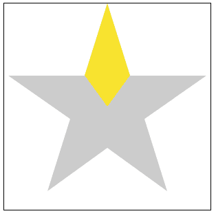
At this step all of them will define the same part of our star. We have to rotate them so each one will get on the top of a different part.
.stars input:nth-child(2) {transform:rotate(72deg)}.stars input:nth-child(3) {transform:rotate(144deg)}.stars input:nth-child(4) {transform:rotate(216deg)}.stars input:nth-child(5) {transform:rotate(288deg)}Now each input is placed on the top of one part of the star and clipped to that part.
I think everyone know the rest of the story. On :hover or :checked I change the variables I described previously and we have our ONE star rating.
That's it! With a simple code, we get an innovative star rating. You can easily adjust the size, the circular direction and it does work with default values:
Original Link: https://dev.to/afif/the-one-star-rating-system-the-future-of-rating-4jl8
Dev To
 An online community for sharing and discovering great ideas, having debates, and making friends
More About this Source Visit Dev To