
An Interest In:
Web News this Week
- April 23, 2024
- April 22, 2024
- April 21, 2024
- April 20, 2024
- April 19, 2024
- April 18, 2024
- April 17, 2024
Some of Our Sources
- Web Designer Wall
- Team Treehouse
- Six Revisions
- Inspiredology
- Web Designer Depot
- Line 25
- Wal You
- Web Resource Source
- Daily Now
- TechPowerUp
Help Webnuz
Referal links:
CSS Tip - Perfect Flexbox overflow items
The following snippet is a powerful set of CSS rules I use all the time. I think it solves a common layout issue I want to help others solve.
Ever needed to create a UI that required a list of items of varying length and you wanted to make it look fluid and pretty at the same time? You tried to use flex box but it all ended up looking like the image below?
Follow along for a quick CSS snippet that helps level up your CSS flex game.
What we will be creating:
| Table of Contents |
|---|
| The Problem |
| The Solution |
| The Explanation |
The Problem
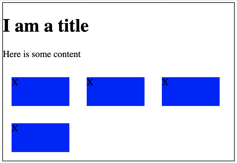
We want to write some CSS that works when tackling variable length lists of items. In a lot of cases, when we start styling these types of pages it looks like the image below.
Here is what I want to solve:
- The margin issue - Children within a Flex parent do not collapse margins. So when we apply margins to them for spacing purposes, we end up in a scenario where the first/last elements in a row have less margin on their outsides than they do next to their siblings. This becomes an issue when we want a consistent gap between elements in our list.
Here's an example:
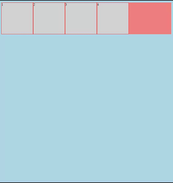
The overflow elements - Depending on the size of our page and the size of the elements in our list, we can have a variable number of items that "overflow" at the end of the list. How do we tackle this? Do we want them to be right justified? Do we want to hardcode some styles for each situation: if 1 item, width 100%, if 2 items width 50%, etc etc?
The size & spacing of the items - How much tweaking do we want to do to ensure the items look good? Are we okay with a
max-widthor do we need amin-widthfor the item to look okay? Are we using all the white space? Are things centered or is everything left-aligned?Is IE friendly.
The Solution
Here is the solution to our problems listed above. I will explain this in further detail below.
.flex { --gap: 15px; display: inline-flex; flex-wrap: wrap; flex-direction: row; margin: calc(-1 * var(--gap)) 0 0 calc(-1 * var(--gap)); width: calc(100% + var(--gap));}.flex > * { flex-grow: 1; flex-shrink: 1; flex-basis: 225px; margin: var(--gap) 0 0 var(--gap);}What it looks like:

The Explanation
The core elements to our solution are margin, the calc function, and flexbox's flex-grow and flex-basis properties.
Margin
In the snippet we're doing 3 things with margin:
- Defining how big of a gap we want between the elements.
- Adding
topandleftmargin to all the children elements. - Translating the parent
.flexcontainer in the opposite direction of our top and left margins we added on the children.
This snippet is essentially fixing our margin issue I outlined above.
Here is the margin applied to the children: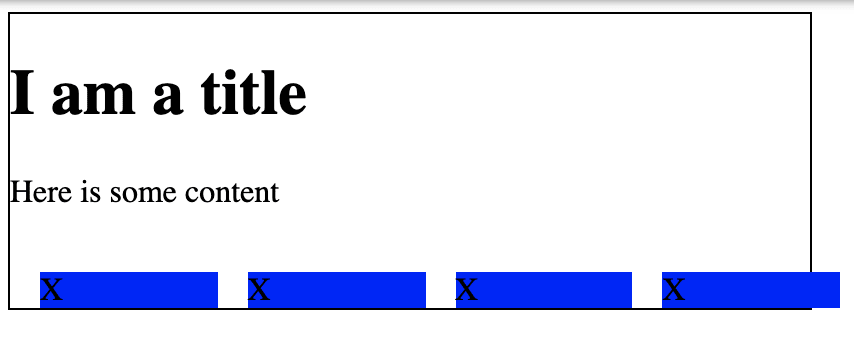
Here is the negative margin applied to the .flex container: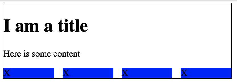
BUT BUT BUT You're forgetting about the gap property!!!!
Yes and no. This same functionality can be applied using the built in gap property, but this currently has limited support in some mobile browsers and all of IE.
I know that IE is going away, but I work in an industry & field that supports around 5-10% of our customer base on IE 11 and need a solution that I can trust works.
Here is a good article outlining the gap property.
Flex Grow
If you have never used flex-grow before, I highly recommend reading about how it works. The quick and dirty explanation is that it allows our flex children to expand to fill the row/column that they are in.
In this case we're using the property flex-grow: 1;. This tells the parent "Hey for all the children you have, make sure they take up ALL of the white space available".
With flex-grow: 0; (default)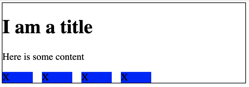
With flex-grow: 1;
Flex Basis
I am going to be honest I really didn't understand what flex basis was until I learned about this css snippet. But, this snippet is a perfect way to understand the concepts of how it works.
Flex basis lets us define the base or minimum size we want an element to be in a flex container. Whats nice about this is for scenarios where we won't know how many elements we're going to be styling in our list, we can treat the flex-basis as our "default" size, and then with flex-grow, if we have less items on the last line, they will fill up the remaining space and look nice.
Without flex-basis or flex-grow:
With flex-basis, Without flex-grow
With both flex-basis and flex-grow
Putting it all together in the long-form way, we have the the snippet again:
.flex { --gap: 15px; display: inline-flex; flex-wrap: wrap; flex-direction: row; /* */ margin-top: calc(-1 * var(--gap)); margin-right: 0; margin-bottom: 0; margin-left: calc(-1 * var(--gap)); width: calc(100% + var(--gap));}.flex > * { flex-grow: 1; flex-shrink: 1; flex-basis: 225px; margin-top: var(--gap); margin-right: 0; margin-bottom: 0; margin-left: var(--gap);}All in all, I hope you can take these learnings and apply them to your web projects as you see fit. I hope you learned something new and if anything -- I hope have a better understanding of how flexbox works.
Thank you for reading.
Original Link: https://dev.to/immannino/css-tip-perfect-flexbox-overflow-items-1ceb
Dev To
 An online community for sharing and discovering great ideas, having debates, and making friends
More About this Source Visit Dev To