
An Interest In:
Web News this Week
- April 20, 2024
- April 19, 2024
- April 18, 2024
- April 17, 2024
- April 16, 2024
- April 15, 2024
- April 14, 2024
Some of Our Sources
- Slashdot
- Mashable
- Web Designer Wall
- Team Treehouse
- Six Revisions
- My Ink Blog
- Fudge Graphics
- CSS Globe
- Line 25
- Freelance Switch
Help Webnuz
Referal links:
How to make your product look good
If you're wearing the design hat before for the first time, here's some tips that might be helpful on your way.
More of a video person? This post is available as a video podcast at evan.streambus.com.

Avoid the temptation to decorate an early product
You're used to using things that are feature complete, so you look at your early product and feel that it's "dull" or "sparse".
This isn't an aesthetics problem, it's a your-product-is-early problem. Be comfortable with this stage; don't try and add extra fonts, colors, borders, and other decorations.
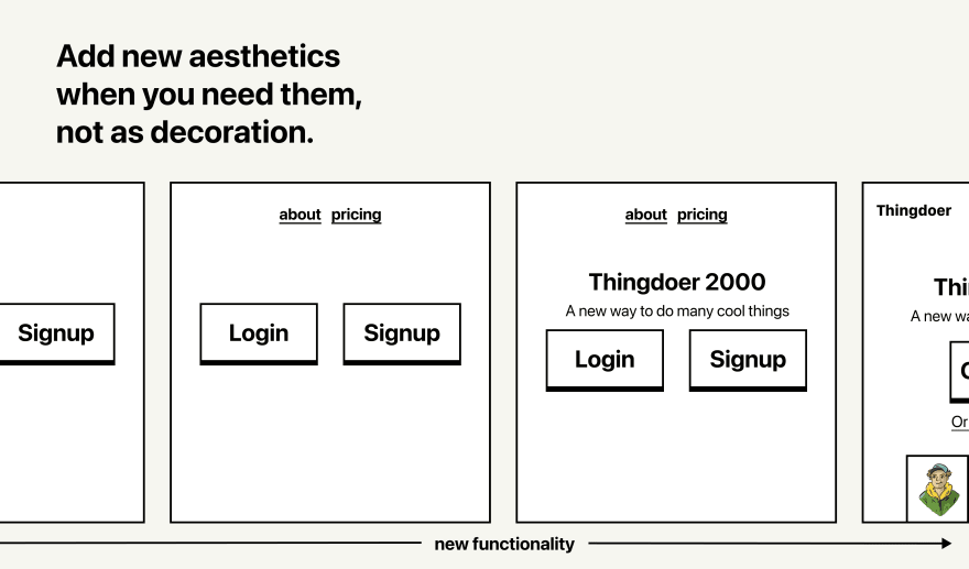
Instead, build features, and your product will evolve naturally.

Keep a spacing palette
You likely already have a color palette, but keeping a spacing palette can help you avoid unintentional contrast, especially when you have multiple people working on one project.
For example:
.p-big { padding: 24px;}.p-medium { padding: 12px;}.p-small { padding: 4px;}
Avoid ambiguous hierarchy
Make sure it's clear what you want a user to do. If you add a big background to one button, but make another one big and blue, it's not clear which one is "more" important.
To avoid this, plan out what an "primary" button looks like, what a "secondary" button looks like, and so on.

Don't make your icons huge
Most icon sets are meant to have roughly the same size as the text. They're meant to be similar to a character.
If you need something big, consider using a stock photo or illustration. Or, consider removing the icon and just letting the text speak for itself.

Grayscale isn't always grayscale
Many professionally designed websites don't use pure gray-scales (like #000000 black). Instead, their grays are darker, desaturated versions of their other brand colors.
Consider using palx.jxnblk.com to generate a grayscale color palette for your brand color.

Avoid stiff vector art
Some vector art is better than others, and can distract from your design. Consider using blush.design to get some professional assets instead.
Consider using unsplash images instead of art assets. Or, if it works for your project, consider letting your design exist without art assets entirely! Not everything needs illustrations.
Original Link: https://dev.to/flaque/how-to-make-your-product-look-good-h5j
Dev To
More About this Source Visit Dev To