
An Interest In:
Web News this Week
- April 1, 2024
- March 31, 2024
- March 30, 2024
- March 29, 2024
- March 28, 2024
- March 27, 2024
- March 26, 2024
Some of Our Sources
- Engadget
- Techcrunch
- Technology Review
- TutsPlus - Code
- Team Treehouse
- TutsPlus - Design
- Wal You
- CSS Tricks
- Android Dissected
- Codrops
Help Webnuz
Referal links:
Building Reusable React Dialog Component
In this tutorial, we will build a reusable Dialog Component using React Hooks, Context API, and Styled Components.
Introduction
Using a Dialog component can violate the DRY (Don't Repeat Yourself) principle, especially if our App has many pages that have Dialog required interactions.
By using React Hooks and Context API, we will try to decrease the code repetition as much as possible.
Installation
Before we jump into building our component, we should install the tools and libraries that we will use.
Creating a new React App
First we create a new React App using Create React App.
npx create-react-app reusable-dialogcd reusable-dialognpx create-react-app reusable-dialog command will install React, testing libraries, and several other libraries/tools to build a basic modern web app.
cd is the command for "change directory", it will change the working directory from the current directory to "reusable-dialog".
Installing Styled Components (Optional)
After creating our React App, we install Styled Components to style our Dialog component.
npm install --save styled-componentsBuilding the Dialog Component
Firstly, we create a file for global styles and export it.
import { createGlobalStyle } from "styled-components";export const GlobalStyles = createGlobalStyle`*, *::before, *::after { box-sizing: border-box; margin:0; padding: 0;} html, body { background: #F3F5FB; color: #333; font-family: "Helvetica Neue", Helvetica, Arial, sans-serif; font-size: 16px; -moz-osx-font-smoothing: grayscale; -webkit-font-smoothing: antialiased; -webkit-overflow-scrolling: touch; } button { border: none; cursor: pointer; } p { line-height: 1.4em; }`;After that, import the GlobalStyles from index.js and add it to the ReactDOM.render method as a component.
This is a wrapper for global styles that we will use globally in our app.
import React from 'react';import ReactDOM from 'react-dom';import App from './App';import {GlobalStyles} from "./styles/global-styles";ReactDOM.render( <React.StrictMode> <GlobalStyles /> <App /> </React.StrictMode>, document.getElementById('root'));Next, we start to code our Dialog using Styled Components.
import styled from "styled-components/macro";export const Container = styled.div` background: #f7f9fa; border-radius: 10px; box-shadow: rgb(100 100 111 / 20%) 0px 7px 29px 0px; left: 50%; max-width: 330px; padding: 1.25em 1.5em; position: fixed; transform: translate(-50%, -50%); top: 50%;`;export const Box = styled.div` display: flex; justify-content: center; & button:first-child { margin-right: 2em; }`;export const Text = styled.p` color: black; font-size: 1.1rem; margin-bottom: 1.5em; text-align: center;`;export const Button = styled.button` background: ${({variant = "white"})=> variant === "red" ? "#d2342a" :"#f7f9fa"}; border-radius: 20px; box-shadow: 0 3px 6px rgba(241, 85, 76, 0.25); color: ${({variant = "white"})=> variant === "red" ? "white" :"#d2342a"}; font-size: 1.2rem; padding: 0.3em 0; text-align: center; transition: background-color 100ms; width: 100px; &:hover { background: ${({variant = "white"})=> variant === "red" ? "#d82d22" :"#f1f1f1"}; }`;I imported the "styled-components/macro" for convenience. Otherwise, you have to deal with the randomly generated class names.
Before building our Dialog component we create a div element in index.html to create a portal to render the Dialog. In this way, our Dialog component can exist outside of the DOM hierarchy of the parent component, so it will be much easier to use it and customize it.
<body> <noscript>You need to enable JavaScript to run this app.</noscript> <div id="root"></div> <div id="portal"></div> </body>Now, we import styled components that we created for our Dialog and add them to build React component and return it using ReactDom.createPortal().
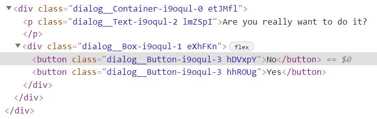
import React, { useContext } from "react";import ReactDOM from "react-dom";import DialogContext from "../../context/dialog";import { Container, Box, Text, Button } from "./styles/dialog";function Dialog({ children, ...rest }) { const { dialog, setDialog } = useContext(DialogContext); const { isOpen, text, handler, noBtnText, yesBtnText } = dialog; return ReactDOM.createPortal( <Container {...rest}> <Text>Are you really want to do it?</Text> <Box> {children} <Button variant="red">No</Button> <Button>Yes</Button> </Box> </Container>, document.getElementById("portal") );}export default Dialog;This is the final look of our Dialog component.

Building the Logic
In order to build Dialog logic, we will use Context API.
First, we create our DialogContext and export it.
import { createContext } from "react";const DialogContext = createContext(null);export default DialogContext;After that, we create DialogProvider to share the logic between components without having to pass props down manually at every level.
import { useState } from "react";import DialogContext from "../context/dialog";function DialogProvider({ children, ...props }) { const [dialog, setDialog] = useState({ isOpen: false, text: "", handler: null, noBtnText: "", yesBtnText:"" }); return ( <DialogContext.Provider value={{ dialog, setDialog }} {...props}> {children} </DialogContext.Provider> );}export default DialogProvider;Our Dialog will use the dialog state which includes several state variables:
isOpenis for showing or not showing theDialog.textis for the text that we show to the user.handleris for the handler function that will be called after clicking the "yes" or similar acceptance button.noBtnTextandyesBtnTextare the texts of theDialogbuttons.
After creating DialogProvider, we wrap our Dialog component with the DialogProvider to access the dialog state.
import Dialog from "./components/dialog";import DialogProvider from "./providers/dialog";function App() { return ( <DialogProvider> <Dialog /> </DialogProvider> );}export default App;Now, we can use the dialog state variables inside of our Dialog component.
We add handlers to handle the Dialog button clicks and make the button texts customizable.
import React, { useContext, useRef } from "react";import ReactDOM from "react-dom";import DialogContext from "../../context/dialog";import { Container, Box, Text, Button } from "./styles/dialog";function Dialog({ children, ...rest }) { const { dialog, setDialog } = useContext(DialogContext); const { isOpen, text, handler, noBtnText, yesBtnText } = dialog; const resetDialog = () => { setDialog({ isOpen: false, text: "", handler: null }); }; const handleYesClick = () => { handler(); resetDialog(); }; const handleNoClick = () => { resetDialog(); }; if (!isOpen) return null; return ReactDOM.createPortal( <Container {...rest}> <Text>{text}</Text> <Box> {children} <Button onClick={handleNoClick} variant="red"> {noBtnText} </Button> <Button onClick={handleYesClick}>{yesBtnText}</Button> </Box> </Container>, document.getElementById("portal") );}export default Dialog;Improving the Accessibility
In order to improve our Dialog's accessibility, we should add several things to it.
import React, { useCallback, useContext, useEffect, useRef } from "react";import ReactDOM from "react-dom";import DialogContext from "../../context/dialog";import { Container, Box, Text, Button } from "./styles/dialog";function Dialog({ children, ...rest }) { const { dialog, setDialog } = useContext(DialogContext); const { isOpen, text, handler, noBtnText, yesBtnText } = dialog; const btnRef = useRef(null); const resetDialog = useCallback(() => { setDialog({ isOpen: false, text: "", handler: null }); }, [setDialog]); const handleYesClick = () => { handler(); resetDialog(); }; const handleNoClick = () => { resetDialog(); }; useEffect(() => { const { current } = btnRef; if (current) current.focus(); }, [isOpen]); useEffect(() => { const handleKeydown = (e) => { if (e.key === "Escape") resetDialog(); }; window.addEventListener("keydown", handleKeydown); return ()=> window.removeEventListener("keydown", handleKeydown); }, [resetDialog]); if (!isOpen) return null; return ReactDOM.createPortal( <Container role="dialog" aria-describedby="dialog-desc" {...rest}> <Text id="dialog-desc">{text}</Text> <Box> {children} <Button ref={btnRef} onClick={handleNoClick} variant="red"> {noBtnText} </Button> <Button onClick={handleYesClick}>{yesBtnText}</Button> </Box> </Container>, document.getElementById("portal") );}export default Dialog;We added, two useEffect hooks, first one calls the callback function to focus on the Dialog button after rendering the Dialog. This is much more convenient to use the Dialog buttons, especially for screenreader users. We achieved this using useRef hook which is the proper way to manipulate and access the DOM element in React.

We also added role and aria-describedby WAI-ARIA attributes to improve accessibility.
The last useEffect hook calls the callback function to add an event listener to the window object after rendering the Dialog which is triggered after keydown event. If the pressed key is Escape, Dialog will be closed.
Our Dialog component is finished, now we can test it.
import React, { useContext } from "react";import DialogContext from "../context/dialog";function Home() { const { setDialog } = useContext(DialogContext); const handleClick = () => { setDialog({ isOpen: true, text: 'Are you want to log "Hello World"?', handler: () => console.log("Hello World"), noBtnText: "Don't log", yesBtnText: "Log it", }); }; return <button onClick={handleClick}>Activate The Dialog</button>;}export default Home;I created a button to activate the Dialog and added a handler for the button. After clicking it, our Dialog has shown.

Dialog buttons are working correctly too.

That's it!
We created our reusable Dialog component. We can use this Dialog component for different actions with different texts.
In order to prevent the performance issues because of rerendering, you should only wrap the components that use the Dialog with the DialogProvider, and if there is still performance issues, probably using React.memo will be a good idea. However, for most applications, I think this won't be needed.
Feel free to reach out to me GitHub || LinkedIn.
Any feedback would be greatly appreciated.
Original Link: https://dev.to/bilkn/building-reusable-react-dialog-component-1l8c
Dev To
 An online community for sharing and discovering great ideas, having debates, and making friends
More About this Source Visit Dev To