
An Interest In:
Web News this Week
- April 25, 2024
- April 24, 2024
- April 23, 2024
- April 22, 2024
- April 21, 2024
- April 20, 2024
- April 19, 2024
Some of Our Sources
- Engadget
- Mashable
- Joshua Blankenship
- Spoon Graphics
- TutsPlus - Design
- Fuel Your Creativity
- Inspiredology
- Web Designer Depot
- Stylized Web
- Web Resource Source
Help Webnuz
Referal links:
Starting with Flutter: Fancy Lateral Menu
Remember our lateral menu from this article? Yes, this one:
Pretty ugly isn't it? Let's make it fancier!
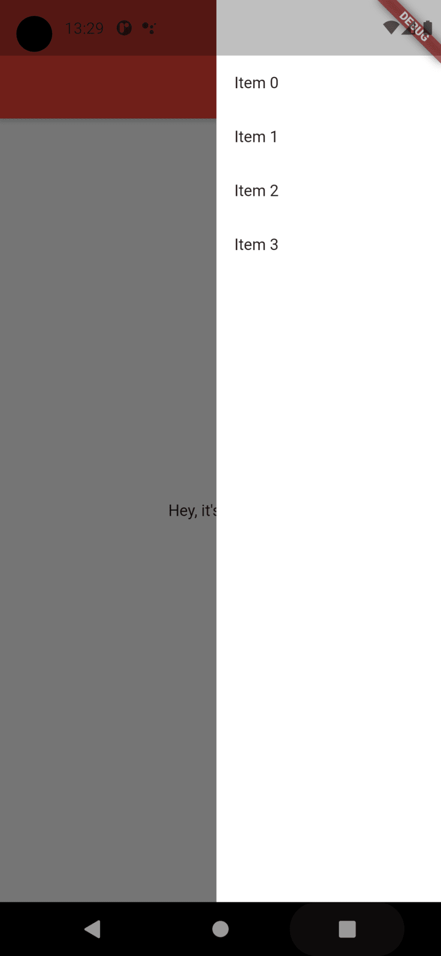
Center that list
Let's start by removing one of the most limiting features, or, at least, change it: the list. We'll change it to a Column and add the list as a child.
endDrawer: Container( width: 200, color: Colors.white, child: Column( mainAxisSize: MainAxisSize.max, mainAxisAlignment: MainAxisAlignment.center, children: [ ListView.builder( shrinkWrap: true, physics: NeverScrollableScrollPhysics(), itemCount: 4, itemBuilder: (context, index) { return Padding( padding: const EdgeInsets.all(16.0), child: GestureDetector( onTap: () { Navigator.pop(context); setState(() { item = index; }); }, child: Text('Item $index') ), ); }, ), ], ), ),The list is now a child of the column, also we needed to set column's height and set the list as shrinkWrap (or the list would not render properly) and block it's scrollable behavior. We are also centering our elements to achieve a cleaner look.
Round it up
Let's now round our ugly squared white menu by wrapping our Container into a ClipRRect and let's give our menu some lovely curves!
endDrawer: ClipRRect( borderRadius: BorderRadius.only(topLeft: Radius.circular(24), bottomLeft: Radius.circular(24)), child: Container( width: 200, color: Colors.white,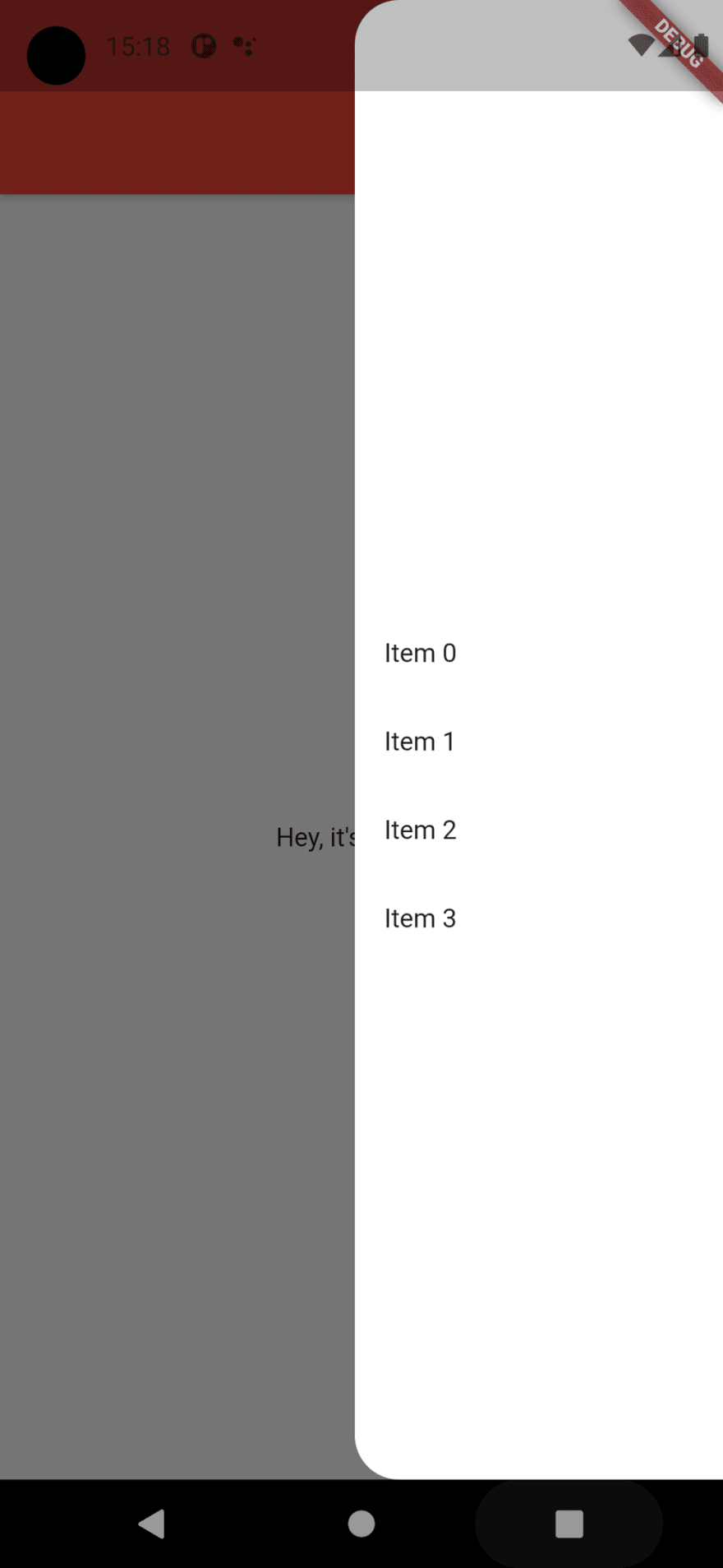
Our menu now looks like this:
Half work done, let's get to the meaty part now!
Better items
Let's set a new look for our items, and let's show which one is clicked.
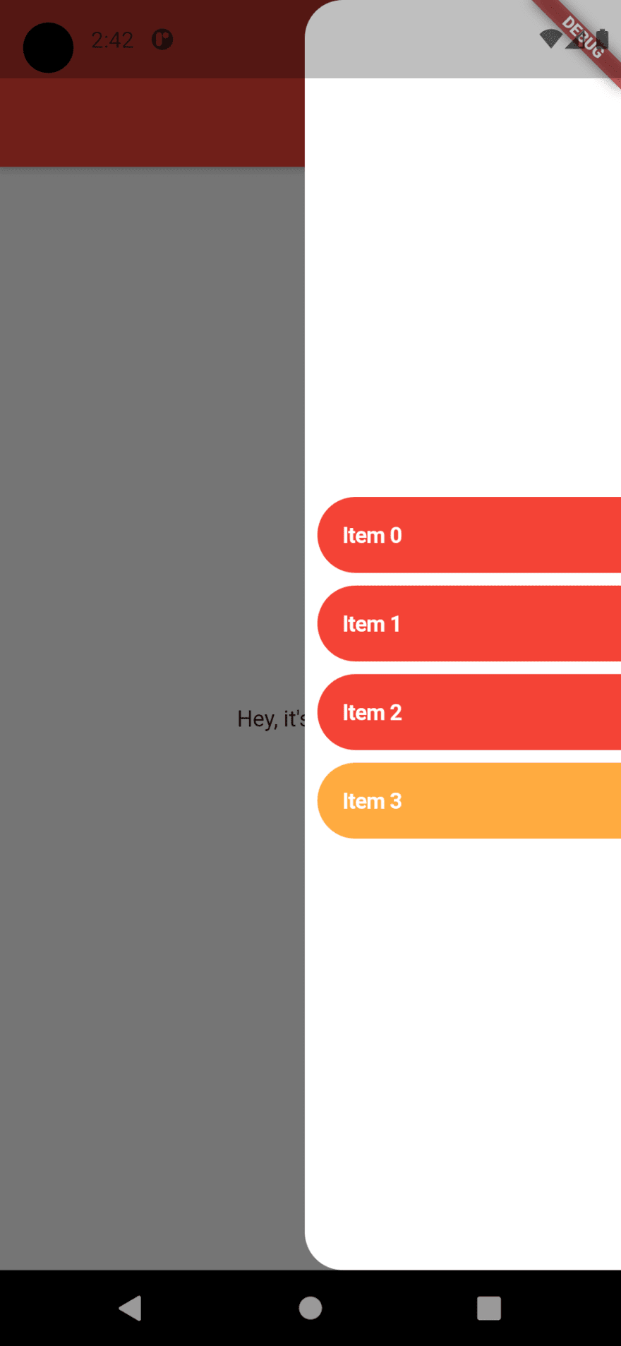
Keeping the "rounded" tradition of the menu we will give all our buttons a new background using the ClipRRect widget and a nice red color. We are adding a bit of complexity to our list item so we'll make brand new StatelessWidget with a calling function to maintain the page control on the main widget:
ListView.builder( shrinkWrap: true, physics: NeverScrollableScrollPhysics(), itemCount: 4, itemBuilder: (context, index) { return ListItem( title: 'Item $index', onClick: () { Navigator.pop(context); setState(() { item = index; }); }, ); }, ),//That's our itemclass ListItem extends StatelessWidget { final String title; final VoidCallback onClick; const ListItem({Key key, this.title, this.onClick}) : super(key: key); @override Widget build(BuildContext context) { return Padding( padding: const EdgeInsets.only(bottom: 8, left: 8), child: GestureDetector( onTap: () => onClick(), child: ClipRRect( borderRadius: BorderRadius.only(topLeft: Radius.circular(30), bottomLeft: Radius.circular(30)), child: Container( color: Colors.red.shade500, child: Padding( padding: const EdgeInsets.all(16.0), child: Text( title, style: TextStyle(fontWeight: FontWeight.bold, color: Colors.white, fontSize: 14), ), ), ), ), ), ); }}The final effect will be pretty nice:

Now we want to show one item different from all others by setting it as "selected", so we'll add a "selected" property which will tell our item to have an orange background instead of a red one:
//How the new value is set: return ListItem( title: 'Item $index', selected: index == item, //Rest of the item.../**The list item:**/final bool selected;child: ClipRRect( borderRadius: BorderRadius.only(topLeft: Radius.circular(30), bottomLeft: Radius.circular(30)), child: Container( color: selected ? Colors.orangeAccent : Colors.red.shade500, child: Padding( //Rest of the item...Click effects
Last, but not least, we will add a click effect to our item by using the CupertinoButton widget. Again, we'll use a custom widget with a CupertinoButton inside. We'll need to set the minSize to 0 in order to let the button be as big as the child.
class TappableWidget extends StatelessWidget { final Widget child; final VoidCallback onTap; const TappableWidget({ Key key, this.onTap, this.child, }) : super(key: key); @override Widget build(BuildContext context) { return CupertinoButton( minSize: 0, padding: EdgeInsets.zero, onPressed: onTap, child: child ); }}Our ListItem widget will look like this:
class ListItem extends StatelessWidget { final String title; final VoidCallback onClick; final bool selected; const ListItem({Key key, this.title, this.onClick, this.selected}) : super(key: key); @override Widget build(BuildContext context) { return TappableWidget( onTap: () => onClick(), child: Padding( padding: const EdgeInsets.only(bottom: 8, left: 8), child: ClipRRect( borderRadius: BorderRadius.only(topLeft: Radius.circular(30), bottomLeft: Radius.circular(30)), child: Container( width: MediaQuery.of(context).size.width, color: selected ? Colors.orangeAccent : Colors.red.shade500, child: Padding( padding: const EdgeInsets.all(16.0), child: Text( title, style: TextStyle( fontWeight: FontWeight.bold, color: Colors.white, fontSize: 14 ), ), ), ), ), ), ); }}The end result will be like this, with a nice fading effect while clicking:
Way better now!
Our menu has a way better look than before, and it was relatively easy to do, don't you think? You can customize your menu as you wish, but adding new animations or behaviors will require a complete change of code. We will save it for another time. Stay tuned!
Original Link: https://dev.to/theotherdevs/starting-with-flutter-fancy-lateral-menu-58g9
Dev To
 An online community for sharing and discovering great ideas, having debates, and making friends
More About this Source Visit Dev To