
An Interest In:
Web News this Week
- April 1, 2024
- March 31, 2024
- March 30, 2024
- March 29, 2024
- March 28, 2024
- March 27, 2024
- March 26, 2024
Some of Our Sources
- TutsPlus - Code
- Smashing Magazine
- TutsPlus - Design
- Fuel Your Creativity
- Inspiredology
- CSS Globe
- Stylized Web
- Wal You
- Codrops
- Dev To
Help Webnuz
Referal links:
Python and Headless: How to make interactive, adaptable, affordable reports
In this article, I'll show you how to pull data from a headless CMS and create a content type report using the Python framework: Dash.
Seeing is believing
I am a visual learner. I really appreciate when a graph or diagram accompanies data, or when a visual aid gets to "the point" in a presentation. Not everyone is as much of a fan of charts as I am, but representing data visually is universally helpful. For example, which is easier to understand in a presentation:
these side-by-side numbers: 101 | 443 | 102 | 320 | 82
or
this graph:
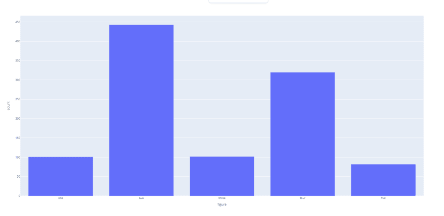
With just the delimited list of numbers, you don't get a good idea of how the values compare to one another. The graph makes differences and similarities more obvious.
Let's say that you are a new manager or member of a marketing team that uses a headless CMS to produce content. Knowing what types of content the team has been producing will be useful for better understanding their current content strategy. However, when you are looking at content models in a headless CMS, you're normally met with a long running list of names and numbers:
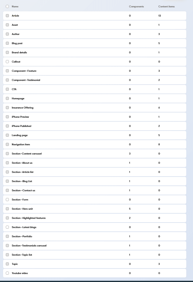
To assess the kinds of content in the project, you're forced to scan the entire content type listing and mentally compare the values. Without a visual aid, it's hard to tell what topics are prevalent in your project. Furthermore, once you've finished your analysis, you can't easily share your findings with other members of your team. Making them believe your analysis is correct is much easier with a visual report.
But what if you don't have the time or resources to integrate a commercial reporting tool into your project? Luckily, there are open source frameworks and libraries for building web analytic applications, like Dash.
What is Dash?
Dash is framework built upon the popular Plotly graphing library, that allows you to build interactive visual applications and render them in a browser. Although it uses JavaScript libraries behind the scenes, Dash apps are written purely in Python and don't require familiarity with JavaScript.
If you know some Python, Dash is well suited to create reports from headless CMS data because it supports a wide variety of well-documented graph types, and the open-source edition is completely free.
How to create a report from a headless CMS
Let's create a content report using the Kentico Kontent headless CMS, the open source Kontent Python SDK, and Dash.
In our sample scenario, we'll create three reports about a coffee shop website, and aggregate them in a tabbed report.

In our report we want to show:
- what type of content exists in the project
- the audiences our articles are targeting
- the timeline showing when they were published.
These reports will give us more insight into the "who, what, when" strategy surrounding our previously published articles.
Application setup
First we need to install Dash, our SDK, and dependencies. I recommend that you do this in a virtual environment. In the terminal run:
pip install dashpip install kontent_deliverypip install pandas
Alternatively, you can download and then install this requirements.txt using pip install -r /path/to/requirements.txt.
By the end of the exercise, we will have a file structure that looks like this:
kontent-dash-blog (root)/ reports/ article_timeline.py content_types.py personas.py report_dashboard.py requirements.txtDash and Kontent Initialization
Once we've installed the requirements, we need to:
- setup our Flask application for running Dash
- initialize our Kontent SDK delivery client using our Kontent project ID
- setup some methods to build our three reports
We'll do this in a file called report_dashboard.py and create it in the root of the project:
import dashimport flaskfrom kontent_delivery.client import DeliveryClient# report methodsfrom reports.content_types import build_types_chartfrom reports.personas import build_personas_piefrom reports.article_timeline import build_post_timelineexternal_stylesheets = ['https://codepen.io/chriddyp/pen/bWLwgP.css']# dashserver = flask.Flask(__name__)app = dash.Dash(server=server, external_stylesheets=external_stylesheets)# kontentclient = DeliveryClient("your_Kontent_Project_ID")# custom methods to create reportsbar = build_types_chart(client)pie = build_personas_pie(client)timeline = build_post_timeline(client)Report 1: bar chart showing content types
In this chart, we'll call the Kontent API and count how many content types exist of a given type. We'll create the file content_types.py in a reports directory:
import plotly.express as pxdef build_types_chart(client): type_response = client.get_content_types() item_response = client.get_content_items() types = {} # add Kontent type counts to a dictionary for content_type in type_response.types: types[content_type.codename] = 0 # increment content type count per item of respective type for item in item_response.items: types[item.content_type] += 1 data = {"content types":types.keys(), "count": types.values()} fig = px.bar(data, x="content types", y="count") return figIn the build_types_chart method, we create key value pairs from the codename of our content types, and a count of how many items are published of that type. With that data, we use Plotly Express to create and return a bar graph to our Dash application.

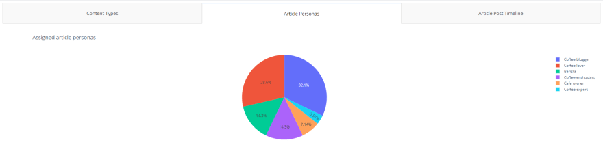
Report 2: pie chart showing article personas
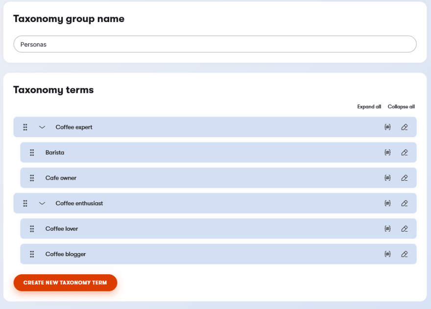
In our second chart, we want to show what percentage of personas our article content targets. Let's assume we know that the article content type uses a taxonomy group called personas:
We'll create the file personas.py in the reports directory:
from kontent_delivery.builders.filter_builder import Filterimport plotly.express as pxdef build_personas_pie(client): # only return "article" content items item_response = client.get_content_items( Filter("system.type", "[eq]", "article") ) # get the taxonomy group that articles use personas_response = client.get_taxonomy("personas") chart_personas = {} # identify personas to be counted def get_taxonomy_terms(terms): for persona in terms: chart_personas[persona.name] = 0 if persona.terms: get_taxonomy_terms(persona.terms) get_taxonomy_terms(personas_response.terms) # increment persona count per item for item in item_response.items: for persona in item.elements.personas.value: chart_personas[persona.name] += 1 data = {"personas":chart_personas.keys(), "count": chart_personas.values()} fig = px.pie(data, names="personas", values="count", title='Assigned article personas') return figIn the build_personas_pie method, we pull all of our article content items. We then create key value pairs from the name of taxonomy terms that exist in our Personas taxonomy group, and a count of how many items are tagged with a particular term. With that data, we use Plotly Express to create and return a pie graph to our Dash application.
Report 3: timeline showing date posted
Information about when these articles were published could provide more context about what our content strategy was previously, or how it changed over time. Let's assume we have a "posted date" element on our articles that we can use to create our timeline:

We'll create the file article_timeline.py in the reports directory:
from kontent_delivery.builders.filter_builder import Filterimport pandas as pdimport plotly.express as pxdef build_post_timeline(client): # only return "article" content items item_response = client.get_content_items( Filter("system.type", "[eq]", "article") ) # setup two arrays for Plotly scatter chart_items = [] chart_post_date = [] # populate arrays with respective item name and post date for item in item_response.items: chart_items.append(item.name) chart_post_date.append(item.elements.post_date.value) df = pd.DataFrame(dict(item=chart_items, post_date=chart_post_date)) # use column names of df for the different parameters x, y, ... fig = px.scatter(df, x="post_date", y="item", title="Article post timeline", labels={"Post Date":"Date item posted"} # customize axis label ) return figLike the other methods, we retrieve the article items from Kontent, but in this example we take an extra step to convert two arrays into a dictionary and pass them into a pandas DataFrame. This is only for the sake of matching the basic dot plot example in the Plotly documentation.

Tying it all together in a tabbed report with Dash
It's time to pull all the visual aids together in a single report and add some interactivity with Dash. We created the report_dashboard.py file earlier to add the Kontent client and our chart building methods, and now we'll add a layout with some interactive components:
# ... other imports from before# add these for components:import dash_html_components as htmlimport dash_core_components as dccfrom dash.dependencies import Input, Outputexternal_stylesheets = ['https://codepen.io/chriddyp/pen/bWLwgP.css']# dashserver = flask.Flask(__name__)app = dash.Dash(server=server, external_stylesheets=external_stylesheets)# kontentclient = DeliveryClient(config.project_id, options=config.delivery_options)bar = build_types_chart(client)pie = build_personas_pie(client)timeline = build_post_timeline(client)# -- end of "Dash and Kontent Initialization" code --# -- start of "Tying it all together..." code --# adding the dash layoutapp.layout = html.Div([ # dash tabs component that wraps individual tabs dcc.Tabs(id='tabs-example', value='tab-1', children=[ dcc.Tab(label='Content Types', value='tab-1'), dcc.Tab(label='Article Personas', value='tab-2'), dcc.Tab(label='Article Post Timeline', value='tab-3'), ]), # div used as a canvas to show reports html.Div(id='tabs-example-content')])# onclick events that call our chart building [email protected](Output('tabs-example-content', 'children'), Input('tabs-example', 'value'))def render_content(tab): if tab == 'tab-1': return html.Div([ dcc.Graph(figure=bar) ]) elif tab == 'tab-2': return html.Div([ dcc.Graph(figure=pie) ]) elif tab == 'tab-3': return html.Div([ dcc.Graph(figure=timeline) ])# run the application when report_dashboard.py is calledif __name__ == '__main__': app.run_server(debug=True)In the final code file of our report, we use Dash's core HTML components to create a simple two div layout. The first div contains Dash "Tab" components that we use to toggle between graphs, and the second div acts as a canvas to show the graphs we generated.

Following the layout, we use Dash callbacks to generate a different graph depending upon which tab we click. More information about Dash's core components, including "Graph" and "Tabs" can be seen in the Dash documentation here.
At this point, you can run report_dashboard.py in your terminal and watch Dash spin up a localhost server for your newly created reporting application. Follow the link in the terminal, and VOILA! You've created your own interactive, custom report for free.
You can check out a live hosted example or the full source code on GitHub.
Conclusion
In this article we discussed what Dash is, and how you can use it to create interactive reports from your headless CMS data. Now you know with a little Python knowledge, and an open-source framework like Dash, you don't have to miss out on having headless CMS reports.
Want more Dash and headless samples? Check out this Dash + Kontent app for making modular content graphs.
Are you having issues with the samples from the article? Get in touch on our Discord.
Original Link: https://dev.to/kentico-kontent/python-and-headless-how-to-make-interactive-adaptable-affordable-reports-1gb3
Dev To
More About this Source Visit Dev To