
An Interest In:
Web News this Week
- April 1, 2024
- March 31, 2024
- March 30, 2024
- March 29, 2024
- March 28, 2024
- March 27, 2024
- March 26, 2024
Some of Our Sources
- TutsPlus - Code
- Team Treehouse
- Joshua Blankenship
- Six Revisions
- Web Designer Depot
- Line 25
- Design Modo
- Daily Now
- Hashedout
- The Verge
Help Webnuz
Referal links:
June 16, 2021 03:00 pm GMT
Original Link: https://dev.to/pritampatil/how-to-test-your-ui-without-resizing-browser-18g2
How to test your UI without resizing browser
The Problem
When working on UI layouts, for testing responsiveness - you may be used to either:
- DevTools with custom viewport sizes
- Or some extension e.g. Window Resizer
- Or resize the browser window itself
The problem with above approaches is you would be testing with fixed window sizes.
The solution
Enter css property resize
The property accepts 4 different values:
- both - resized both horizontally and vertically
- horizontal - resize it in the horizontal direction
- vertical - resize it in the *vertical direction
- none - no user-controllable method for resizing it.
The rules to use
resize:
- NO inline elements
overflowis NOTvisible
Say you have code that has items wrapped in a flex container:
<ul class="items"> <li> item </li> <li> lorem ipsum dorem </li> <li> Lorem ipsum dolor sit amet </li> <li> consectetur adipiscing elit, sed do eiusmod tempor incididun </li> </ul>.items { display: flex; flex-flow: row wrap; justify-content: space-evenly;}li { border: 1px solid; padding: 10px;}To use resize, you'll wrap the ul with style as:
.container { display: block; overflow: auto; resize: both;}<div class="container"> <li> item </li> <li> lorem ipsum dorem </li> <li> Lorem ipsum dolor sit amet </li> <li> consectetur adipiscing elit, sed do eiusmod tempor incididun </li></ul>With this, you can test the responsiveness easily:
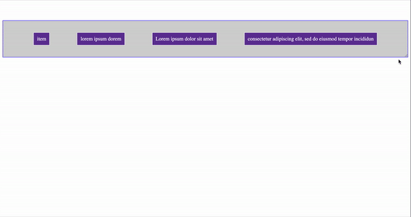
Codepen for a demo is available here
...
Original Link: https://dev.to/pritampatil/how-to-test-your-ui-without-resizing-browser-18g2
Share this article:
Tweet

View Full Article
Dev To
 An online community for sharing and discovering great ideas, having debates, and making friends
More About this Source Visit Dev To