
An Interest In:
Web News this Week
- April 19, 2024
- April 18, 2024
- April 17, 2024
- April 16, 2024
- April 15, 2024
- April 14, 2024
- April 13, 2024
Some of Our Sources
- Techcrunch
- Technology Review
- Team Treehouse
- The Logo Smith
- Smashing Magazine
- Abduzeedo
- FanExtra - PSD
- Noupe
- Reencoded
- Design Modo
Help Webnuz
Referal links:
Making a custom toggle/switch button with Tailwindcss and Vue.js
Not sure what you call them, toggles or switches, but here's how you make a toggle button with Tailwindcss and Vue.

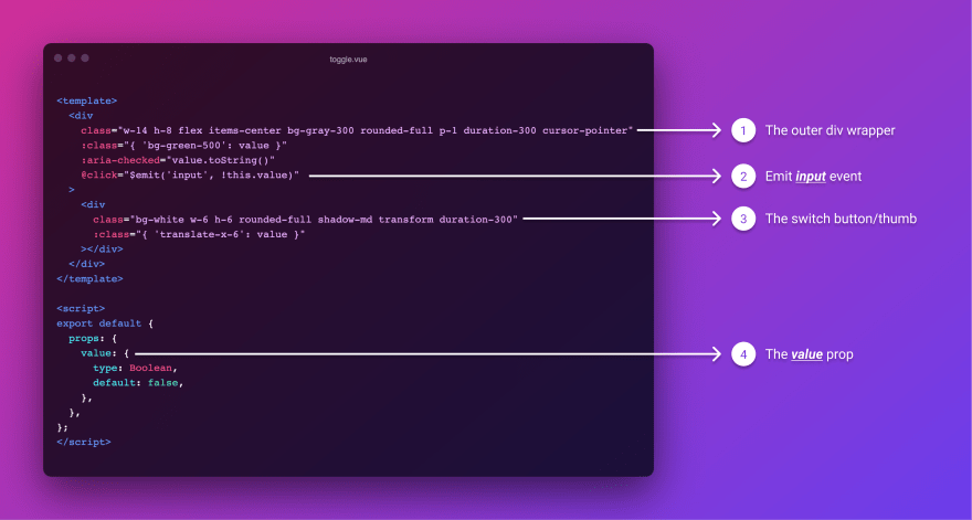
Let's make a new component called toggle.vue and add the below code
<template> <div class="w-14 h-8 flex items-center bg-gray-300 rounded-full p-1 duration-300 cursor-pointer" :class="{ 'bg-green-500': value }" :aria-checked="value.toString()" @click="$emit('input', !this.value)" > <div class="bg-white w-6 h-6 rounded-full shadow-md transform duration-300" :class="{ 'translate-x-6': value }" ></div> </div></template><script>export default { props: { value: { type: Boolean, default: false, }, },};</script>Now, use the component in your code, whoever you'd like to.
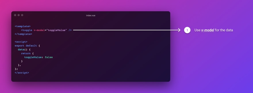
<template> <div> <toggle v-model="toggleValue" /> </div></template><script>export default { data() { return { toggleValue: false, }; },};</script>Let's break down the component and try to understand.
Sorry for the bad image quality, not sure why is dev reducing the quality, even if it's hosted somewhere else, here's the link to a higher resolution pic
An outer which acts as a container for our toggle button, styled with rounded corners, and
display: flexproperties.Here's the thing when we want to add
v-modelto custom events, there are two important things involved, a prop named value and a event named input to emit. so technically you custom component should look like this.
<custom-component :value="variable" @input="doSomething"/>The interesting thing is v-model directive is a shorthand for the above attributes, which would make our component markup like this.
<custom-component v-model="variable"/>That is exactly what we're doing here with our toggle component.
3.. Add a rounded div and bind this class to it translate-x-6 so it is gets slided to the right when value === true
:class="{ 'translate-x-6': value }"4.. The final thing, just add a receive a prop with name value, which is very important that it be named value.
We now have a working custom toggle component. Just call it wherever you need like below.
Here's a demo if you'd like to test it and here's the source code
Shameless plug, do follow me on twitter for more articles and announcements
Original Link: https://dev.to/fayaz/making-a-custom-toggle-switch-button-with-tailwindcss-and-vue-js-9cm
Dev To
 An online community for sharing and discovering great ideas, having debates, and making friends
More About this Source Visit Dev To