
An Interest In:
Web News this Week
- March 21, 2024
- March 20, 2024
- March 19, 2024
- March 18, 2024
- March 17, 2024
- March 16, 2024
- March 15, 2024
Some of Our Sources
- BoingBoing
- Pearsonified
- TutsPlus - Design
- Noupe
- Crazy Leaf Design
- Web Design Ledger
- Spyre Studios
- Freelance Switch
- Hashedout
- TechPowerUp
Help Webnuz
Referal links:
Build a Responsive Flutter App with The Power of MediaQuery
First of all, I wanna say that Im so excited about the new release of Flutter 2.2 with null-safety stable. But we'll talk about it later.
When we develop an app with a multi-platform framework like Flutter. Responsive and Adaptive are something important to care about. Because our app isnt only run on a smartphone, but in various devices with different aspect ratio and visual density. So, as a developer, our task is to make sure our app layout is stable, good, and adaptive to all of those devices.
Okay, in this article I will show you step-by-step how to build a responsive app with Flutter. Feel free to follow along.
Load The Project
I have created a starter project. So, you dont have to create a project from scratch. Just clone this repository
 codestronaut / flutter_responsive_onboarding
Demo flutter responsive handle with MediaQuery
Note:
On that repository, select the branch flutter_responsive_onboarding_starter. Now, youre ready to start
On that source code, I make separate packages/folders to keep our code more clean and maintainable. This is what the lib folder looks like:
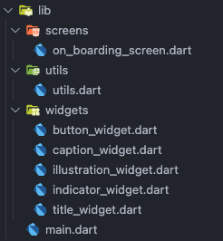
Inside the lib folder there are several folders:
- Screens: used to put all app screens or layouts
- Utils: used to put all utilities such (i.e. constants, helper, etc)
- Widgets: used to put widgets
Remember:
When developing an app, make sure to create single-responsibility functions, classes, and widgets (on Flutter). That's why it's better to separate the code into small pieces.
Working On The Widgets
Lets begin with the widgets folder. We will write some code to construct the layout:
- Title Widget
import 'package:flutter/material.dart';import 'package:flutter_responsive_onboarding/utils/utils.dart';class TitleWidget extends StatelessWidget { @override Widget build(BuildContext context) { double deviceWidth = MediaQuery.of(context).size.width; return Center( child: Image( image: AssetImage('assets/title.png'), width: Utils.getDeviceType() == 'phone' ? deviceWidth / 2 : deviceWidth / 3, ), ); }}- Illustration Widget
import 'package:flutter/material.dart';import 'package:flutter_responsive_onboarding/utils/utils.dart';class IllustrationWidget extends StatelessWidget { @override Widget build(BuildContext context) { double deviceWidth = MediaQuery.of(context).size.width; return Center( child: Image( image: AssetImage( 'assets/illustration.png', ), width: Utils.getDeviceType() == 'phone' ? deviceWidth : deviceWidth / 1.2, ), ); }}- Caption Widget
import 'package:flutter/material.dart';import 'package:flutter_responsive_onboarding/utils/utils.dart';import 'package:google_fonts/google_fonts.dart';class CaptionWidget extends StatelessWidget {  @override  Widget build(BuildContext context) {    return Container(      child: Column(        children: [          Text(            'Play Anywhere',            style: GoogleFonts.inter(              fontSize: Utils.getDeviceType() == 'phone' ? 28.0 : 46.0,              fontWeight: FontWeight.w800,            ),          ),          SizedBox(            height: 16.0,          ),          Text(            'The video call feature can be
accessed from anywhere in your
house to help you.', textAlign: TextAlign.center, style: GoogleFonts.inter( fontSize: Utils.getDeviceType() == 'phone' ? 18.0 : 28.0, fontWeight: FontWeight.w300, color: Color(0xFFA6A6A6), ), ), ], ), ); }}- Indicator Widget
import 'package:flutter/material.dart';import 'package:flutter_responsive_onboarding/utils/utils.dart';class IndicatorWidget extends StatelessWidget { @override Widget build(BuildContext context) { return Container( child: Row( mainAxisAlignment: MainAxisAlignment.center, children: [ Icon( Icons.paid, color: Color(0xFF4756DF), size: Utils.getDeviceType() == 'phone' ? 24.0 : 32.0, ), Icon( Icons.paid, color: Color(0xFFB9BFF3), size: Utils.getDeviceType() == 'phone' ? 24.0 : 32.0, ), Icon( Icons.paid, color: Color(0xFFB9BFF3), size: Utils.getDeviceType() == 'phone' ? 24.0 : 32.0, ), ], ), ); }}- Button Widget
import 'package:flutter/material.dart';import 'package:flutter_responsive_onboarding/utils/utils.dart';import 'package:google_fonts/google_fonts.dart';class ButtonWidget extends StatelessWidget { @override Widget build(BuildContext context) { double deviceWidth = MediaQuery.of(context).size.width; return Container( width: Utils.getDeviceType() == 'phone' ? deviceWidth / 2 : deviceWidth / 2.5, height: Utils.getDeviceType() == 'phone' ? 56.0 : 72.0, child: ElevatedButton( child: Text( 'Get Started', style: GoogleFonts.roboto( fontSize: Utils.getDeviceType() == 'phone' ? 18.0 : 24.0, ), ), style: ElevatedButton.styleFrom( primary: Color(0xFF4756DF), elevation: 0.0, shape: RoundedRectangleBorder( borderRadius: BorderRadius.circular( Utils.getDeviceType() == 'phone' ? 15.0 : 20.0, ), ), ), onPressed: () {}, ), ); }}All right, all of our widgets are ready and have a single responsibility. If you notice, we use MediaQuery to get the device width. Then, we manipulate the width of all widgets that we have to make it more sense when the app running on smartphones and tablets.
double deviceWidth = MediaQuery.of(context).size.width;The variable deviceWidth will change as well as the device type change. Until this step, you may have errors in your widget's code. To control the UI behavior, add the following code to Utils Class:
import 'package:flutter/material.dart';class Utils { static String getDeviceType() { final data = MediaQueryData.fromWindow(WidgetsBinding.instance!.window); return data.size.shortestSide < 550 ? 'phone' : 'tablet'; }}In Utils class, we use MediaQueryData to specify the kind of devices. We get the shortest side of the device. We can specify the shortest side < 550 is a smartphone. Otherwise, it must be a tablet.
Complete The Pages
Lets complete our on_boarding_screens.dart! Put all widgets on the column. This is the arrangement of the widgets:
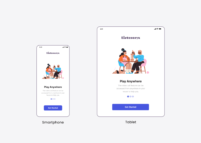
import 'package:flutter/material.dart';import 'package:flutter_responsive_onboarding/widgets/button_widget.dart';import 'package:flutter_responsive_onboarding/widgets/caption_widget.dart';import 'package:flutter_responsive_onboarding/widgets/illustration_widget.dart';import 'package:flutter_responsive_onboarding/widgets/indicator_widget.dart';import 'package:flutter_responsive_onboarding/widgets/title_widget.dart';class OnBoardingScreen extends StatelessWidget { @override Widget build(BuildContext context) { return Scaffold( body: SafeArea( child: Padding( padding: const EdgeInsets.symmetric( horizontal: 16.0, vertical: 24.0, ), child: Column( mainAxisAlignment: MainAxisAlignment.spaceAround, children: [ // Here is where the widget will build TitleWidget(), Column( children: [ IllustrationWidget(), CaptionWidget(), SizedBox( height: 16.0, ), IndicatorWidget(), ], ), ButtonWidget(), ], ), ), ), ); }}Now, our app is ready. Lets run it and see the result on both a smartphone and a tablet. Here are the results:
All right. So, thats the step of how to make your Flutter app more responsive on any kind of device. For web and other OS, you can add more conditions in the Utils file.
This is the traditional method to make your app responsive. Flutter has provided tools for that. But, if you want to work faster, then you better use third-party packages like the following:
- Sizer (Link to Pub.dev)
- Responsive Framework (Link to Pub.dev)
Thats all from me. If you like this kind of article, please give me claps :) also if you have any questions, feel free to post a comment to this article. Thank you so much!
For the complete source code, you can check it here:
codestronaut / flutter_responsive_onboarding
Demo flutter responsive handle with MediaQuery
Original Link: https://dev.to/codestronaut/build-a-responsive-flutter-app-with-the-power-of-mediaquery-46a5
Dev To
 An online community for sharing and discovering great ideas, having debates, and making friends
More About this Source Visit Dev To