
An Interest In:
Web News this Week
- April 1, 2024
- March 31, 2024
- March 30, 2024
- March 29, 2024
- March 28, 2024
- March 27, 2024
- March 26, 2024
Some of Our Sources
- Technology Review
- Simplebits
- Team Treehouse
- Just Creative
- Web Designer Depot
- My Ink Blog
- Web Design Ledger
- Freelance Switch
- Design Modo
- TechPowerUp
Help Webnuz
Referal links:
Getting Started With JetPack Composed
In this tutorial we are going to discuss few concept in the jetpack composed library which a upcoming ui toolkit for faster development of android UI with kotlin managed by google.
What We are going to cover.
1. Creating Custome StaggeredGrid.
2. Creating Custome Column With Composed.
3. Generating ListView.
4. Combining Logic to Have full UI.
Imports
import android.os.Bundleimport androidx.activity.ComponentActivityimport androidx.activity.compose.setContentimport androidx.compose.foundation.*import androidx.compose.foundation.layout.*import androidx.compose.foundation.lazy.LazyColumnimport androidx.compose.foundation.lazy.rememberLazyListStateimport androidx.compose.foundation.shape.CircleShapeimport androidx.compose.foundation.shape.RoundedCornerShapeimport androidx.compose.material.*import androidx.compose.material.icons.Iconsimport androidx.compose.material.icons.filled.Favoriteimport androidx.compose.runtime.Composableimport androidx.compose.runtime.CompositionLocalProviderimport androidx.compose.runtime.rememberCoroutineScopeimport androidx.compose.ui.Alignmentimport androidx.compose.ui.Modifierimport androidx.compose.ui.draw.clipimport androidx.compose.ui.graphics.Colorimport androidx.compose.ui.layout.ContentScaleimport androidx.compose.ui.layout.Layoutimport androidx.compose.ui.res.painterResourceimport androidx.compose.ui.text.font.FontWeightimport androidx.compose.ui.tooling.preview.Previewimport androidx.compose.ui.unit.Dpimport androidx.compose.ui.unit.dpimport com.example.test2.ui.theme.Test2Themeimport com.google.accompanist.coil.rememberCoilPainterimport kotlinx.coroutines.launchimport kotlin.math.max- Creating custom StaggerGrid
@Composablefun StaggeredGrid( modifier: Modifier = Modifier, rows: Int = 3, content: @Composable () -> Unit) { Layout( modifier = modifier, content = content ) { measurables, constraints -> // Keep track of the width of each row val rowWidths = IntArray(rows) { 0 } // Keep track of the max height of each row val rowHeights = IntArray(rows) { 0 } // Don't constrain child views further, measure them with given constraints // List of measured children val placeables = measurables.mapIndexed { index, measurable -> // Measure each child val placeable = measurable.measure(constraints) // Track the width and max height of each row val row = index % rows rowWidths[row] += placeable.width rowHeights[row] = max(rowHeights[row], placeable.height) placeable } // Grid's width is the widest row val width = rowWidths.maxOrNull() ?.coerceIn(constraints.minWidth.rangeTo(constraints.maxWidth)) ?: constraints.minWidth // Grid's height is the sum of the tallest element of each row // coerced to the height constraints val height = rowHeights.sumBy { it } .coerceIn(constraints.minHeight.rangeTo(constraints.maxHeight)) // Y of each row, based on the height accumulation of previous rows val rowY = IntArray(rows) { 0 } for (i in 1 until rows) { rowY[i] = rowY[i - 1] + rowHeights[i - 1] } // Set the size of the parent layout layout(width, height) { // x co-ord we have placed up to, per row val rowX = IntArray(rows) { 0 } placeables.forEachIndexed { index, placeable -> val row = index % rows placeable.placeRelative( x = rowX[row], y = rowY[row] ) rowX[row] += placeable.width } } }}In order to view the implementation of what we've just created, let's create a preview
This is the column We want to insert into the staggered Grid.

The image should be in your drawable folder.
/* Testing custom staggered Grid. */@Composablefun GetImageColumn(text: String){ val typography = MaterialTheme.typography MaterialTheme{ Column ( modifier = Modifier.padding(16.dp) ){ Card( elevation = 10.dp ){ Image( painter = painterResource(R.drawable.header), contentDescription = null, modifier = Modifier .height(180.dp) .fillMaxWidth() .clip(shape = RoundedCornerShape(4.dp)), contentScale = ContentScale.Crop ) } Spacer(Modifier.height(16.dp)) Card( elevation = 10.dp, modifier = Modifier.fillMaxWidth() ) { Column (modifier = Modifier.padding(16.dp)){ Text(text = text, style = typography.h4) Text("Nairobi Kenya", style = typography.body2) Text("14 th Feb 2021", style = typography.body2) } } } }}To Create A Preview, Have the below code.
@Preview(showBackground = true)@Composablefun Preview1(){ Scaffold{ Column(modifier = Modifier .padding(16.dp) .verticalScroll(rememberScrollState()), content = { StaggeredGrid (rows = 2){ for (topic in topics) { GetImageColumn(text = topic) } } } ) }}Preview Image: With frames.

Preview Image: Without frames.
Task One Done, Let's now move to task two.
2. Creating Custom Column With Composed.
@Composablefun GetCustomColumn(modifier: Modifier, content: @Composable () -> Unit){ Layout(modifier = modifier, content = content){ measurables, constraints -> val placebles = measurables.map { measurable -> measurable.measure(constraints) } var yPosition = 0 layout(constraints.maxWidth, constraints.maxHeight){ placebles.forEach{ placeable -> placeable.placeRelative(x = 0, y = yPosition) yPosition += placeable.height } } }}For testing our column, we can replace all the column composables that we used in creating the preview to our custom staggered view.
@Preview(showBackground = true)@Composablefun Preview1(){ Scaffold{ /* New GetCustomColumn we created*/ GetCustomColumn(modifier = Modifier .padding(16.dp) .verticalScroll(rememberScrollState()), content = { StaggeredGrid (rows = 2){ for (topic in topics) { GetImageColumn(text = topic) } } } ) }}Some Preview.
Now let's move to the next task.
3. Generating ListView.
here is our list.
val topics = listOf( "Arts & Crafts", "Beauty", "Books", "Business", "Comics", "Culinary", "Design", "Fashion", "Film", "History", "Maths", "Music", "People", "Philosophy", "Religion", "Social sciences", "Technology", "TV", "Writing")List Code.
@Composablefun SimpleList(){ val listSize = 100 // We save the scrolling position with this state val scrollState = rememberLazyListState() // We save the coroutine scope where our animated scroll will be executed val coroutineScope = rememberCoroutineScope() Row( modifier = Modifier.fillMaxWidth(), horizontalArrangement = Arrangement.SpaceEvenly ) { Button( onClick = { coroutineScope.launch { scrollState.animateScrollToItem(0) } } ) { Text(text = "Top") } Button( onClick = { coroutineScope.launch { scrollState.animateScrollToItem(listSize - 1) } } ) { Text(text = "Bottom") } } LazyColumn(state = scrollState) { items(listSize){ PhotographerCard(numberCount = it) } }}@Preview(showBackground = true)@Composablefun LayoutsCodeLabPreview(){ Test2Theme{ SimpleList() }}@Composablefun PhotographerCard(modifier: Modifier = Modifier , numberCount: Number){ Card(elevation = 10.dp, ) { Row( modifier .padding(6.dp) .clip(RoundedCornerShape(4.dp)) .background(MaterialTheme.colors.surface) .clickable(onClick = { /*TODO Implement click */ }) .padding(16.dp) .fillMaxWidth() ){ Surface( modifier = Modifier.size(50.dp), shape = CircleShape, color = MaterialTheme.colors.onSurface.copy(alpha = 0.2f) ) { Image( painter = rememberCoilPainter( request = "https://developer.android.com/images/brand/Android_Robot.png" ), contentDescription = "Android Logo", modifier = Modifier .size(50.dp) .padding(8.dp) )// Icon(Icons.Filled.PersonOutline, modifier = Modifier.padding(8.dp), contentDescription = null) } Column( modifier .padding(start = 8.dp) .align(Alignment.CenterVertically) ) { Text("List View. ", fontWeight = FontWeight.Bold) CompositionLocalProvider(LocalContentAlpha provides ContentAlpha.medium) { Text(text = "$numberCount sec.", style = MaterialTheme.typography.body2) } } } }}Preview
Lastly Let's combine everything to have some simple UI in action.
/* UI play */@Preview(showBackground = true)@Composablefun LayoutsCodeLab(){ Scaffold ( topBar = { TopAppBar( title = { Text(text = "Design With Composed", style = MaterialTheme.typography.h5) }, actions = { IconButton(onClick = { /*TODO*/ }) { Icon(Icons.Filled.Favorite, contentDescription = null) } } ) } ){ innerPadding -> BodyContent( Modifier .padding(innerPadding) .padding(8.dp)) }}@Composablefun BodyContent(modifier: Modifier = Modifier){ Spacer(Modifier.height(10.dp)) GetCustomColumn(modifier = modifier) { Row(modifier = modifier .fillMaxWidth() .padding(16.dp) .size(200.dp) .horizontalScroll(rememberScrollState()), content = { StaggeredGrid { for (topic in topics) { Chip(modifier = Modifier.padding(8.dp), text = topic) } } } ) PreviewListView1() }}@Composablefun PreviewListView1(){ Scaffold{ /* New GetCustomColumn we created*/ // We save the scrolling position with this state val scrollState = rememberLazyListState() LazyColumn(state = scrollState) { for (topic in topics) { items(topics.size) { GetImageColumn(text = topic) } } } }}Preview.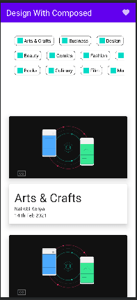

14:29 PM - 26 May 2021


kotlin_test1
Jetpack Compose is a modern toolkit for building native Android UI. It's based on the declarative programming model, so you can simply describe what your UI should look like, and Compose takes care of the restas app state changes, your UI automatically updates.
Original Link: https://dev.to/kchienja/getting-started-with-jetpack-composed-4ihl
Dev To
 An online community for sharing and discovering great ideas, having debates, and making friends
More About this Source Visit Dev To