
An Interest In:
Web News this Week
- April 25, 2024
- April 24, 2024
- April 23, 2024
- April 22, 2024
- April 21, 2024
- April 20, 2024
- April 19, 2024
Some of Our Sources
- Slashdot
- Techcrunch
- Team Treehouse
- Pearsonified
- Smashing Apps
- Creative Curio
- Web Designer Depot
- Specky Boy
- CSS Tricks
- Codrops
Help Webnuz
Referal links:
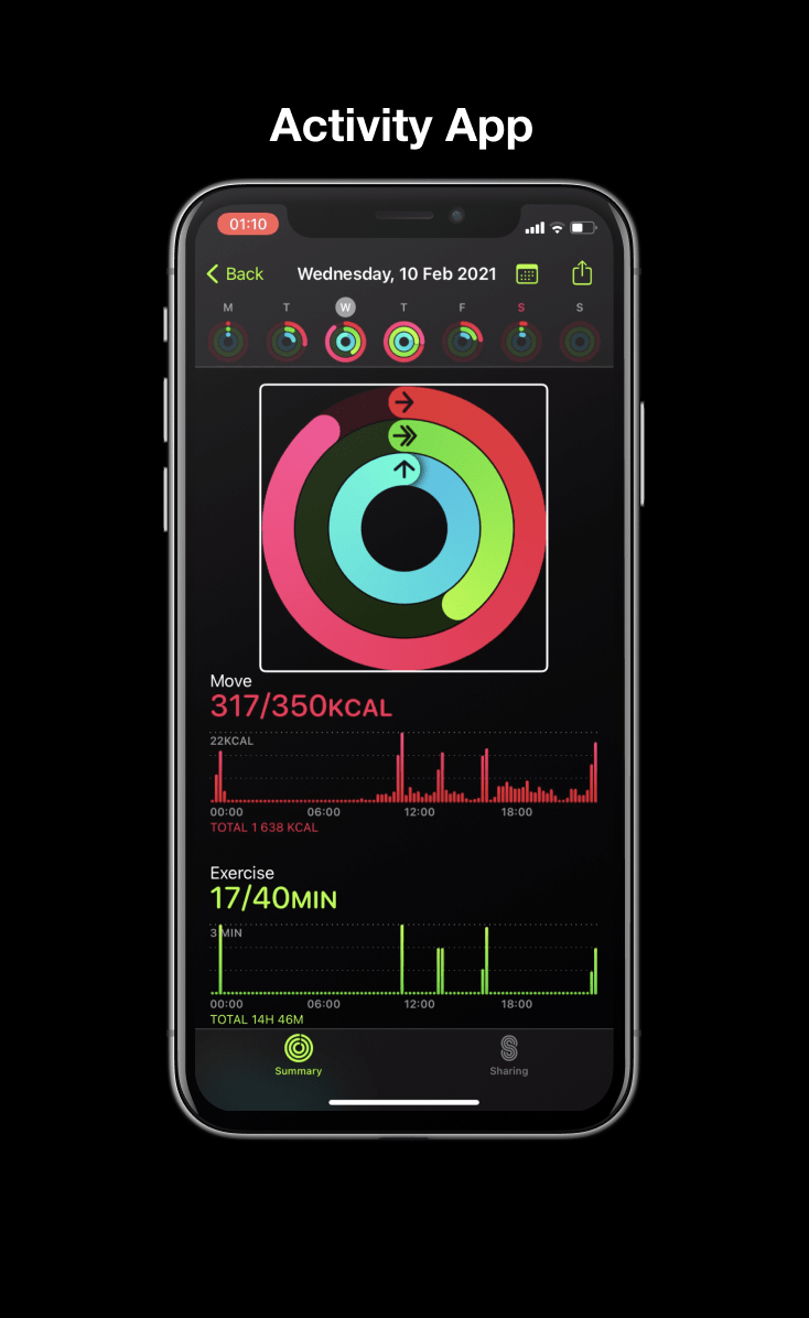
How to create a screen reader accessible graph like Apple's with D3.js
Originally posted on fossheim.io.
After previously writing about the accessibility of Apple Healths data visualizations, I felt inspired to recreate one of them with D3.js. I already covered some of the basics in the form of a bar chart, so this time I decided to go for a different type of graph: the activity rings.
Before we start
While we will build the graph together step by step, this tutorial does require some previous knowledge or experience with D3.js. If you havent used D3 before, I suggest starting with some of these tutorials:
Part 1: Drawing the rings.
First, well need to add a container in the HTML, and (optionally) style the page with CSS already. Next, well draw an SVG element using JavaScript:
/* Define properties */const width = 450;const height = 450;const margin = 40;/* Add SVG inside <div id="activity"></div> */const chart = d3.select('#activity').append('svg') .attr('width', width) .attr('height', height);Now that we have an we can start adding elements to it. First, well create a group to draw the rings in, and center it within its parent ().
const rings = chart.append('g') .attr('transform', `translate(${width / 2}, ${height / 2})`);Then well need to draw our three rings for moving, exercising, and standing. For now, well be using the following input data:
const stats = [ { name: 'Moving', value: 122, goal: 350, perc: 0.35, unit: 'kcal', color: 'hotpink' }, { name: 'Exercising', value: 40, goal: 40, perc: 1.00, unit: 'min', color: 'limegreen' }, { name: 'Standing', value: 9, goal: 12, perc: 0.75, unit: 'h', color: 'turquoise' }];There are a few different ways to draw the rings, but I chose to drawpaths in combination with the d3.arc() function by looping through the stats and using the perc (percentage) to define start and stop positioning.
rings.append('path') .attr('d', d3.arc() .innerRadius(150) .outerRadius(200) .startAngle(0) .endAngle(Math.PI) // full circle: Math.PI * 2 ) .attr('fill', 'white');This would give us half a donut thats 200px in radius (400px in diameter), has a band width of 50px and a gap of 2px.
When we look back at the activity rings, we can see that each ring should decrease in size, and we should have a small gap between each of the rings.
Concretely, this means that for each row of data, the innerRadius and outerRadius should get smaller.
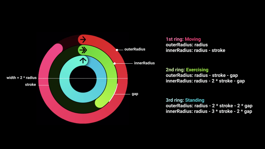
If we set our radius to (width - margin) / 2 (so it takes up the entire space of the SVG minus a predefined margin) and the stroke/donut width to 50, the first row of data would look like this:
rings.append('path') .attr('d', d3.arc() .innerRadius((width - margin) / 2 - 50) .outerRadius((width - margin) / 2) .startAngle(0) .endAngle(Math.PI * 2 * 0.35) ) .attr('fill', 'hotpink');Because Math.PI * 2 gives us a full circle, we can multiply it with the goal completion percentage (stat.perc) to calculate the correct endAngle.
For the second ring, this would have to be:
rings.append('path') .attr('d', d3.arc() .innerRadius((width - margin) / 2 - 100 - 2) .outerRadius((width - margin) / 2 - 50 - 2) .startAngle(0) .endAngle(Math.PI * 2 * 1) ) .attr('fill', 'limegreen');Which we can generalize as:
stats.forEach((stat, index) => { rings.append('path') .attr('d', d3.arc() .innerRadius(radius - circleStroke * (index + 1) - circleSpace * index) .outerRadius(radius - circleStroke * index - circleSpace * index) .startAngle(0) .endAngle(Math.PI * 2 * stat.perc) ) .attr('fill', stat.color);});Then, well need to add a similar <path> for the darker, uncompleted part of the circle. The only thing we need to do for that is set the startAngle to fullCircle * stat.perc, so that it starts where the bright circle ends and set the endAngle to Math.PI * 2. Well also turn down the opacity.
stats.forEach((stat, index) => { rings.append('path') .attr('d', d3.arc() .innerRadius(radius - circleStroke * (index + 1) - circleSpace * index) .outerRadius(radius - circleStroke * index - circleSpace * index) .startAngle(0) .endAngle(Math.PI * 2 * stat.perc) ) .attr('fill', stat.color); rings.append('path') .attr('d', d3.arc() .innerRadius(radius - circleStroke * (index + 1) - circleSpace * index) .outerRadius(radius - circleStroke * index - circleSpace * index) .startAngle(Math.PI * 2 * stat.perc) .endAngle(Math.PI * 2) ) .attr('fill', stat.color) .attr('opacity', 0.25);});I made a few more modifications to this and moved part of the code into a drawRings function, so I wouldnt have to repeat the calculations for the inner and outer radius. You can see the full code for this part in the pen below .
If we listen to this with a screen reader, such as VoiceOver or Narrator, we wont hear much useful. In fact, we wont hear anything at all. That is because so far we have only drawn shapes, which doesnt really tell a screen reader what to do.
In my previous tutorial we used elements to read out the data, but for this one I decided to go for another option: the aria-labelledby property in combination with a and element. This is inspired by how FiveThirtyEight labeled their graphs in their 2020 presidential election forecast (I reviewed those graphs before).
Well want to:
- Set the role of the graph to img.
- Include a and inside the SVG, and give each a unique id.
- Link the title and description to image by adding aria-labelledby=titleID descID to the graph.
If we want to mimic Apples native behavior, the completion percentage for all three rings should be read simultaneously. Eg. Moving: 35%. Exercising: 100%. Standing: 75%.
To generate this text, well create a function that extracts the label (moving, exercising, standing) and the values (35%, 100%, 75%) from the array with the data and then puts it in a sentence.
const generateDescription = () => { return stats.map((stat) => { return `${stat.name}: ${stat.perc * 100}%.`; }).join(' ');}Here we loop through the objects inside the stats array and replace each of them with a string. So after were finished looping through the stats, this is our output:
[ 'Moving: 35%.', 'Exercising: 100%.', 'Standing: 75%.']Lastly, well use .join(' ') at the end to create one long description, and use the output of the function to fill out the text inside the element.
/* Create the chart. */const chart = d3.select('#activity').append('svg') .attr('width', width) .attr('height', height) .attr('role', 'img') // SR support .attr('aria-labelledby', 'activityTitle activityDesc'); // SR support/* Add title. */chart.append('title') .text('Activity') .attr('id', 'activityTitle');/* Add the description. */chart.append('desc') .text(generateDescription) .attr('id', 'activityDesc');Alternative: Using aria-label
We can achieve the same result by using aria-label instead of aria-labelledby in combination with the same generateDescription() function.
const chart = d3.select('#activity').append('svg') .attr('width', width) .attr('height', height) .attr('role', 'img') .attr('aria-label', generateDescription());Part 3: Explaining the data.
So now we have three screen reader accessible rings, but visually those dont tell us that much yet. Pink, green and blue dont really mean anything, and dont work well for color blind folks either.
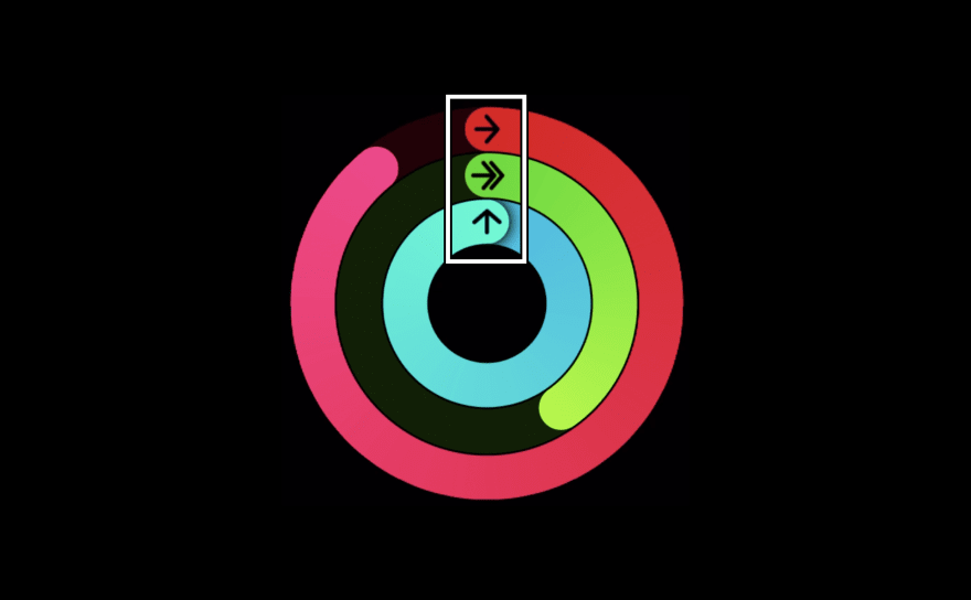
Lets start by adding icons. For the sake of simplicity, I didnt draw or import any icons but used existing symbols as text.
/* Define icons */const icons = { moving: '', exercising: '', standing: ''};/* Inside of stats.forEach(...), at the end of the loop */rings.append('text') .text('icons[stat.name.toLowerCase()]') .attr('fill', '#000') .attr('transform', `translate(${circleSpace}, -${(arc.outer + arc.inner) / 2 - circleSpace * (index + 2)})`) .attr('font-size', '1.5rem');});In addition, we should explain what the colors and symbols mean in a legend. Apple combines this explanation with statistics that show the data in a more detailed way.
This doesnt just add context to the colors of the graph, but also makes the same data available in different formats, which also improves accessibility.
We can implement a simplified version of this by adding elements containing the label, total, goal and percentage values. Well also need to add the corresponding icons and colors, and adjust the vertical position for each row.
chart.append('text') .text(`${icons[stat.name.toLowerCase()]} ${stat.name}: ${stat.value}/${stat.goal}${stat.unit} (${stat.perc * 100}%)`) .attr('text-anchor', 'middle') .attr('transform', `translate(${width / 2}, ${radius * 2 + 20 * (index + 2)})`) .attr('fill', stat.color);The text is added directly to the , not to the same group as the rings, so that it can be focused when using VoiceOver.
Right now the icons in the legend will still be read. If we want that to prevent that from happening, we can add the aria-hidden='true' attribute to the icons this way:
const legend = chart.append('text') .attr('text-anchor', 'middle') .attr('transform', `translate(${width / 2}, ${radius * 2 + 20 * (index + 2)})`) .attr('fill', stat.color); legend.append('tspan') .text(`${icons[stat.name.toLowerCase()]} `) .attr('aria-hidden', 'true'); legend.append('tspan') .text(`${stat.name}: ${stat.value}/${stat.goal}${stat.unit} (${stat.perc * 100}%)`);Alternative: Expanding the aria-label solution
Next steps.
We can keep styling the graph to make it look more similar to Apples graphs, or apply our own styling to it. A few possible next steps could be to move the color scheme to the CSS file, replace the icons or add gradients and shadows.
If youre new to working with D3.js, SVGs or (dataviz) accessibility, here are a few more articles that can help you with this:
- SVG properties and CSS
- Adding gradients onto a line chart
- How to write accessible descriptions for interactive charts
- Add animation with D3.js
- SVG and CSS
- Adding shadows to an SVG (demo)
Feel free to share the results with me (you can tag me on Twitter or mention it in the comments here) if you build something similar using this tutorial or have a different way of solving this
Bonus solutions:
Different type of input.
Navigate through the activity rings.
Original Link: https://dev.to/fossheim/how-to-create-a-screen-reader-accessible-graph-like-apple-s-with-d3-js-18c9
Dev To
More About this Source Visit Dev To