
An Interest In:
Web News this Week
- April 1, 2024
- March 31, 2024
- March 30, 2024
- March 29, 2024
- March 28, 2024
- March 27, 2024
- March 26, 2024
Some of Our Sources
- Mashable
- TutsPlus - Code
- Joshua Blankenship
- Pearsonified
- Abduzeedo
- Inspiredology
- Spyre Studios
- Android Dissected
- Daily Now
- Hashedout
Help Webnuz
Referal links:
How I Made This Realistic Red Switch (Pure CSS)
I created this pen last week after stumbling across this 3D Red Switch design on Dribble. Since then it gained a lot of popularity (much more than I have anticipated!), and a few people have asked me to write a tutorial about how I made it.
I've used various different CSS techniques in the making of this, including gradients, 3D transformations, animations, and transitions. In this tutorial, I will go over some of these techniques in depth.
Simulating a State
This is probably the oldest trick in the book. A switch has 2 states - on and off, but CSS has no way of maintaining such a state.
To solve this, we can use one of the native HTML elements. Since we only need to maintain 2 states, a checkbox element is a great choice. We can use the :checked CSS selector to apply CSS based on whether the checkbox is checked or not.
We wrap the whole thing in a <label/> to link the click event of the entire element to the checkbox, and we hide the checkbox itself using CSS.
<label class="switch"> <input type="checkbox" checked/></label>.switch { input { display: none; }}One issue with this is that we can't apply CSS to the <label/> itself based on the checkbox state, since there's no "ancestor selector" in CSS. Because of that, I placed all the switch elements after the checkbox and used the adjacent sibling selector (+) to apply CSS to them.
<label class="switch"> <input type="checkbox" checked/> <div class="button"></div></label>.switch { input { display: none; &:checked + .button { // Apply some CSS to .button when the checkbox is checked } }}If you need to simulate an element with more than 2 states, you can use other HTML elements like radio buttons (<input type="radio"/>). Some people take this technique to the next level and create an entire game using CSS only! Check out this collection of pure CSS games on CodePen for some inspiration.
Making The Black Frame
I used box-shadow to simulate the button's frame. box-shadow is a very powerful CSS property, because it allows you to stack multiple shadow effects separated by a comma.
I used a set of 5 shadow effects to create the frame, and a border-radius property to make the shadow round in the corners. Here's the breakdown:
.switch { border-radius: 5px; box-shadow: 0 0 10px 2px rgba(black, 0.2), // The surrounding shadow (first layer) 0 0 1px 2px black, // The surrounding shadow (second layer) inset 0 2px 2px -2px white, // The top white "shine" inset 0 0 2px 15px #47434c, // The light gray frame inset 0 0 2px 22px black; // The internal black shadow}Making The 3D Button Shape
I used CSS transformations and transitions to make the button appear 3-dimensional.
The button itself is made of 3 divs (1 div and 2 pseudo-elements to be precise), that are perpendicular to each other, as illustrated below:
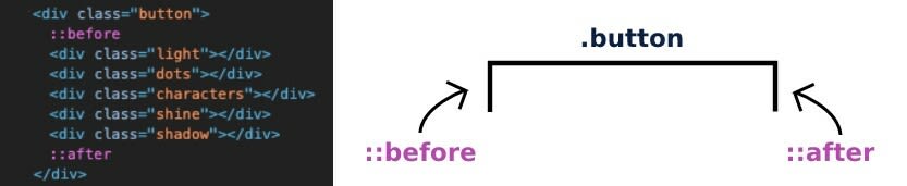
.button { &::before { height: 50px; width: 100%; transform: rotateX(-90deg); } &::after { height: 50px; width: 100%; transform: translateY(50px) rotateX(-90deg); }}Then, I rotated the entire button 25 degrees, and used transform-origin to set the pivot point away from the div, to make the button appear as if it is rotating around some point deeper inside the button, rather than around the div:

.switch { perspective: 700px; .button { $rotation: 25deg; $pivot-distance: 20px; transform-origin: center center -#{$pivot-distance}; transform: translateZ($pivot-distance) rotateX(-$rotation); transform-style: preserve-3d; }}Making The Animation
I used CSS transitions to rotate the switch back and forth. I wanted the transition to appear realistic, by starting slowly and ending quickly. I could've used one of the native easing functions, like ease-in, but that wasn't producing the right animation, so I used a custom cubic-bezier() easing function instead:
transition: all 0.3s cubic-bezier(1, 0, 1, 1);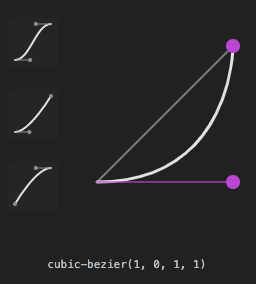
This curve means that the transition starts slowly, and ends quickly, just like a real switch that slowly turns until it "clicks" towards the end.
Making The I/O Characters

There are multiple tricks I could've used to create the I/O characters. I could've used real letters and apply styling to them, or use a special font. But since those are pretty simple characters to draw, I decided to use gradients to make them.
CSS gradients are amazing, but I had no idea how powerful they are until I came across this great article about CSS Drawings.
The true power of gradients comes from the fact that they are considered as "images" by CSS, and therefore can benefit from the power of the background property. backgrounds in CSS can not only be stacked (like shadows), but they can also have custom position and size!
This means that you can do pretty much everything with CSS gradients. If you want to understand just how far you can take it, check out https://a.singlediv.com/ (every art piece on that site is made with a single div).
The syntax is pretty simple:
background: <image> <position> / <size>You can stack multiple gradients with commas, and add background-repeat: no-repeat to prevent the gradients from repeating:
.image { background: <image> <position> / <size>, <image> <position> / <size>, <image> <position> / <size>; background-repeat: no-repeat;}I made the characters using a background with 2 gradients.
For the "I" character, I used an all-white linear-gradient(), and made it narrow and long. For the "O" character I used a radial-gradient() with 4 color stops, from transparent to white and back to transparent.
background: linear-gradient(white, white) 50% 20% / 5% 20%, // White vertical line ("I") radial-gradient(circle, transparent 50%, white 52%, white 70%, transparent 72%) 50% 80% / 33% 25%; // White circle ("O")If you take a look at the radial-gradient(), you'll notice that there's a 2% gap between each color stop:
radial-gradient( transparent 50%, white 52%, white 70%, transparent 72%)This makes the different colors blend together, instead of having a crisp, pixelated transition. To illustrate this, take a look at the image below:
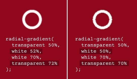
This is an inherent CSS gradient behavior - it creates a smooth blend between the colors when there's a gap between the color stops.
Making The "LED" Gradient

As seen in the picture above, I stacked 2 gradients to achieve a look of an LED bulb hidden behind a semi-transparent red plastic with small round bumps on it.
I had to use 2 elements, one for each gradient, since the first gradient had to be none-repeating, and the second one had to be repeating. Additionally, I wanted to make the light "flicker", so I had to separate them.
The first element is the .light element, where I used a radial-gradient() to illustrate a red LED light, with a brighter center (the center is orange, while the surroundings are red).
.light { background-image: radial-gradient( adjust-hue(lighten($color, 20%), 35), // Orange $color 40%, // Red transparent 70% );}Don't be alarmed by
adjust-hue()andlighten(), I will cover those in the next part. For now, just consider them as hex colors.
The second element is the .dots element, where I used a repeating radial-gradient() with a transparent center to create a matrix of round-shaped bumps.
.dots { background-image: radial-gradient(transparent 30%, rgba(darken($color, 35%), 0.7) 70%); background-size: 10px 10px;}Finally, I used animation to create the flickering effect:

.light { animation: flicker 0.2s infinite 0.3s;}@keyframes flicker { 0% {opacity: 1} 80% {opacity: 0.8} 100% {opacity: 1}}Controlling The Color Through A Variable
As this pen gained popularity, some people asked to see it in different colors. Initially, I had hardcoded colors throughout my CSS, so I changed those to SASS variables for simple configuration.
However, I wanted the main color to be easily configurable, so having multiple color variables wasn't good enough. I needed to control all of the colors & shading through a single variable.
In order to achieve that, I used SASS's built-in color functions: lighten(), darken() and adjust-hue() (SassMe is a nice tool for visualizing the output of these functions).
lighten() and darken() are pretty self-explanatory. They make a given color lighter or darker based on the given percentage. For example, lighten(black, 50%) will mix black with 50% white, producing a gray color.

However, for the LED light, lighten() and darken() were not enough, since the center of the light was orange, while the surroundings were red. That's not a different color shade, it's a different color altogether.
That's where adjust-hue() comes in handy. It lets you change the color's hue property by a given degree.
A color's hue is the color's position on the color wheel and can be represented by a single numerical value, usually in degrees (0 - 360).
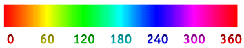
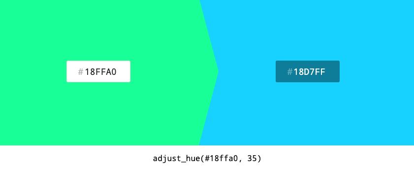
So I used adjust-hue() to "rotate" the color's hue property 35 degrees to the right:
adjust-hue($color, 35)Producing this:

So if the color is red, to rotated color will be orange. But if the color is green the rotated color becomes blue!
So now, you can control all the colors in the switch via a single variable $color:

Summary
This tutorial turned out to be a bit longer than I anticipated, and it may appear a bit overwhelming at first to see all the different techniques and tricks that were used for making this switch. But when you break it down to its basic elements, these techniques are pretty simple to comprehend.
I hope I was able to provide some insight into the development process, and I hope you learned some new CSS techniques.
Original Link: https://dev.to/ykadosh/how-i-made-this-realistic-red-switch-pure-css-49g2
Dev To
 An online community for sharing and discovering great ideas, having debates, and making friends
More About this Source Visit Dev To