
An Interest In:
Web News this Week
- April 19, 2024
- April 18, 2024
- April 17, 2024
- April 16, 2024
- April 15, 2024
- April 14, 2024
- April 13, 2024
Some of Our Sources
- Joshua Blankenship
- Abduzeedo
- You The Designer
- Web Designer Depot
- Naldz Graphics
- Stylized Web
- Freelance Switch
- Design Modo
- Hashedout
- The Verge
Help Webnuz
Referal links:
The easiest way to build a responsive navbar using Tailwind & React
I recently wrote an article about some of my favorite Tailwind component libraries.
However, I could never find an ideal navbar for my projects.
I've always dreaded the navbar! For such a small component that sits at the top of your website, it sure needs a lot of attention.
In this tutorial, we will learn how to build a clean and responsive navbar in under 10 minutes.
Step 1:
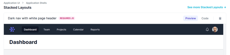
Go to Tailwind UI and copy the HTML code for "Dark nav with white page header".
Step 2:
Make a functional Nav component in your React project and paste this code.
Step 3:
- Convert all the 'class' attributes to 'className'.
- Remove the HTML comment tags and add the JSX comment tags instead.
- Close the 'img' tags.
- Get rid of the 'profile' and the 'notifications' components to keep it simple.
Step 4:
- Remove the 'bg-gray-900' class from Dashboard and add 'hover:bg-gray-700' instead.
This is roughly how our Nav component should look right now:
import React from "react";function Nav() { return ( <div> <nav className="bg-gray-800"> <div className="max-w-7xl mx-auto px-4 sm:px-6 lg:px-8"> <div className="flex items-center justify-between h-16"> <div className="flex items-center"> <div className="flex-shrink-0"> <img className="h-8 w-8" src="https://tailwindui.com/img/logos/workflow-mark-indigo-500.svg" alt="Workflow" /> </div> <div className="hidden md:block"> <div className="ml-10 flex items-baseline space-x-4"> <a href="#" className=" hover:bg-gray-700 text-white px-3 py-2 rounded-md text-sm font-medium" > Dashboard </a> <a href="#" className="text-gray-300 hover:bg-gray-700 hover:text-white px-3 py-2 rounded-md text-sm font-medium" > Team </a> <a href="#" className="text-gray-300 hover:bg-gray-700 hover:text-white px-3 py-2 rounded-md text-sm font-medium" > Projects </a> <a href="#" className="text-gray-300 hover:bg-gray-700 hover:text-white px-3 py-2 rounded-md text-sm font-medium" > Calendar </a> <a href="#" className="text-gray-300 hover:bg-gray-700 hover:text-white px-3 py-2 rounded-md text-sm font-medium" > Reports </a> </div> </div> </div> <div className="-mr-2 flex md:hidden"> <button type="button" className="bg-gray-800 inline-flex items-center justify-center p-2 rounded-md text-gray-400 hover:text-white hover:bg-gray-700 focus:outline-none focus:ring-2 focus:ring-offset-2 focus:ring-offset-gray-800 focus:ring-white" aria-controls="mobile-menu" aria-expanded="false" > <span className="sr-only">Open main menu</span> <svg className="block h-6 w-6" xmlns="http://www.w3.org/2000/svg" fill="none" viewBox="0 0 24 24" stroke="currentColor" aria-hidden="true" > <path stroke-linecap="round" stroke-linejoin="round" stroke-width="2" d="M4 6h16M4 12h16M4 18h16" /> </svg> <svg className="hidden h-6 w-6" xmlns="http://www.w3.org/2000/svg" fill="none" viewBox="0 0 24 24" stroke="currentColor" aria-hidden="true" > <path stroke-linecap="round" stroke-linejoin="round" stroke-width="2" d="M6 18L18 6M6 6l12 12" /> </svg> </button> </div> </div> </div> <div className="md:hidden" id="mobile-menu"> <div className="px-2 pt-2 pb-3 space-y-1 sm:px-3"> <a href="#" className="hover:bg-gray-700 text-white block px-3 py-2 rounded-md text-base font-medium" > Dashboard </a> <a href="#" className="text-gray-300 hover:bg-gray-700 hover:text-white block px-3 py-2 rounded-md text-base font-medium" > Team </a> <a href="#" className="text-gray-300 hover:bg-gray-700 hover:text-white block px-3 py-2 rounded-md text-base font-medium" > Projects </a> <a href="#" className="text-gray-300 hover:bg-gray-700 hover:text-white block px-3 py-2 rounded-md text-base font-medium" > Calendar </a> <a href="#" className="text-gray-300 hover:bg-gray-700 hover:text-white block px-3 py-2 rounded-md text-base font-medium" > Reports </a> </div> </div> </nav> <header className="bg-white shadow"> <div className="max-w-7xl mx-auto py-6 px-4 sm:px-6 lg:px-8"> <h1 className="text-3xl font-bold text-gray-900">Dashboard</h1> </div> </header> <main> <div className="max-w-7xl mx-auto py-6 sm:px-6 lg:px-8"> {/* <!-- Replace with your content --> */} <div className="px-4 py-6 sm:px-0"> <div className="border-4 border-dashed border-gray-200 rounded-lg h-96"></div> </div> {/* <!-- /End replace --> */} </div> </main> </div> );}export default Nav;Step 5:
React doesn't include a first-party transition component out of the box. Thus, the folks at Tailwaind made one.
npm install @headlessui/react
or
yarn add @headlessui/react
Step 6:
Time to add the boolean state to open and close the mobile navbar. We will also have to use the same boolean logic to change the nav icon for open and close state.
You can learn more about the implementation here.
Step 7:
Here is the final code with the responsive state added.
import React, { useState } from "react";import { Transition } from "@headlessui/react";function Nav() { const [isOpen, setIsOpen] = useState(false); return ( <div> <nav className="bg-gray-800"> <div className="max-w-7xl mx-auto px-4 sm:px-6 lg:px-8"> <div className="flex items-center justify-between h-16"> <div className="flex items-center"> <div className="flex-shrink-0"> <img className="h-8 w-8" src="https://tailwindui.com/img/logos/workflow-mark-indigo-500.svg" alt="Workflow" /> </div> <div className="hidden md:block"> <div className="ml-10 flex items-baseline space-x-4"> <a href="#" className=" hover:bg-gray-700 text-white px-3 py-2 rounded-md text-sm font-medium" > Dashboard </a> <a href="#" className="text-gray-300 hover:bg-gray-700 hover:text-white px-3 py-2 rounded-md text-sm font-medium" > Team </a> <a href="#" className="text-gray-300 hover:bg-gray-700 hover:text-white px-3 py-2 rounded-md text-sm font-medium" > Projects </a> <a href="#" className="text-gray-300 hover:bg-gray-700 hover:text-white px-3 py-2 rounded-md text-sm font-medium" > Calendar </a> <a href="#" className="text-gray-300 hover:bg-gray-700 hover:text-white px-3 py-2 rounded-md text-sm font-medium" > Reports </a> </div> </div> </div> <div className="-mr-2 flex md:hidden"> <button onClick={() => setIsOpen(!isOpen)} type="button" className="bg-gray-900 inline-flex items-center justify-center p-2 rounded-md text-gray-400 hover:text-white hover:bg-gray-800 focus:outline-none focus:ring-2 focus:ring-offset-2 focus:ring-offset-gray-800 focus:ring-white" aria-controls="mobile-menu" aria-expanded="false" > <span className="sr-only">Open main menu</span> {!isOpen ? ( <svg className="block h-6 w-6" xmlns="http://www.w3.org/2000/svg" fill="none" viewBox="0 0 24 24" stroke="currentColor" aria-hidden="true" > <path strokeLinecap="round" strokeLinejoin="round" strokeWidth="2" d="M4 6h16M4 12h16M4 18h16" /> </svg> ) : ( <svg className="block h-6 w-6" xmlns="http://www.w3.org/2000/svg" fill="none" viewBox="0 0 24 24" stroke="currentColor" aria-hidden="true" > <path strokeLinecap="round" strokeLinejoin="round" strokeWidth="2" d="M6 18L18 6M6 6l12 12" /> </svg> )} </button> </div> </div> </div> <Transition show={isOpen} enter="transition ease-out duration-100 transform" enterFrom="opacity-0 scale-95" enterTo="opacity-100 scale-100" leave="transition ease-in duration-75 transform" leaveFrom="opacity-100 scale-100" leaveTo="opacity-0 scale-95" > {(ref) => ( <div className="md:hidden" id="mobile-menu"> <div ref={ref} className="px-2 pt-2 pb-3 space-y-1 sm:px-3"> <a href="#" className="hover:bg-gray-700 text-white block px-3 py-2 rounded-md text-base font-medium" > Dashboard </a> <a href="#" className="text-gray-300 hover:bg-gray-700 hover:text-white block px-3 py-2 rounded-md text-base font-medium" > Team </a> <a href="#" className="text-gray-300 hover:bg-gray-700 hover:text-white block px-3 py-2 rounded-md text-base font-medium" > Projects </a> <a href="#" className="text-gray-300 hover:bg-gray-700 hover:text-white block px-3 py-2 rounded-md text-base font-medium" > Calendar </a> <a href="#" className="text-gray-300 hover:bg-gray-700 hover:text-white block px-3 py-2 rounded-md text-base font-medium" > Reports </a> </div> </div> )} </Transition> </nav> <header className="bg-white shadow"> <div className="max-w-7xl mx-auto py-6 px-4 sm:px-6 lg:px-8"> <h1 className="text-3xl font-bold text-gray-900">Dashboard</h1> </div> </header> <main> <div className="max-w-7xl mx-auto py-6 sm:px-6 lg:px-8"> {/* <!-- Replace with your content --> */} <div className="px-4 py-6 sm:px-0"> <div className="border-4 border-dashed border-gray-200 rounded-lg h-96"></div> </div> {/* <!-- /End replace --> */} </div> </main> </div> );}export default Nav;Here's how our navbar looks like:

Here's a link to the Codesandbox, if you guys want to test it out.
Hope this helps!
Original Link: https://dev.to/prnvbirajdar/the-easiest-way-to-build-a-responsive-navbar-using-tailwind-react-2803
Dev To
 An online community for sharing and discovering great ideas, having debates, and making friends
More About this Source Visit Dev To